Vietnamese Transform

Get help with FontCreator here. Please do not post feature requests or bug reports here.
Post Reply
kyokorebit
Posts: 4
Joined: Sat Apr 26, 2008 12:05 pm

Vietnamese Transform

Post by kyokorebit »

Hi everybody,

I'm a Vietnamese and now I'm working with a font for my mobile. That font is called Rastapopoulos.
http://kyokorebit.googlepages.com/Rastapopoulos.zip

When I use the "Glyph Transfomer" to have some Vietnamese character, I notice that the character is not displayed in the right way.

This is my font & I use the glyph transfomer to transform to Vietnamese:
Image

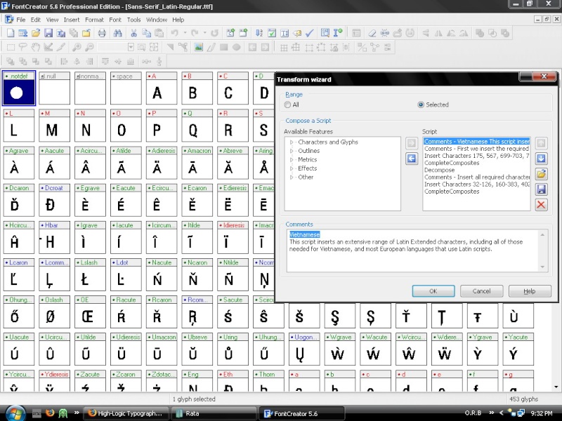
I got many new characters but only the selected characters are in Vietnamese.
Image

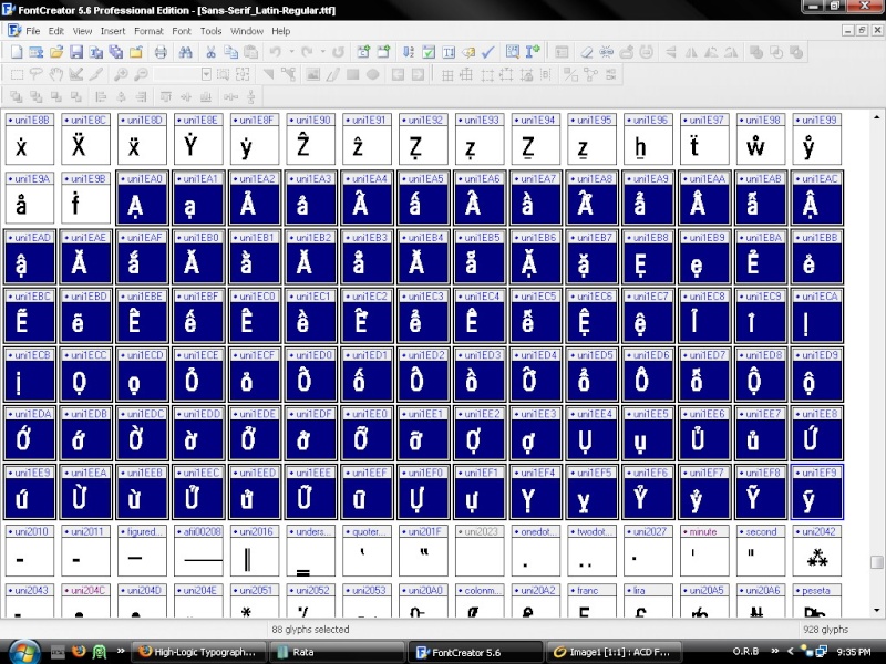
However, they aren't written in the right way in Vietnamese. For example:
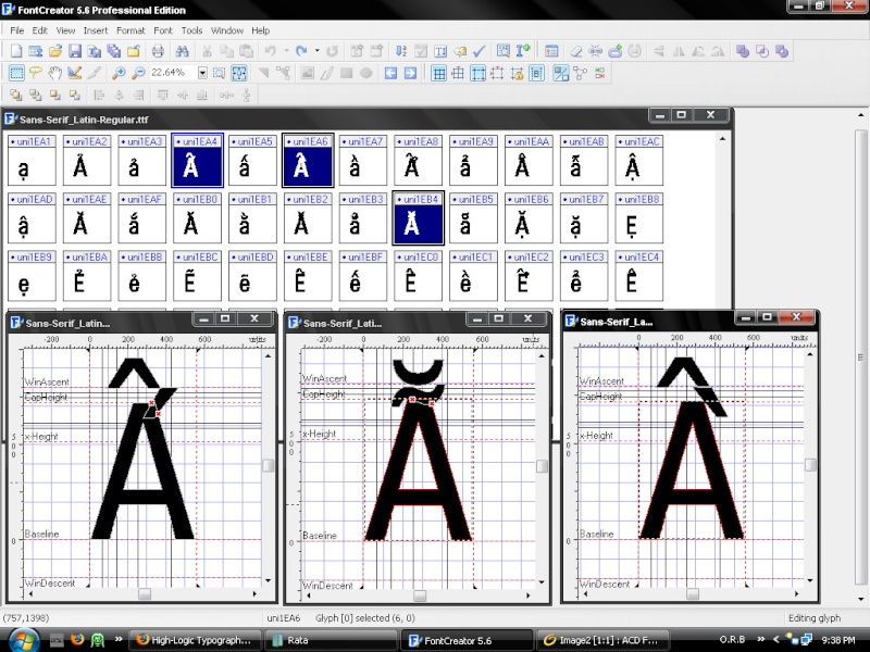
Image

The first character should like this:
The second character should like this:
The third character should like this:
And many other characters have the same problem.

So, how can I edit them? Edit one by one or in another way?

Please help me. I will be very pleased. And I'm a 14-year-old Vietnamese boy so please guide me in details.

TIA.

Kyokorebit
Bhikkhu Pesala
Top Typographer
Top Typographer
Posts: 9878
Joined: Tue Oct 29, 2002 5:28 am
Location: Seven Kings, London UK
Contact:

Post by Bhikkhu Pesala »

See sections 5, 14, and 15, in the PDF Tutorial Using Glyph Transformations
You don't need to edit them one by one. Begin by editing the Stacking Diacritics at the end of the font. When you're satisfied that they're the right size and position for Capital E then select the Latin Extended Additional characters that use them, make the composite glyphs empty and complete composites to let Font Creator position them again.

See my free fonts such as Garava or Verajja for working examples. When I was designing my fonts, a Vietnamese suggested that the circumflex grave accent worked best if the grave was on the right of the circumflex, not on the left as you have illustrated. You can move it to the left if you wish. Some fonts do that.

See this thread for a tip on adjusting the Geometric Centre of the stacking diacritics that are not symmetrical.

I use various techniques to reduce the height of the stacking diacritics. Otherwise the font's line-spacing is too high to be useful for normal English text. You can allow more vertical space for your fonts if you wish, as they will be used mainly for Vietnamese.

Format, Settings, Metrics, Maximum, Calculate will make sure that the high accents are not clipped when the fonts are used in Windows applications.
My FontsReviews: MainTypeFont CreatorHelpFC15 + MT12.0 @ Win 10 64-bit build 19045.2486
kyokorebit
Posts: 4
Joined: Sat Apr 26, 2008 12:05 pm

Post by kyokorebit »

Thank you Bhikkhu Pesala :D.
Although I don't fully understand all you have told me, but I'm trying my best to fix my font. I think it's really complicated :?.
When I was designing my fonts, a Vietnamese suggested that the circumflex grave accent worked best if the grave was on the right of the circumflex, not on the left as you have illustrated.
Yeah in Vietnamese the grave should be on the right :D. I don't notice that.

When I'm done I will post my font here. Can you comment it :D?
Bhikkhu Pesala
Top Typographer
Top Typographer
Posts: 9878
Joined: Tue Oct 29, 2002 5:28 am
Location: Seven Kings, London UK
Contact:

Post by Bhikkhu Pesala »

You can send me your font when you want, maybe before you spend too much time on it, so that I can give you some tips to save time. Creating Vietnamese fonts is about as hard as it gets with Latin scripts — rather easier than CJK fonts though (Chinese, Japanese, Korean) I imagine.

You certainly jumped in at the deep end of font creation.
My FontsReviews: MainTypeFont CreatorHelpFC15 + MT12.0 @ Win 10 64-bit build 19045.2486
kyokorebit
Posts: 4
Joined: Sat Apr 26, 2008 12:05 pm

Post by kyokorebit »

Here's the font:
http://kyokorebit.googlepages.com/Rastapopoulos.zip

I'm a student now and I'm going to take an exam so if making this font takes too much time, your tips will help me much, otherwise I must stop :(.

Really thank you.
Bhikkhu Pesala
Top Typographer
Top Typographer
Posts: 9878
Joined: Tue Oct 29, 2002 5:28 am
Location: Seven Kings, London UK
Contact:

Post by Bhikkhu Pesala »

First you need to try to do some work yourself. No point me doing it all for you.
My FontsReviews: MainTypeFont CreatorHelpFC15 + MT12.0 @ Win 10 64-bit build 19045.2486
kyokorebit
Posts: 4
Joined: Sat Apr 26, 2008 12:05 pm

Post by kyokorebit »

Here is my font (only in regular, I haven't done anything with italic, bold and bold italic yet):
http://kyokorebit.googlepages.com/Sans- ... egular.ttf
Any tips :D ?

*edit: I notice that the A in A and the A in À is not equal to each other, but the A in is equal to the first A. *

How to fix it?
Bhikkhu Pesala
Top Typographer
Top Typographer
Posts: 9878
Joined: Tue Oct 29, 2002 5:28 am
Location: Seven Kings, London UK
Contact:

Post by Bhikkhu Pesala »

That's the first time I have seen a font like that. The accented glyphs use smaller capital letters than the regular glyphs. That adds a whole new layer of complexity to this task, although you could just select the accented glyphs and do Complete Composites it would spoil the font's design, which is specially made for mobile devices. All of the Vietnamese characters should use the same smaller glyphs for capitals too.

Since the fonts are protected by copyright, I cannot recommend that you modify them unless you have the font creator's permission. For personal use only it may be OK (it depends on the license), but distributing them is unlikely to be permitted, so it is hardly worth all the effort of modifying them.

Image My cut-down version of Verajja for PDA devices may be what you need, but I suspect that it is not so well designed as the Rastapopoulos fonts. If it is not suitable, you can modify it. You can see the license agreement in the font itself, from Format, Naming, Advanced.
My FontsReviews: MainTypeFont CreatorHelpFC15 + MT12.0 @ Win 10 64-bit build 19045.2486
Post Reply