Page 1 of 2
Ligatures - two simple questions
Posted: Thu Apr 18, 2024 2:15 pm
by Bageder
I understand that a ligature is a 'join' between letters (glyphs). I'm getting nowhere with ligatures. I'm starting from rock bottom, and I'm lost in technicalities and unfamiliar words. I've tried some tutorials, but they seem to address more complicated issues.
(I'm using the FontCreator Professional.)
First, in the simplest possible terms, how do I make ligatures? My efforts simply do not work.
Second, how do I make space in the font definition file for a large number of ligatures.
Here's what I'm trying to do:
It's a very simple handwriting style, but pairs of letters join, or not, in different ways. For example,
t joins from the cross to a c i m n, but is not joined to ascenders like b h l, ...,
horizontal joins follow f o r t v, ..., except when followed by e,
when f follows a c m n, ..., it has different shape,
the second f of ff has a different shape,
etc...
I estimate that the letters join in 15 different ways, though some simplification may be possible.
Re: Ligatures - two simple questions
Posted: Thu Apr 18, 2024 5:39 pm
by Bhikkhu Pesala
Ligatures are not what you need. What you are doing is
creating a cursive font, for which you need to use
Contextual Alternates.
For this, you need to create two or more versions of some letters and use an OpenType feature to substitute the appropriate glyph dependent on the context. This alternate glyphs do not need any Unicode mapping, but they need to be named appropriately.
The linked thread above is a bit old, but I don’t think it is out-of-date yet.
Re: Ligatures - two simple questions
Posted: Fri Apr 19, 2024 6:11 am
by Bageder
Thank you. I've been on the wrong track for days. I will definitely follow your advice.
Re: Ligatures - two simple questions
Posted: Fri Apr 19, 2024 6:45 am
by Erwin Denissen
This tutorial covers Contextual Alternates which might give some more ideas.
https://www.high-logic.com/font-editor/ ... e-features
Re: Ligatures - two simple questions
Posted: Fri Apr 19, 2024 7:04 am
by Bageder
Thanks. I seem to have a fairly steep learning curve at the moment.
Re: Ligatures - two simple questions
Posted: Sun Apr 21, 2024 9:45 am
by Bageder
Thank you for your help so far.
There are two OpenType Features example files at:
viewtopic.php?p=26561#p26561 .
I wonder if one of those (probably the second) could be brought up-to-date, as neither FontCreator 15 nor I, can interpret them?
Or is there an alternative example?
I won't be able to respond immediately as I am going away for a few days.
Re: Ligatures - two simple questions
Posted: Mon Apr 29, 2024 7:56 pm
by Bageder
I'm still struggling with this. I'm an absolute beginner, but I think I've made progress.
I have created some classes and looked at the Code Editor, but I cannot understand how to use the classes.
I have one class call "diagonal" which I want to join to another class by a diagonal join. (I'm tempted to call the "join" a "ligature", but I'm not sure if that's right.) When the characters of the "diagonal" class come before other characters, there should be no join.
Can someone please help me with this? It's supposed to be easy, but I cannot see it.
Is there a simple example font I could load, perhaps, to see how it's done?
Re: Ligatures - two simple questions
Posted: Mon Apr 29, 2024 9:16 pm
by Erwin Denissen
A ligature is used as a replacement of two or more glyphs. What you describe related to cursive attachment, but that is not meant for Latin based characters.
However, it might be worth a try to upload an illustration or screenshot of what you try to achieve.
Or upload a reduced version of your font, so we can go from there.
Re: Ligatures - two simple questions
Posted: Tue Apr 30, 2024 9:04 am
by Bageder
Erwin
Thanks for offering to help.
Ultimately, I want the font to look like the attached image. It's Tom Gourdie's "Simple Modern Hand". (It's for personal non-commercial use).
These letters: a c d e h i k l m n u
join to the next letter, a b c d f g h i ...
by a diagonal join.
If I can achieve that, I feel I'll be able to approach other joins and refinements.
These letters: b g j p q s x y
do not join to the next letter.
Regards
Bageder
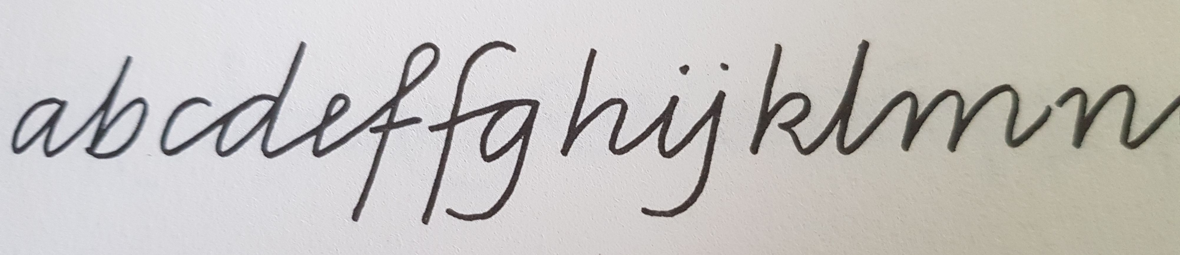
- SMH_photo.jpg (354.44 KiB) Viewed 1090 times
Re: Ligatures - two simple questions
Posted: Wed May 01, 2024 2:03 pm
by Bageder
There's not much to my font as yet, so I'm attaching the project file.
Re: Ligatures - two simple questions
Posted: Thu May 02, 2024 8:40 am
by Erwin Denissen
I removed some lookups from the calt feature and connected SingleSubstitution2 to ChainingContext1.
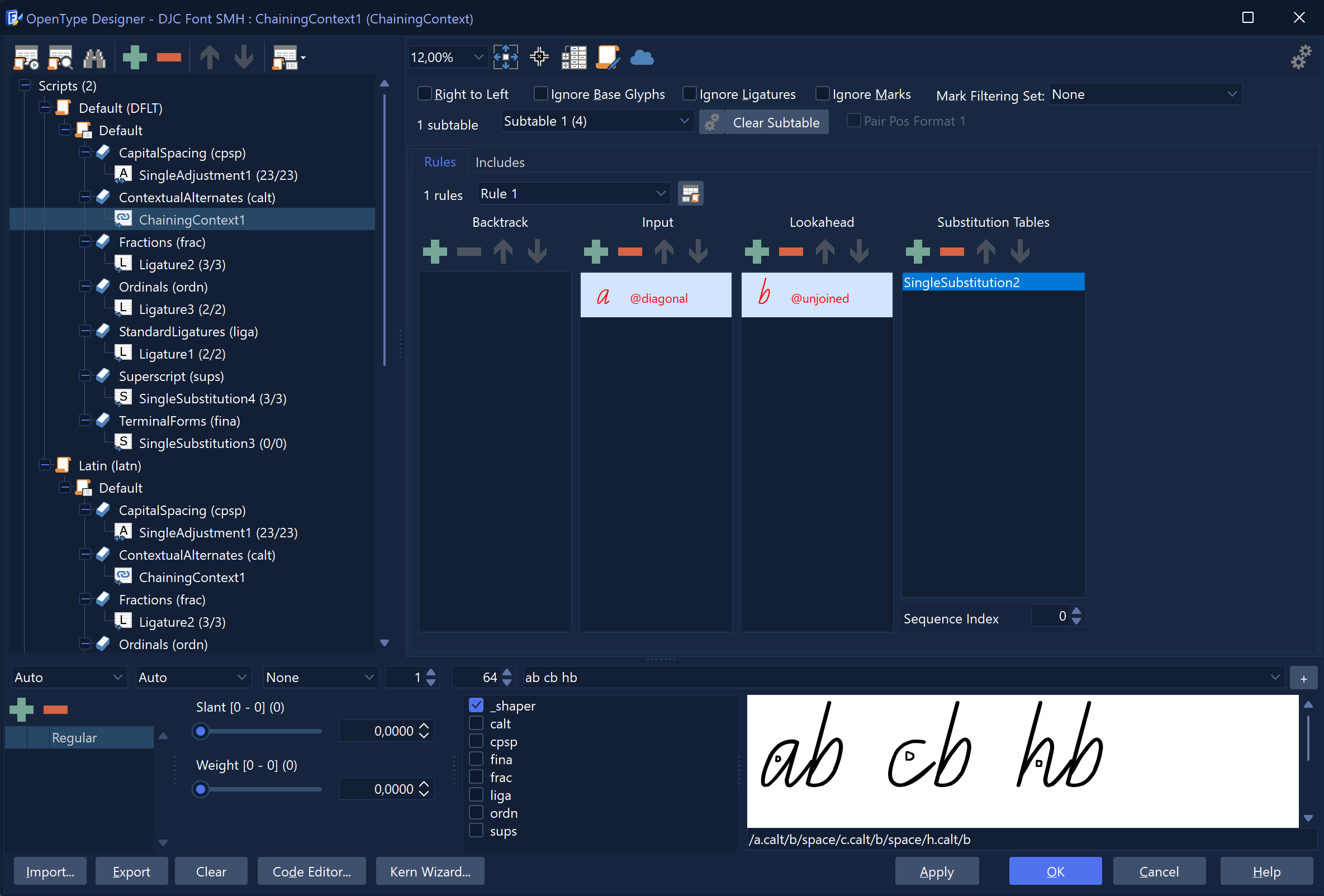
- hand.png (202.52 KiB) Viewed 967 times
Re: Ligatures - two simple questions
Posted: Thu May 02, 2024 1:34 pm
by Bageder
I regret, I have to ask you to make this much simpler for me. Could you please explain what you have done and why? Also, what has it achieved? I can see changes in the .fea file, but their significance escapes me.
Re: Ligatures - two simple questions
Posted: Thu May 02, 2024 1:48 pm
by Erwin Denissen
This is a basic extract from your original. I hope this will help understand how it works.
###
# OpenType Layout feature definitions
# Generated by: FontCreator
# Font name: DJC Font 1
#
languagesystem DFLT dflt;
languagesystem latn dflt; # Latin default
@diagonal = [a c-e h i k-n u];
@unjoined = [ b e g j p q s x y];
lookup SingleSubstitution2 { # GSUB lookup type SingleSubstitution
sub a by a.calt;
sub b by b.calt;
sub c by c.calt;
sub h by h.calt;
} SingleSubstitution2;
feature calt { # Contextual Alternates
sub @diagonal' lookup SingleSubstitution2 @unjoined;
} calt;
Re: Ligatures - two simple questions
Posted: Thu May 02, 2024 2:26 pm
by Bageder
Sorry, but it doesn't clarify anything. I must call upon your patience and press you further on this. I admit I'm ignorant of fonts, and there's no one to guide me. My background is in computer and network performance engineering and technical writing. Therefore, please explain as you would to a ten-year-old, although I'm actually 76, brain intact - er - yes, it is.
When I test the font, it doesn't look any different.
Re: Ligatures - two simple questions
Posted: Thu May 02, 2024 2:36 pm
by Bageder
Actually, I think I'm beginning to get it. Don't reply just yet. I need to study this and try some things that might work.