This initial release of Acariya has the same glyphs and OpenType features as Guru, but is 10% less condensed. Guru was designed to save paper, but since I rarely print anything on paper now, a less condensed version is easier to read in PDF publications.
Very nice, Guru is OK but I thought it a little cramped, this one is just right, thanks. ![]()
Version 1.10 fixed a few bugs, and reduced file sizes by using composites for subscripts from the superscript glyphs. The Italic and bold italic enclosed alphanumeric glyphs were also shifted right to compensate for the italic angle.
Version 1.20 fixes a lot of defects caused by the way that the Thin Transformation works.
It would be better if it was proportional to the stroke weight. See this feature request
I have now completed all four type styles and updated the archive my web page.
No doubt I will find more bugs later, but I think its good enough to use now.
The font looks great. I couldn’t locate any issues at first glance, but did notice the kerning isn’t class based. Did FontCreator flatten your class based kerning?
Yes. My kerning is class-based in all of my fonts now. It happens to Acariya, Guru, Garava, but not to Pali. I have sent you some project files by email.
Thank you for sending the font project files. Class based kerning isn’t possible due to overlapping glyph classes. We’ll release an update soon which will show which classes are overlapping when you recompile the OpenType feature code.
That fixed it, and the Windows menu bug that I reported earlier.
Updated again to version 1.21
Version 1.30 fixed lots of bugs, added many kerning pairs, and the archive now includes smaller versions with fewer symbols, no Petite Capitals (only Small Capitals), and no Greek Extended. However, these web versions are hinted as otherwise some light glyphs might not look so good.
Upgrading is strongly recommended. The early versions were a bit of a rush job, just to get the font published. This has been more thoroughly checked, but as always I will glad to hear about any bugs.
Version 1.40 added localised forms for Romanian, ligatures for Dutch, smaller accents for Small and Petite Capitals, improved kerning classes, and added many more kerning pairs. It includes smaller web versions.
Version 1.50 improved some ogonek contours, added four glyphs with ogonek for Nordic, and added some more kerning pairs.
Version 1.60 improved many contours, added two glyphs for irony punctuation, and added many more kerning pairs.
It is next to impossible to spot any issues with your fonts, but the upcoming improvements to the validation feature did find one minor issue with germandbls.smcp.
Thanks. However, the more closely I look, the more issues I discover. I ran the glyph validator on Acariya Regular, which came up with another 5 glyphs with redundant points. I then ran the glyph transform optimize feature, validated again, and found loads more issues. So I scrapped that and started again.
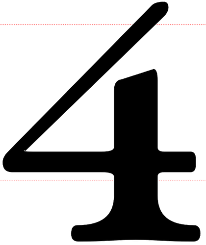
The 4 numerator for stacking fractions was the main problem, so I have now fixed that.
Good catch!
Version 1.61 was released to fix these bugs.
- Version 1.70 replaced Romanian localised forms with a Stylistic Set.
- Irony punctuation reversed question mark is a Standard Ligature substitution for ??, while Interrobang replaces ?! and inverse interrobang replaces ¿¡.
- Super/subscript glyphs (×÷) and thin space were added for use with fractions.
- Kerning pairs were added for subscripts and fractions that use them.
- Character Variants were improved and are now included in the Web and WOFF versions.
- Alternative Fractions were improved and some bugs were fixed.
Version 1.80 added the Bitcoin currency symbol for Unicode 10, and Transport and Map symbols for stupa and pagoda. Kerning pairs were improved.
Version 1.90 improved the spacing of a few ligatures, which were too tightly kerned.

