I think all of the fonts that I edited already had the æ symbol, but if any font lacks them, adding them is not difficult with Font Creator. Even easier with Font Creator Professional Edition.
Stage 1
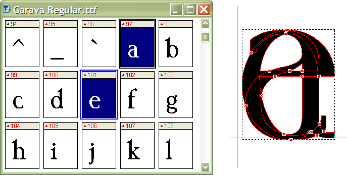
Map a new empty glyph to codepoint 230 (U+00E6 : LATIN SMALL LETTER AE). Select the a and e in the glyph overview and copy them to the clipboard. Open the empty new æ glyph and paste them is as composite glyph members (right).
Stage 2
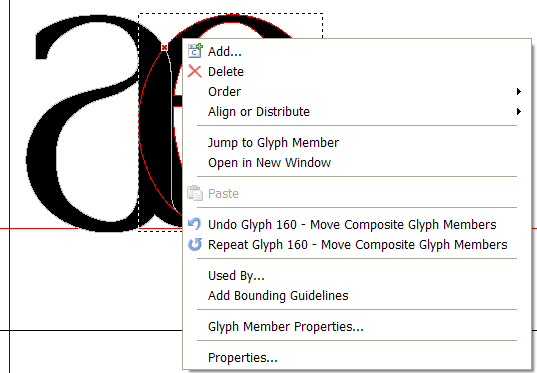
Right-click on the e, and select “Open in new window.”
Stage 3
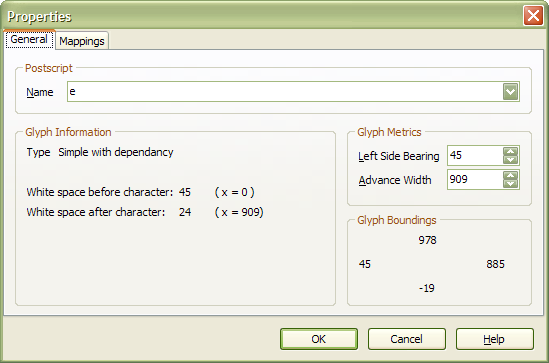
Edit the glyph properties (Alter Enter) and make a note of the white space after the character, 24 in this case.
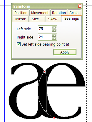
Close the glyph edit window for e, and reopen the one for æ. Make the glyph simple, and use the Transform toolbar to set the left side-bearing so that x=0 and the right side-bearing is 24.
Stage 4
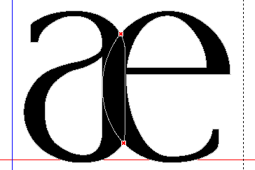
If necessary, move a few points in points mode to make the curves join smoothly, then in contour mode, select all contours (Control A), and select “Get Union of contours” from the toolbar.
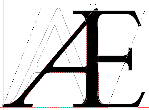
The A of Capital Æ can be skewed by dragging with the mouse to select both of its contours, then click again on the contours to get the skew and rotate handles.
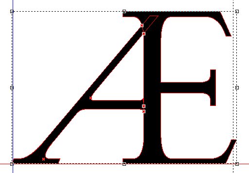
Cut the “E” to the clipboard, and trim any excess off the “A” with the knife tool before pasting the “E” back in. Afer merging the contours with “Get Union of Contours” you may have to do a bit of editing in point mode.
You can also combine contours like this in the Home Edition, but you have to use the join contours function which is a bit more difficult. Add a node on each contour at the intersection point, select them both, then right-click and select “Join contours” from the popup menu. TIP: You can also use the context menu key to the left of the Control key on the right of your keyboard.
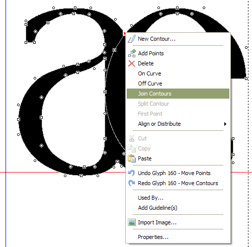
That leaves a bit of a mess to tidy up. You have delete some nodes, and move a few others.
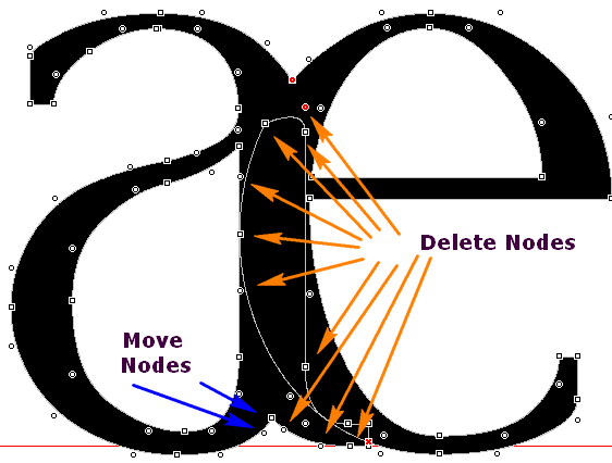
Font Creator Professional Edition will do this joining process automatically. It is not perfect, but it works well with joining all but the most complex of contours.