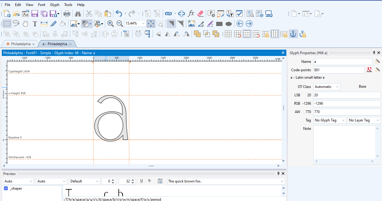
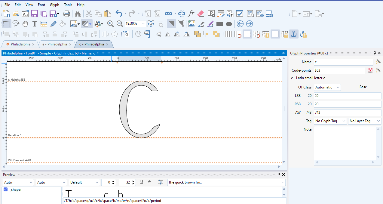
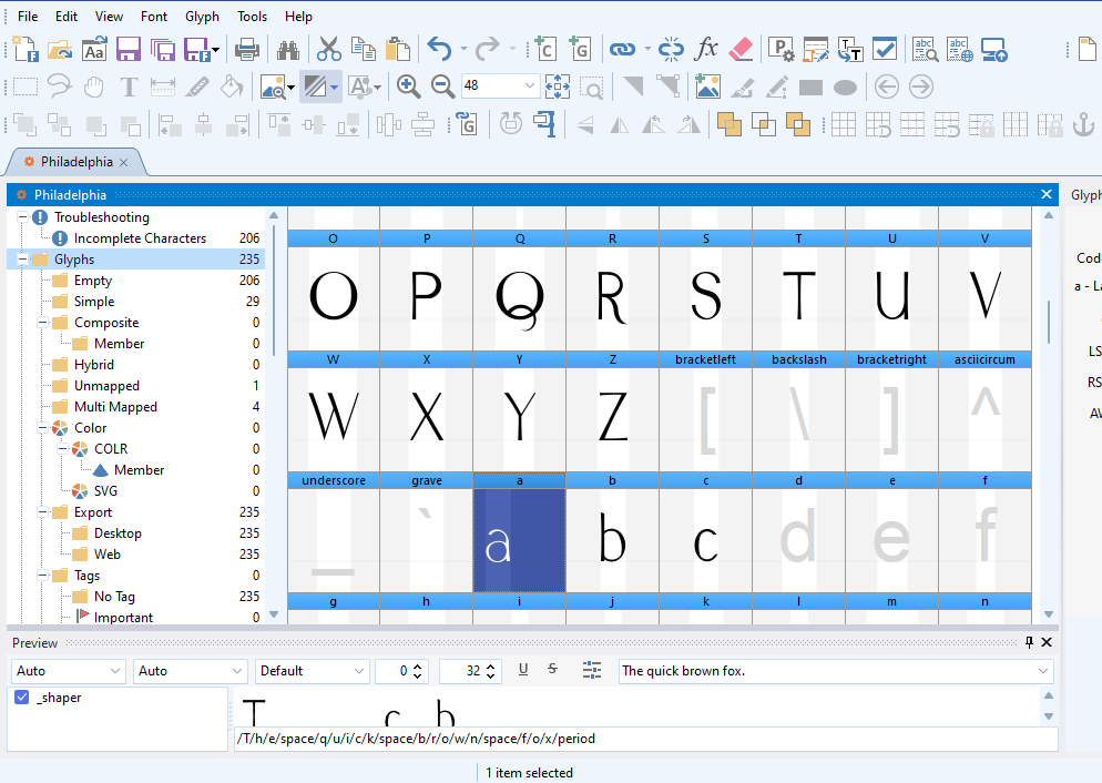
Take a look at the screen shots below, please. You’ll note that the position of the lower case “a” in the window with the overview of the font has that glyph well to the left (all other glyphs are centered) in their individual windows). Furthermore, take a look at the glyph properties: you’ll note that the left and right side bearings in the case of the lower case “c” (which look like they’re typical of all the rest of the lower case letters) are different from those of the lower case “a”.
I don’t understand why the lower case “a” has such a large negative right side bearing, whereas the other lower case characters don’t. I’m concerned this inconsistency will lead to kerning problems down the road. How do I fix this, please?