Three type designers walked into a bar.
The first two said, “I must dash,” and left without another word.
The third muttered to himself—after a space—“What’s wrong with ’em?”
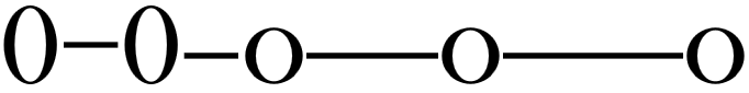
In my fonts, I generally design the various dashes like this, but it’s not a fixed rule:-
- Figure Dash [$2012] has an advance width equal to figure zero, and is centred vertically on the zero
- En-dash [$2013] has an advance width of 1024 funits, and is centred vertically on the x-height
- Em-dash [$2014] has an advance width of 2048 funits, and is centred vertically on the x-height
- Horizontal Bar [$2015] has an advance width of 3072 funits, and is centred vertically on the x-height
Both en-dash and figure dash may have some space either side, but em-dash and horizontal bar generally have side-bearings of zero so that they can be used to create a continuous rule.