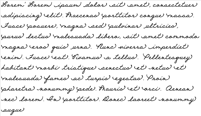
The attached pdf “Bern-cursive.pdf” shows my experiments with making a cursive font with OpenType features. It shows my progress as of today.
I made the font using FontCreator 9.1 Professional.
At the top I show sample text in the default font (left) and my cursive font (right). The only difference in input is the font used: all the coding is in the font, there is no extra markup. This was rendered by Firefox 53 and Windows 10.
Below is the script used in the font.
My purpose was to learn how to write an OpenType script using chaining contextual alternates (calt).
Making the font look nice was not a priority. The letters are crude, as I am a novice at designing and drawing. The letters have wide left and right spaces for joins: this makes the joining lines easy to identify.
Letter shapes
The design is based on how my primary school teachers tried to teach me to write fifty years ago.
I started by identifying classes of letters that had the same combinations of right-side connections, and the classes with the same left-side connections.
Six different “g”s are visible. Six “o”s are used; there should eventually be another three “o”s. (I may put a small break at the top of the connected “o”s, to show that I write them anticlockwise, not clockwise, which would be horrible.) Most of the alphabet is still waiting to be drawn.
The most demanding letter was “e”: it has to start half way between the baseline and the midline. Thus I had to have a variant of “o” like the one in the sequence “ooooe”. It seems to me that most script typefaces have “o”s (and in fact all letters) that join at this height just to make the link to “e” look right.
The sequences “ooo” and “og” show the link out from an “o” at the height of the midline, where it belongs before letters other than “e”. (The “h” has a looped stem so that when I add the variant after an “o” I can show the join above the midline.)
Most of the glyphs are yet to be added.
The glyphs were very easy to name: right click, glyph properties, name, apply.
OpenType script
I used “Font” menu, “OpenType Designer”, “Code Editor…” to write the script myself, because I could not manage the automated system. When I had written the code I checked it with the blue tick; the syntax checker warned that there was a class — @g — that was not used, but an unused class does not prevent the compiler working.
One can see that this font produces initial, final and isolated forms just by using chaining contextual alternates: I have not tried to use “init” or “fina”, which are, I gather, not intended for use with the Latin alphabet.
Actually, of course, I worried away at the code for a week (on and off) before I reached this stage.
The syntax checker found plenty of errors: glyph names not corresponding to glyphs (misspelled glyph names), very many missing semicolons, and so on.
The syntax checker checks that the code is valid, but it does not check whether it actually does what you want it to do! At one point I was convinced that Firefox simply did not show chaining contextual alternates, just simple contextual alternates. In fact, Firefox was showing what I told it to do, not what I wanted it to do.
Now that I know what I was doing wrong, adding code for the rest of the alphabet and tidying or combining classes will be much more straightforward.
My two main errors were:
(1) I forgot to add glyph names to all the relevant classes. As an example, at the end of the script
lookup oe {
  context (@mid.out) @lower;
  sub 0 oe1;
}
lookup oe1 {
  sub e -> e_mid_in;
  sub e_low_out -> e_mid_in_low_out;
}
I added the line
sub e_low_out -> e_mid_in_low_out;
but this had no effect because I had not previously added “e_low_out” to the class @lower. The substitutions only affect members of the class @lower in the context of following members of the class @mid.out.
(2) My second error was in misunderstanding how the rendering is performed. I thought that, just as the features are carried out in sequence, so the lookups (i.e. class.1.high.out, class.1.mid.out, class.2.low.out, high.out, low.out, and oe) were also performed one after another, in sequence.
Thus, in the first set of substitutions, I now use
lookup class.1.high.out.1 {
sub o -> o_high_out;
sub o_high_in -> o_high_in_high_out;
sub o_low_in -> o_low_in_high_out;
}
Before (in the code that did not work properly), I used
lookup class.1.high.out.1 {
sub o -> o_high_out;
}
because I thought that
sub o_high_in -> o_high_in_high_out;
sub o_low_in -> o_low_in_high_out;
belonged further down.
That is, even though the glyphs o_high_in and o_low_in are produced from the letter “o” later on, I should still include their replacements here, at the start.
Finding sample scripts to modify
On the internet I have found sample scripts that are posted to show OpenType syntax. But it appears that different compilers use slightly different syntax. For example, Fontcreator uses “->”; elsewhere I have seen “by”. This is fairly trivial. Elsewhere I have also seen
group @lower [a-z]
which I think does not work here.
Although there are some examples of scripts on the forum I could not find any for cursive Latin type. I hope that my experiences will be useful to others planning to make such fonts.
In answer to Roger Stone
- If we want it, we can make letters overlap: a glyph can extend beyond the left or right sidebearing (or both).
- My font is an example of one letter corresponding to multiple glyphs. If you use a spell-checker or “find” it identifies the underlying letters but the ink on the paper or pixels on the screen show different glyphs.
Honest Bern
Bern-cursive.pdf (13 KB)
