Newbie here. I have a font which was foisted upon me to use in a big job. Sadly, the designer chose a font which necessitates the use of a glyph which is not visible to Microsoft programs. I don’t want to change the font, I just want Microsoft to see this one character. Using the guidance from Erwin here How to enable a glyph, so it can be used as a character? I successfully remapped the character, yay! However, when I export the font, the kerning is not recognized by Microsoft. Adobe programs see the font correctly, Microsoft does not. Microsoft views the font as if it has no kerning. Is there an extra step I need to take to get the font to be Microsoft-friendly? Thank you.
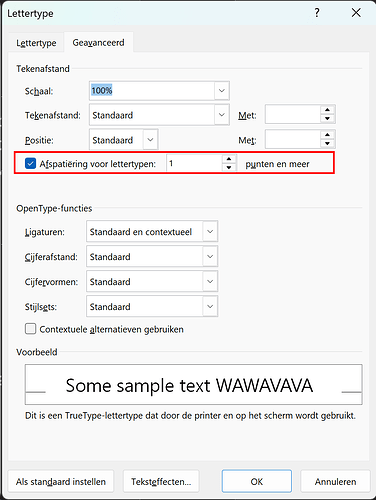
By default, Microsoft Word doesn’t automatically enable kerning. You usually have to turn it on manually. Here’s how:
- In Word, press Ctrl + D (or click the small arrow in the lower-right corner of the Font group on the ribbon) to open the Font dialog.
- Go to the Advanced tab (in some versions, it’s the Character Spacing tab).
- Check the box labeled Kerning for fonts and set the point size to “1” (or a small default like 8 pt).
- Click OK to confirm and save the setting.
Currently my Windows language is set in Dutch, but I am sure you will figure this out.
Thank you for your reply, Erwin!
Interestingly, Microsoft Word sees the font correctly, but Microsoft PowerPoint does not.
The font I’m trying to use is called Arbotek Ultra. It is a font which is available through Adobe Creative Cloud, which I have a subscription for. When I use Adobe’s font activation to enable Adobe’s version of the font for use in other programs, the kerning is recognized by PowerPoint, but I’m stuck with that one character (glyph) which I can’t use. Adobe’s version of the font somehow activates the kerning for PowerPoint. I would like to create a version of the font which can be installed independently of Adobe which has both the character I want and kerning. Reading through other sites suggests this may have something to do with activating legacy kerning tables.
Thank you for sharing the font files. We’ve installed both versions and tested them in Word and PowerPoint. While kerning works perfectly in Word, unfortunately, neither version displays kerning in PowerPoint. This aligns with what we often see: PowerPoint uses an older text layout/shaping engine that doesn’t reliably recognize OpenType GPOS kerning. In fact, it appears PowerPoint does not support OpenType layout features at all—ironic, considering Microsoft has been a driving force in promoting these features in fonts!
See also: PowerPoint: Please vote for OpenType Feature support eg. Kerning
Too bad the link to vote is no longer valid.
Where to go from here?
-
Talk to Microsoft
Since this is primarily a PowerPoint limitation, the best long-term solution is to ask Microsoft to update PowerPoint’s layout engine. However, they are usually cautious about any change that could alter text flow in existing documents. -
Use an Older FontCreator (or Another Tool)
If you really need to add a legacy ‘kern’ table, you’d have to do so with a FontCreator 13, as that still supports exporting that table or use another font tool that does. But be aware the old kern table can include at most 10920 pairs. -
Workaround
Use Word or another program that does support modern kerning for final output.
I know that’s not the most satisfying answer, but at this point, the primary issue is how PowerPoint manages font features. If you have any other questions, feel free to ask!
Thank you Erwin for your time in testing this. I really appreciate it.
I have contacted Microsoft. We had a screen sharing session. The help desk technician was able to see what you describe. It is now an open ticket with Microsoft.
I am not a font creator, just a humble PowerPoint artist. So most of the discussions here go right over my head. How difficult is it to “add a legacy ‘kern’ table”?
I find it interesting that Adobe Creative Cloud can activate this font so that the kerning works in PowerPoint. Perhaps Adobe is working with another version of the font altogether. If I get desperate and can’t fix this myself, I will contact the font creator. Thanks again for looking into this.
It’s good you reached out to them. This issue has come up multiple times over the years, and we need to keep reminding Microsoft that it’s important to fix.
It’s actually quite straightforward, but you’ll need to download FontCreator 13 to do it.
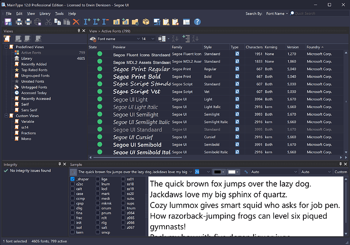
You can use MainType to check whether a font contains the legacy ‘kern’ table, modern OpenType layout kerning in the form of glyph positioning lookups, or both.
Ironically, Microsoft is one of the main font vendors that still includes the legacy ‘kern’ table or both—understandably, as you’ve discovered.
Note: Since the legacy ‘kern’ table does not work with variable fonts, those obviously do not contain that table. PowerPoint does not support variable fonts, but that is another story.
The OpenType specification has a part about recommendations and that states:
If compatibility with legacy environments is not a concern, font vendors are encouraged to record kerning in the GPOS table’s kern feature and not in the kern table.
It doesn’t make much sense in modern contexts, but based on that guidance, we essentially have to consider PowerPoint a “legacy environment.”
Thanks again for your thorough and thoughtful response, including the screen captures. It is very helpful.
I received an email from the Microsoft help desk this morning:
As discussed, I have checked the issue with backend team, they have informed that the behavior you are observing is by design behavior for now and backend team is aware about the spacing difference, they are already working on the fix but there is no ETA available as of now. The fix will be rolled out globally in the upcoming updates.
I am a keen admirer and collector of fonts. This issue has given me a great respect for the complexity involved in creating a good font. Thank you to all of the font creators out there!

