Hello.
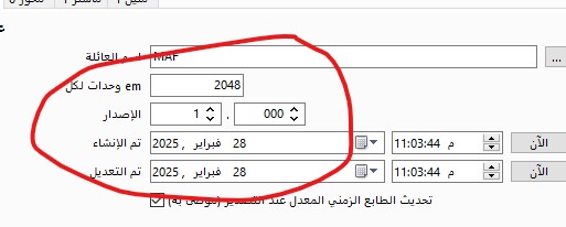
I noticed that some designers choose 2048 and others choose 1000.
Is there a difference in the final font size?
I’ve tried it, but I didn’t see any difference in design programs.
Binary computers like multiples of 2 better than multiples of 10. The performance difference will not be noticed unless the font is huge, but 2048 is better. The final font size will depend on the number of nodes, the number of glyphs, and OpenType lookup tables, e.g. kerning pairs.
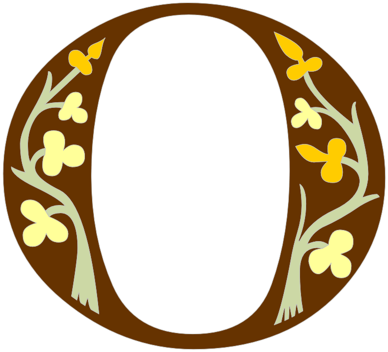
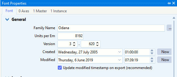
For fonts with fine details in the outlines select 4096 or 8192 funits / em.
The units per em (UPM) value doesn’t affect the visual size of your fonts in design programs directly, as the software will scale the font accordingly. However, as Bhikkhu Pesala nicely illustrates, it does impact the precision available for glyph outlines—especially important if your design includes very fine details.
A value of 2048 is recommended for most fonts today, especially TrueType-based fonts. It provides a good balance of precision for detailed contours and compatibility across various applications.
Fonts with very fine details (such as tiny circular shapes) might benefit from higher settings like 4096 or 8192, offering increased accuracy.
For OpenType fonts using CFF-based outlines (PostScript curves), 1000 units per em is the standard recommendation.
In short:
TrueType outlines: Usually 2048 (or higher if finer details are needed).
OpenType CFF outlines: Usually 1000.
Feel free to choose based on your font’s specifics and precision needs!