So, it seems this should be simple but i’m still having trouble. I have a font that i only need to change the space between characters (working on a program skin that needs a very specific look, but the font i like is just a tad crowded). whenever i try various ways i’ve read about the tops and bottoms of letters with curved edges get little… tabs of sorts:
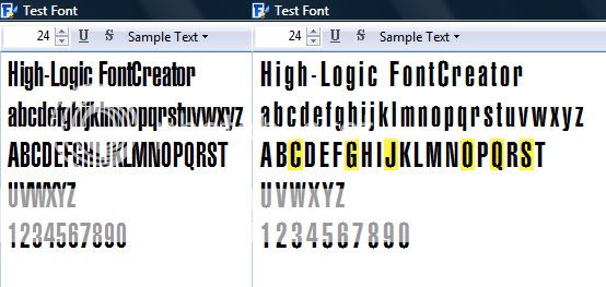
(i highlighted the affected capital letters though there are lower case affected as well)
the advice i followed from this forum were Glyph Transformer>>Metrics>>Width>>Increase by ___ on the right side
i never wanted to change a thing about the letters themselves, just add some white space between them. considering i really know nothing about this sort of thing, what is the simplest way to relieve the crowding without messing with the actual look of the characters?
The problem is caused by loss of hinting. As soon as you edit the contours, the “H” in the top left of the glyph edit window at the intersection of the rulers disappears because the character hinting has been removed. FontCreator doesn’t support hinting so once it is removed, you cannot add it back within FontCreator.
It is possible to increase the character widths by increasing the right side bearing without removing the hinting, but if you increase the left side bearing, the contours are moved and hinting is lost.
The only work-around that I know of relying entirely on FontCreator is to copy the glyphs to empty glyphs and then replace the original glyph with a composite using the copied glyph as the composte glyph member. Then, changing the bearings has no effect on the hinting that is retained in the copied glyphs. Hinting is only retained if copying glyphs within the same font.
The copied glyphs don’t need to be mapped. Just create enough empty glyphs for the entire font. Make the original glyphs empty, and insert the copied glyphs as composite glyph members. The easiest way is to copy the glyph from the Overview window, and paste it into the Glyph Edit Window. Shift it say, 100 funits to the right, and increase both left/right bearings by 100 funits to make each glyph 200 funits wider.
The attached font shows how it is done. I have created composites for the letters A-E only, increasing the width of each by 200 funits, as proof of concept.
It depends to some extent on the application in which you want to use the font.
There is a problem with altering some existing fonts in relation to screen display as the altering can upset hinting information with the effect that the letters of the font lose their look to some extent.
If the application allows you to format each letter to a specific font, in the way that Microsoft WordPad does, perhaps the simplest way would be to do nothing to the font and to make another font that has, say, a letter q encoded as a narrow space (that is, no glyph, and a small Advance Width) and then set the word Test as follows using the font you are using.
Tqeqsqt
Then format each of the letters q using the special font.
I have made such a font especially for this post.
In fact, when testing the font I found that a more effective way to use it with WordPad is to set the letter q in any font, then format it using the special font, then copy it onto the clipboard and then paste a copy after each letter in the original text directly.
So, it works well with WordPad. Whether it will work with other applications depends on the application.
However, here is the font and hopefully it is worth trying so as to observe whether it works with the application that you are using.
NSPACE_Q.TTF
William Overington
9 November 2009
that idea is creative, but wouldn’t work because it’s being used as a media player skin and this font will display things like the title of the file or movie being played. adding extra characters won’t work in this case, the font itself needs to be spaced. i did figure out a long-way around: if i go into the properties of individual letters and increase the “advance width” then it works. i just had to go in and do it to each letter which was a bit of a pain but it met my needs. thanx for the suggestions!