The small uc E was used in a font design called Peignot designed in 1937. This sign doesn’t use standard Peignot but could simply have substituted a small size E in another font.
I have just been virtually strolling in a southwards direction down the Via San Giovanni and I noticed a nameboard for the Ristorante Bel Soggiorno.
Zooming is produces a larger display.
I tried keying Ristorante Bel Soggiorno in WordPad at 36 point using Lucida Calligraphy and the effect is similar though not exactly the same it seems.
If one then turns around about 180 degrees and zooms in, there is a display above a shop in a rather nice script. It says “Armando e Marcella”.
I noticed the loop on each of the A and the M.
Above the names is some more lettering, following a curve. It appears to start with the word Pasticceria but I cannot distinguish what letters follow. The Translation Plus program that I use translates the word Pasticceria from Italian into English as Confectionery.
The sign advertises a business which About.com says:
Definition: La Pasticceria is the Italian pastry shop. You can go early in the morning for a nice pastry (some serve coffee as well–often called a Bar/Pasticceria) or in the afternoon for a sweet.
If you need to buy someone in Italy a gift to repay a small kindness, often a small tray of assorted pastries or biscotti (cookies) from a good Pasticceria may be appropriate.
Pastries are sold by the kilogram if they are small. Ask for un etto, or a tenth of a kilogram, to get about a quarter pound of goodies.
You will sometimes find good Italian ice cream, gelato, in a pasticceria, especially in a smaller town that might not have a gelateria.
In a style similar to this:
Armando e Marcella.jpg
With font similar to this:
pulling.ttf
Two views of an information plaque. In each case zooming-in displays the plaque in more detail.
The first view sets the scene as to location.
The second view is closer.
I have been able to read the word BENVENUTE in a capital and small capitals, on the top: the word translates from Italian into English as WELCOME. There is then some text that I cannot read, the final part of which appears to be in bold. Some way down the page is the word WELCOME in a capital and small capitals, in English. There is then some text that I cannot read, the final part of which appears to be in bold. Beneath is some information that appears to be in a very light colour on a dark background.
I have looked in the User Photos section just in case there is a close up of the information plaque, though at the time of writing this post there is not.
The Piazza della Cisterna is shaped almost like a right-angled triangle.
Zooming in three times displays an enlarged view of the sign of a bank, in an old script.
From our viewpoint, the next building along to the right contains a hotel. The sign is to the right of the covered tables.
Note please the position of the sign in relation to the covered tables and the stone structure in the piazza.
That structure might be a well.
Moving to the right by clicking on the Google streetview arrow in fact produces a view that is much nearer to the buildings than that arrow suggests and the display of the sign of the hotel is clearer, though a little distorted in one place.
The script font used in the webspace looks very similar to the script font used on the sign on the building. Are they the same?
Google has recently extended its coverage of San Gimignano.
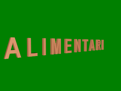
Here is a sign using a sans serif typeface.
Here is a stylish ligature for the word coop used on a wall related to a rather nice building.
Turning to the right there is a display of an arch in the front of the building. Please note the stylish design of the dark grey and light grey paved area in front of the arch.
That arch reminded me of an arch in the Piazza Duomo.
In relation to the coop ligature, how would one encode the substitution rule in an OpenType font so as to get that ligature when required, yet not otherwise?
For example, one could not use c o o p being substituted by the ligature glyph as the word cooperative would be displayed with a ligature.
Using c ZWJ o ZWJ o ZWJ p could be a possible choice, if indeed a rule using seven characters is both possible and desirable.
How about using c o o ZWJ p in the substitution rule?
A sign with a font not unlike Lucida Calligraphy, though the capital V is different and the lowercase i is different as well.
Zooming-in and making the display full screen is helpful.
Turning to the left and following the road leads to a view of a vehicle, which seems to be a minibus, that has been decorated with an image and some text in a sans serif font. The lettering is white on red. I am wondering what is the font and whether the capitals are letter-spaced?
Following the road is fun, yet takes time, so here is a direct link to a view of the vehicle.
Zooming-in and making the display full screen is helpful.
Please note the script lettering on the second window from the left.
Does anyone reading this thread know anything about the process of how a vehicle is decorated with a large picture like that please?
The image seems to be from the same original artwork as the image on the poster in the following view.