Amongst the photos provided at the next position along to the right in Google Streetview are the following.
http://maps.google.com/?ie=UTF8&ll=43.722599,7.111931&spn=0.002357,0.008583&z=17&layer=c&cbll=43.722616,7.111789&panoid=brqjxl5gBL3nRIfRnZEPKg&cbp=12,236.14049599999998,,0,0&photoid=po-20337881
http://maps.google.com/?ie=UTF8&ll=43.722599,7.111931&spn=0.002357,0.008583&z=17&layer=c&cbll=43.722616,7.111789&panoid=brqjxl5gBL3nRIfRnZEPKg&cbp=12,235.69108100000005,,0,0&photoid=po-20337854
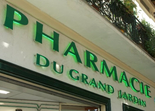
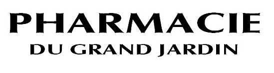
The lettering is for PHARMACIE DU GRAND JARDIN.
The typeface seems to be on the border between serif and sans serif.
For example, the verticals of the P and the H are wider at the ends than in the middle.
I remember reading somewhere that this can be done to try to give an effect of lettering carved into stone.
If this typeface was designed with that intent, then it is interesting that the letters are freestanding in front of what may be stone or simulated stone.
As the typographic fountain is in the Place du Grand Jardin, I tried to locate the pharmacy in Google Streetview. I found it in an oblique view at a distance, after having found the location of the pharmacy from its website.
The website is particularly interesting because in its opening animation there is a reproduction of an artwork. I am wondering whether that is a well-known artwork that happens to feature the pharmacie or whether it an artwork specially produced for the pharmacie.
http://www.pharmaciedugrandjardin.com/
William Overington
25 August 2010