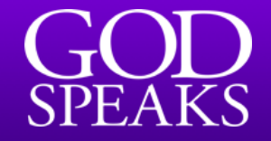
The big problem is the large midsection of the G. All the fonts I’ve tried have not had as large of one.
Ruled out fonts:
Adobe Garamond
EB Garamond
Garamond Classico
Garamond SC
Garamond
Garamond 3 URW
Apple Garamond
pretty much any “condensed” Garamond font
Partially Ruled-Out: Sabon Next (might actually be it)
I may have missed something but I’ve compared all these to the logo.
Elegant Garamond BT is the nearest I can find. I have many different versions, but that’s the only one with a flat top to the D, and the gap in the bowl of the P. The Logo may be a combination of bold for GOD and regular for SPEAKS.
I believe it actually is Adobe Garamond. I have confirmed from other sources that the GOD is stretched. That’s what made me originally rule it out. The K in the font you provided has an angles split line. The K in mine has a straight one.
if the design is the same, the font is equivalent. Too many fonts have been duplicated under various names and various foundries. If you going to use the design commercially make sure an authentic copy is purchased.
Here are three fonts I discovered which look identical: