Help with ligatures, etc.

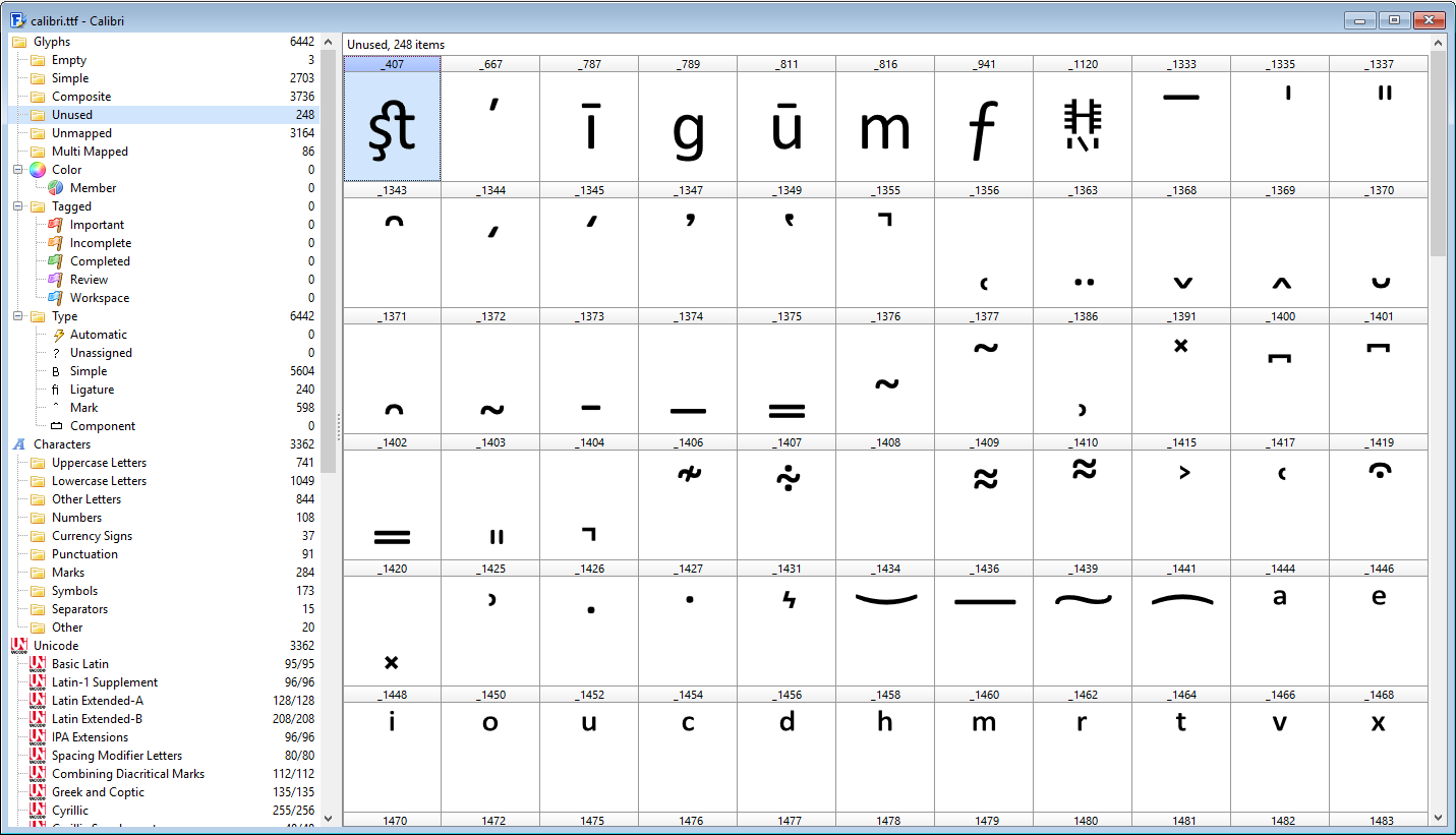
Aha. I was just about to write back saying that – once again – I couldn’t find where on earth you found these “lists of code points,” and fiiiiiiiinally I found them!

For future reference, if anyone ever comes here down the road and asks this same question, then copy/paste the following instructions (which I really wish you’d given me way back at the beginning of this thread)…


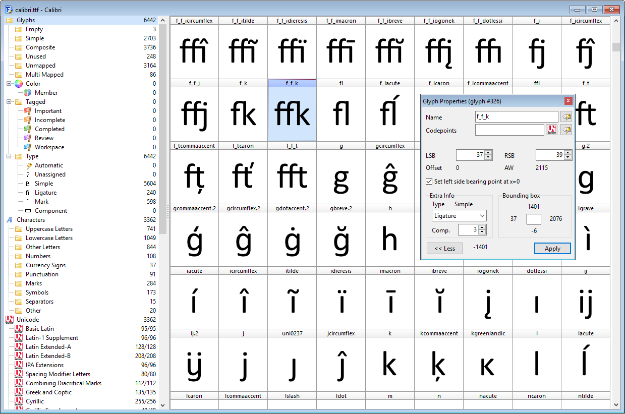
Go under Tools → Glyph Transformer.

Under “Characters and Glyphs,” select “Insert Characters.”

Then, on the right-hand side you’ll see what looks like a little yellow file folder, and if you hover your cursor over it you’ll see a tooltip that says “Open script” [THIS IS THE PART YOU NEGLECTED TO TELL ME BEFORE and I kept looking in that left-hand list for “Ligature Collection,” etc!] :wink: and then from there you choose the script you want to use (whether that be “Ligature Collection,” or “Discretionary Ligatures,” or whatever else).


No offense, but I actually shared this thread with a professional type designer friend of mine, just to get his take on the discussion here. He’s on Mac, and uses Fontlab for his work and isn’t familiar with FontCreator and wasn’t able to help me, but he read the entire series of posts here from beginning to end, and was as flabbergasted as I’ve been with the really quite overly-confusing responses that I’ve been getting to what have been quite simple, straightforward questions. As I said to him, too, it’s been like asking where the Louvre Museum is, and instead of getting the answer “Paris,” I’m given the longitude and latitude coordinates – or, indeed, given the longitude but not the latitude. :open_mouth:

I really do hope you’ll take that in the spirit that it’s meant – if someone asks a question, just answer the damn question, don’t give them “PhD-level” answers that are way over the person’s expertise level, and just keep it simple and straightforward, with step-by-step instructions on how to do it (without skipping over steps). :unamused:

And with that said, and with my due and most genuine respect (sincerely), once again thank you! After all this, all this back-and-forth, I’ve finally found the answer that I was looking for with my very first post here. :wink:

Aha (once again). :wink:

Well, pardon me if I came across as a bit snarky, but I guess that wasn’t clear to me before. When you said to click on the folder icon, I interpreted that to mean expand the “tree” on the left there (where it says “Characters and Glyphs” – my eyes were looking up to the top-left, where one would generally see things like “open file,” or “open folder,” etc., not over on the right. I honestly kept thinking that I was in totally the wrong place (wrong dialog box) as a result of that – or, at least, just couldn’t seem to make sense of it all.

If that was my “bad,” well, I’ll take that. :wink:

Anyway, once again I hope I wasn’t too harsh, and hope my comments were taken in the spirit they were meant – and again, thank you so much for all your help! :smiley:

I think you may not realise that I don’t work for High-Logic, and provided a lot of detailed help in my free time. I did a lot of the development and testing on Complete Composites and Transform scripts, so I know how it’s designed to work.

The truth is that what you’re trying to do is not for the novice user, and there is a lot to learn. If you don’t have a reasonable working knowledge of how OpenType features work, the chances are you will waste a lot of time learning from your mistakes.

The video tutorials have no sound, so the only way is to work through them is by using the pause button and reading the text. Writing tutorials and documentation takes a lot of time, and if people don’t even read it before complaining, it only discourages me from writing better documentation that would be a waste of even more of my precious free time.

I have my own work to do. You can download my free fonts to see how they are constructed, or open any commercial font like Gabriola or Calibri to see how much work the font designers have done.

Actually, I had just assumed that you didn’t work for them – but then you said something here in this thread (I forget what, off-hand) that left me thinking that perhaps you did, but I guess now I know you don’t. :wink:

I do realize that you have been an important part of the community here, though! When I just recently came to sign up for this forum (to ask my questions), I discovered that I already had an account here – I’d totally forgotten about it, but many years ago I was on here… and, surprise, surprise, you’d helped me out all those years ago, too. :slight_smile:

The truth is that what you’re trying to do is not for the novice user, and there is a lot to learn. If you don’t have a reasonable working knowledge of how OpenType features work, the chances are you will waste a lot of time learning from your mistakes.

Actually, I know that there’s a lot more that I can (and no doubt probably should) learn about type design (and FontCreator), but I am actually starting to feel that I’m getting to the point that I can accomplish at least what I want to – if only for the time being. There are a couple of issues that I’ve seen come up in my font that I know I need to resolve, but I think I know how to do that now – I just haven’t gotten around to trying to sort those out yet.

And one other thing that I’ll need to learn is fixing errors that I might discover when I validate my font – but I’m not that far yet, and while I know there will be a learning curve at that point, too, hopefully the help files and/or whatever tutorials out there (including yours) will help me with that.

Of course, I don’t mean to seem over-confident in my knowledge and abilities – I do realize that there’s a LOT to learn for me still – but I’ve been having quite a bit of fun with this blackletter font, and things are going along much more smoothly now, thanks to this thread.

And so, with that said, please let me apologize once more if I was overly-harsh in any way, and thanks very much once again, too, for all your help! :slight_smile:

Okay, I’m back! And confused all over again here.

Re our previous discussion about my putting my own ligatures in slots that are specified for other ligs, I misunderstood that those slots aren’t just designated for certain ligs by FontCreator, but are actually designated for such by Unicode standards. I thought it was just a FC thing, and that’s why I couldn’t understand why people were so adamant that I not put the “wrong” lig in those. I have to admit, however, that I’m actually rather baffled that there’s Unicode standards for things like “AA,” “ao,” etc. – do those combinations really need a ligature???

Anyway, I’ve made a ton of headway on my font, and almost have it up to meeting WGL4 standards (all I have left to do are some symbols – like arrows and other easy stuff like those), but it would be nice to re-do the ligatures and put them in the correct slots.

The problem is where are those correct slots, that aren’t already meant for something else??? I guess I need slots that are truly “empty,” not meant for anything else. This font I’m working on is an old-style blackletter font, and I need ligs for – for example – a whole pile of combinations that go with the long-s character.

I’ve followed the instructions from here, but all I seem to end up with is slots that are meant for other characters/ligatures (the vast majority of which are useless for my purposes). As it is, I’ve gone into the Glyph Transformer and added in EVERY single script that adds in extra slots for new characters, and as far as I can tell they’re all already meant to be used for something else.

So what the heck??? Where am I supposed to put that “unusual” ligatures of mine (which, if you ask me, are a lot less unusual than a lot of the other ligs that do seem to be “standard”)?

Hope this latest question of mine isn’t too stupid on my part. :wink:

The Unicode standard is vast and designates code points for many languages and purposes (the aim is to cover all but they haven’t quite got there yet).

You can get the code charts for each block here Unicode 16.0 Character Code Charts or here Unicode block - Wikipedia

The Unicode committee know that they can’t cover everybodys needs so there is a ‘Private Use Area’ block with codepoints which are deliberately not allocated and will never be allocated for any specific purpose. In the ‘Basic Multilingual Plane’ (the first 65,536 codepoints) there are 6,400 codepoints in the ‘Private Use Area’ block.

If you need to put strange glyphs in your font then I would suggest you put them there.

Things like “AA,” “ao,” etc. are historical and date from the days of scripts written on parchment with dip pens, they are in the block ‘Latin Extended-D’, it might be worth looking at this block to see if any of the glyphs you want are already there.

OMG this is so frustrating – each time I think I’m finally starting to “get it,” I realize that I’m not. :open_mouth:

Okay, I’m not quite sure whether I did this right or not, but for starters I went in Insert → Characters, and then added in $F000-$F100. That’s more than I need for my “extra” ligs, but I guess I can plop in as many glyphs as I need and then delete whatever I don’t use.

And that’s taking into account what you also said here of course…

Things like “AA,” “ao,” etc. are historical and date from the days of scripts written on parchment with dip pens, they are in the block ‘Latin Extended-D’, it might be worth looking at this block to see if any of the glyphs you want are already there.

So first I’ll look for what’s “already there,” and then if there isn’t already a slot for my additional ligs, then I’ll put them in those $F000-$F100 slots.

And then I have to re-do all my lookups, of course – ugh.

I hope I’m getting this right – even if I don’t entirely understand it all as yet. :wink:

Not necessarily. If you rename a glyph used in a lookup, its name will be changed in the lookup automatically. If you change a named glyph’s code-point mapping it has no affect on the lookup.

Well, I’m sure I probably will have to. In an effort to get those ligatures done correctly, this morning I did a “save as” and saved my project as something else, then deleted ALL my ligatures that I’d made before, and then re-added in those additional character slots. And then I was going to copy/paste the glyphs from the previously-saved project into the various slots in the new one.

No big deal, really, won’t take long to re-do them (assuming I have to).

Was I correct with what I said I was going to do, that for any additional ligs that don’t already have a slot specified that I put them in $F000-$F100 somewhere – and then, whenever I’m finished, just delete whatever empty private use slots I have left over?

And speaking of empty slots, is it “good practice” to delete any/all empty slots? Apart from the first few, that is – I gather that .notdef, .null, and nonmarkingreturn (not to mention space!) actually serve a purpose and shouldn’t be touched (let alone deleted)?

You can safely delete all unused glyphs. They won’t be accessible unless specific software is used that provides access to all glyphs. Adobe InDesign has such feature, but in general this is bad practise, so you shouldn’t worry about that.

Including those first three that I mentioned, i.e. .notdef, .null, and nonmarkingreturn? I have no idea what those are meant to be for, but it just somehow looks like they’re there for a reason.

Those are used glyhps, so don’t delete them. Especially the first glyph is very important.

Do take a closer look at the screenshot I provided in my previous post. You will see the “unused” glyph category is selected.

10-4 :slight_smile:

Do take a closer look at the screenshot I provided in my previous post. You will see the “unused” glyph category is selected.

Yeah, I did catch that. I guess the reason I asked in the first place is because I’ve opened up fonts before and sometimes it seems that they keep all the unused/empty glyphs anyway – wasn’t sure if there was some reason to keep “whole sets” (or whatever). Apparently not. :wink:

I’m still unsure about that other question I asked, though – wish someone would answer so that I could get back to work! :wink: As I mentioned earlier, I added in slots for the discretionary characters from $F000-$F100. According to this page (which was referenced earlier)…

…those fall in the “Supplementary Private Use Area-A.”

There’s also a “Private Use Area” (E000-F8FF) and “Supplementary Private Use Area-B” (100000-10FFFD).

What exactly is the difference – or is there a difference? Does it matter where I would put in those “extra” ligatures that I have (i.e. those that aren’t already allotted in other slots)?

If you want people to be able to access the ligatures through OpenType layout features only, then you can just add glyphs without any code points.

Calibri for example contains 6442 glyphs and 3164 of those are unmapped.

And how do I do that? I did see that in the Glyph Transformer there’s a script for “Unmapped Discretionary Ligatures,” but when I use that then it adds in a whole bunch of pre-made (auto-generated) glyphs. I would need extra empty glyphs for these “extra” ligatures – I don’t know where/how to add in those.

My apologies for my stupidity here. I’m in an odd place with this whole type design thing – on the one hand, I do have a fair bit of knowledge about it that’s “advanced” (having been interested in the subject for decades, and having had friends who are professional type designers), but on the other hand, because I’ve never had any formal training in this, sometimes even the most basic stuff is beyond me. :confused:

Duh, I figured it out (I think) – I think I was overcomplicating what I was trying to do (i.e. add a bunch of unmapped glyphs). :wink:

I gather I just go in Insert → Glyphs, then add in whatever number of empty slots I want? And that’s it? And then I can re-name them to whatever I want (like, what the actual ligature is, for example)?

With that said (and assuming that’s correct – it does seem to have done the trick, anyway), are there any disadvantages to not having those actually mapped at all? Would they then be completely inaccessible by any means in certain software (while if I did have them mapped then they would be)?

Sorry – are my questions dumb? My apologies if that’s the case.

I guess I’m still just wondering if there are any pros/cons to using mapped vs unmapped glyphs for those “extra” ligatures (and a few alternates) that I’ve been making – I’ve kinda been on hold for days now with working on my font, not knowing what the answer is to that.

Again, sorry if this is a dumb question. :confused:

If the glyphs are ‘mapped’ i.e. they have a codepoint then they are accessible to any piece of software. This does not preclude their use in open type features as well as being a normal character.

If the glyph is ‘unmapped’ i.e. it does not have a codepoint then it cannot be typed from a keyboard or inserted using ‘Character Map’ or copy and paste from anywhere else because all these methods refer to the character by it’s codepoint. ‘Unmapped’ glyphs can however be used by open type features as a substitute for another glyph and so may appear in text if the conditions for it’s use are met.

‘Unmapped’ glyphs which are not used in open type features are the ones which are listed in the ‘Unused’ glyphs classification in Font Creator.

Any questions ? :wink:

Oh, okay, that makes sense. Why would anyone even “want” to use unmapped glyphs, though? I mean, if there’s thousands of empty mapped slots to plop your glyph in, why not use them, so that everyone can have access to all your characters?

I’m glad I asked this, actually. I was going to take the earlier suggestion and just add my extra ligs in unmapped glyphs, but now I can’t see any reason why that would be a good idea.

Any questions ? > :wink:

Stay tuned… :wink: