Help with ligatures, etc.

Strange as it may seem some people don’t want the more unusual glyphs to be accessible except through the proper methods. For instance the ‘Cyrillic Descender’ in ‘Kelvinch’ which is only ever used as part of a composite.

I have mapped it to the Private Use Area but I doubt anyone would ever use it as a standalone character.

I think that having everything mapped gives people more flexibility when composing documents.

Well, just because it’s “there” doesn’t mean that people “have” to make use of it – I have a box of cookies in front of me, but that doesn’t mean I have to eat them all. :wink:

But as has been said, not all software will automatically make use of opentype features, but what if they were doing, say, graphic design and wanted (needed) to make use of your Cyrillic descender (for example)? There have been many times in the past when I had to “fake” composite characters in creating graphics – which is a different sort of thing than putting out a text document, of course.

I guess I can’t see any advantage to having any characters unmapped, why one wouldn’t make them all accessible to anyone/everyone, even if it’s nothing more than a rarely-used diacritical mark or something.

Mapped glyphs can be inserted from a Character Map if a program has one, or by copy/pasting from Windows Character Map or BabelMap if not.

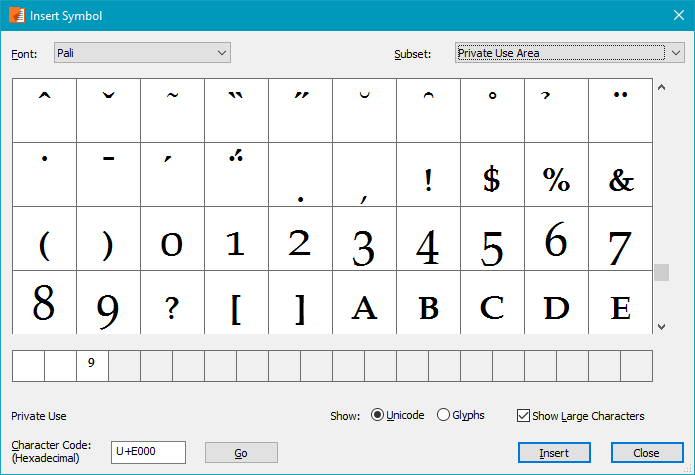
PagePlus has a character map built-in, from which one can select any mapped character in the Basic Multilingual Plane (but not in higher Unicode Planes). The screen shot below shows the low profile diacritics used by Petite Capitals and Small Capitals in my Pali font. It also shows the Old Style Figures and some Petite Capitals. Since this application supports OpenType features you should not insert Petite Capitals from here, but just type lowercase text with the Petite Capitals feature enabled, or type figures 0-9 with the OldStyle figures feature enabled.


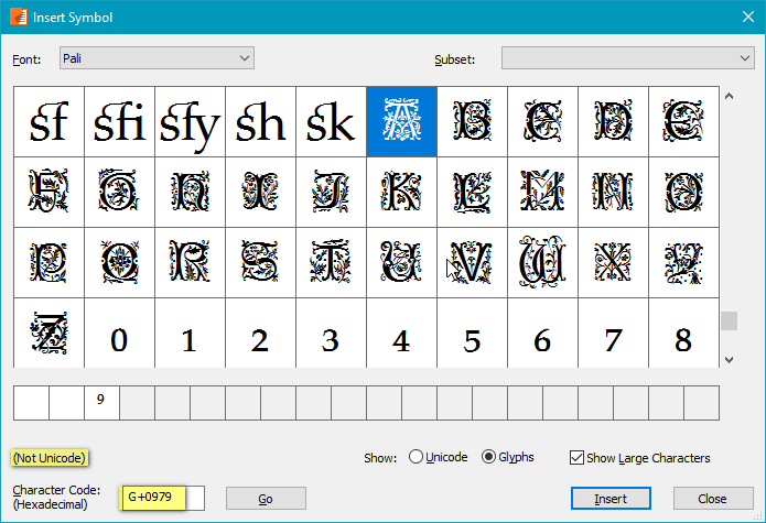
PagePlus can also access any unmapped glyphs in the font by enabling the Glyphs radio button. Again, one should normally use OpenType features to access these glyphs. The discretionary ligature sk is the last mapped glyph. The Stylistic Alternates feature should be used to substitute Capital letters with decorative drop capitals. The subscripts are used as denominators by the fractions feature and by the OpenType Subscript feature.

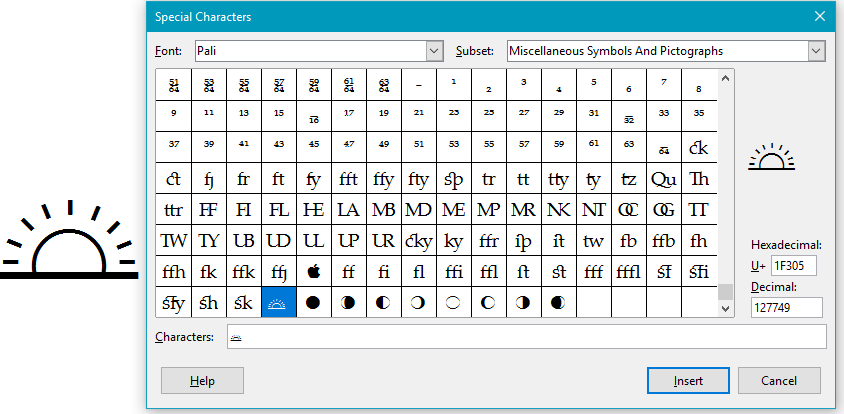
LibreOffice¹ also has a character map available from the Insert Special Character Dialogue. LibreOffice does support glyphs in the higher Unicode planes, so it shows the Miscellaneous Symbols and Pictographs that are mapped in my fonts. However, it does not show unmapped glyphs such as the Small Capitals so there is no way to use Small Capitals in LibreOffice, only Petite Capitals.

¹ LibreOffice 5.3 does now support OpenType Features. See my review page to learn how.

Okay, interesting discussion here (for me, anyway), and thanks for the replies on this. I guess I find myself thinking back to what Erwin wrote earlier…

I suppose I took that as a “suggestion” for how I should go about things with my font, although in re-reading it I suppose it wasn’t that, really. Either way, I can’t really see any actual advantage to using unmapped glyphs – only disadvantages.

Am I missing something here?

I’m still pluggin’ away here! This has definitely turned into a MAJOR project – although I’m sure that’s largely due to this being the first font I ever really put any major effort into. Things seem to be finally coming together, though, and I believe I can see light at the end of the tunnel in completing this, but I’m utterly stumped on something…

When I embed my font (as it currently is) into an ebook (another creative pursuit of mine), all the various ligatures should render/display automatically just fine – with other ebooks I’ve done, which have included fonts that I’ve edited and stuff, this hasn’t been a problem, and so there’s nothing wrong with my CSS coding or anything like that. There’s something wrong with my font itself, because while – as far as I can tell – all my “regular” ligatures (liga) seem to show up just fine, for some strange reason all my discretionary ligs (dlig) don’t.

I haven’t had this problem before, with other fonts that I’ve edited (adding in additional ligatures).

Any ideas what might be causing this problem?

Also, is there any easy way to test out all the ligatures one has made, to see if the lookups are working correctly and stuff?

Use the Preview Toolbar or the Preview in the OpenType Designer.

To test in a browser use Test WOFF (Ctrl F5)

Thanks, I have been using the preview in the OT Designer, but hadn’t tried the WOFF test (just the TT test). Everything seems to work fine in there, all my ligs seem to come out okay – but not in my ebook, only the liga ones do, none of the dlig ones show up.

Perhaps this is a question for over on the ebook forum I’m on rather than here – I just assumed there was something wrong with my font, since I haven’t had this problem with other ebooks (where I added in “new” glyphs to the discretionary ligs).

Okay! I posted queries on three different forums (including this one, along with another type designer forum and an ebook designer forum) and it seems that nobody had an answer! :frowning: So I tried a little experiment, changed all my dlig lookups to liga lookups, and now everything shows up as it should in my ebooks. Woohoo! :smiley:

Any reason that I shouldn’t do it that way? Virtually all those ligatures should be “standard” anyway, not “discretionary” – text done up in my font look awful without them.

On another note (re my ligs), one other thing I noticed is that when I run autokern on my entire font, for some odd reason FC doesn’t kern any of the glyphs in my private use area – that’s weird.

Is there, like, a checkbox that I’m missing somewhere to get autokern to also kern those characters, too?

Autokern already takes too long, and it only process a few accented glyphs.

What you should do is create kerning classes, then Autokern will calculate values much more quickly from the existing pair adjustments lookup. My Petite Capitals are in the PUA, and my Small Capitals glyphs are all unmapped, but Autokern still calculates kerning adjustment values.

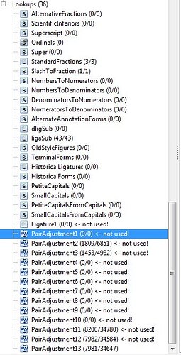
Pardon my stupidity, but I’m not sure what you mean by “create kerning classes” – or, at least, how to go about creating them. Plus, in my font I don’t quite see the same thing you showed me in your screencapture. Here’s a screencapture of my font. It seems I already have 13(!) “PairAdjustments,” while you seemed to have only one – and most of mine are “not used.”

Is that normal? I’m confused. :frowning:

You have apparently run Autokern 13 times when you only needed to run it once.

FontCreator will automatically create kerning classes when you run Autokern. Your font has 7,981 kerning classes and 34,647 kerning pairs.

I prefer to create my own kerning classes as it give me more control, and greater efficiency.

My font has 824 kerning classes and 40,101 kerning pairs.

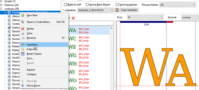
I suggest deleting all of the unused lookups, renaming pairadjustment13 to pairadustment1, and running Autokern from the context menu in the OpenType Designer from now on.

P.S. Where did all those other unused lookups come from? Are you planning to add all those Features such as Small Capitals etc. later?

Oh, yes, I have. As I’ve been working on this font, adding in new glyphs, etc., each time I’d get to a point where I wanted to test things out, I needed (or wanted) to run autokern on the whole shebang first – I mean, how else would one go about things? I didn’t realize, however, that running autokern from the main menu would add in a whole new PairAdjustments thingie each time. I’ll do as you suggested, though, and run autokern by right-clicking in there in the OT designer.

FontCreator will automatically create kerning classes when you run Autokern. Your font has 7,981 kerning classes and 34,647 kerning pairs.

I prefer to create my own kerning classes as it give me more control, and greater efficiency.

I’m confused by what you mean by a kerning “class.” I know what a kerning “pair” is – basically how two glyphs are adjusted in relation to each other. Nowhere do I see the word “class” in the OT designer dialogue box, let alone do I understand what the difference between “class” and “pair” is.

I suggest deleting all of the unused lookups, renaming pairadjustment13 to pairadustment1, and running Autokern from the context menu in the OpenType Designer from now on.

Yeah, I’ll do that (as I mentioned above).

This is very strange. When I look through that PairAdjustment (ex-13, now 1), I see that it’s kerned for me the longs with many different characters, but for some reason it skipped over a whole bunch. Like, I see kerning pairs for…

longs a
longs b (which I have a lig for)
longs c
longs d (which I also have a lig for)

…but then there’s no pairing up of longs and “e” – which is ridiculous, obviously that’s a commonly-used one (at least, in texts where the longs is used, of course). Why would my previous autokernings have kerned those other characters, but not “e”? I haven’t gone through them all, but I’m sure there’s others that are missing (but which should be there).

I’m so terribly confused about all this, it almost leaves me feeling like giving up. I wish I could understand this – it all just seems so astonishingly complicated (and by no means “user friendly,” if anything the complete opposite of that). :frowning: I can’t even seem to figure out how to add in a new kerning pair for longs and “e” – I hit the green plus sign, and immediately I’m at a complete loss in the dialog box I get. I gather that what I want to do is add in a “@Kern_First_longs” (or whichever other character) on the left hand side – i.e. not the character itself, but that “@Kern_First” thing), but then when I go to try to find the “e,” well, yikes! For starters, it looks like there’s 1000 things to manually search through, and then even when I do find those that relate to “e,” I see 14 or 15 @Kern_First things relating to “e,” and one “@Kern_Second” one that relates to “e.” I presume that the latter is what I need…

…but I’m just so damn confused about all this. :frowning:

P.S. > Where did all those other unused lookups come from? Are you planning to add all those Features such as Small Capitals etc. later?

I have no idea – they’ve just been “there,” I thought it was the software (FC) that put them there by default, for any/every font. Or something. I certainly didn’t add them in intentionally – as far as I know (can remember), those have been there since the time I started from scratch, with virtually nothing (no glyphs). I don’t know, but it just seems like they’ve always been there.

Should I just go ahead and delete anything/everything in that entire “Lookups” section that has nothing in it?
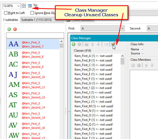
If it has a @ in front of the name it’s a kerning class. Glyphs of the same shape can be grouped in the same kerning class, e.g. A Á À Ä Ã can all be in the @A_Caps class, then when it is paired with T, W, etc., you only need one kerning pair and not six. T, W, V, may also have similar glyphs like Ṭ Ţ, Ẃ Ẁ Ẅ, etc., so instead of 5 x 5 = 25 pairs, we need just two: @A and @T, @A and @W. Open the Class Manager to cleanup unused classes.

FontCreator will create classes from the glyphs in your font. If you add more glyphs later, you need to add them to the appropriate class.

Right.

I certainly didn’t add them in intentionally – as far as I know (can remember), those have been there since the time I started from scratch, with virtually nothing (no glyphs). I don’t know, but it just seems like they’ve always been there.

They are not there by default unless you add them.

Should I just go ahead and delete anything/everything in that entire “Lookups” section that has nothing in it?
Yes, you can do that.

Thank you so much once again, Bhikkhu! I’m too tired – and fed up :wink: – to take another look at this now (after pulling my hair out all day), but I’ll take another stab at this later tonight or tomorrow, and I’ll let you know how things go! If nothing else, I’m sure I’ll be back with more questions (and more confusion). :wink:

Thanks again! :slight_smile:

  1. As noted in this post if your font contains no OpenType feature yet, you can open the Code Editor and let FontCreator add some common features for you. That’s apparently what you did. If you don’t want any of them, click the Clear button to start over. This will also remove all of your kerning pairs with the kerning feature.
    Clear Button.png
  2. After adding all of the glyphs that you want in your font, and checking that the side-bearings are right, then it is time to add the kerning feature.
  3. Run Autokern. This will add a kerning feature, kerning classes, and kerning pairs that use those classes.
  4. Open the Class Manager, and clean up to remove all unused kerning classes

The attached font project¹ from FontCreator 10.1 is a default new font with some basic glyphs added from Verajja Serif Regular. I completed composites, and ran Autokern, there were no unused Kerning Classes. I suspect that your issues are the result of running Autokern thirteen times.

¹ I also attached an OpenType version for anyone who cannot open the latest FontCreator project files.
New Font.otf (30.1 KB)
New Font.fcp (103 KB)

I then used the OpenType Designer to add a Standard Ligature feature to use the two fi and fl ligatures that are in a new font by default (Complete Composites on the last two glyphs).

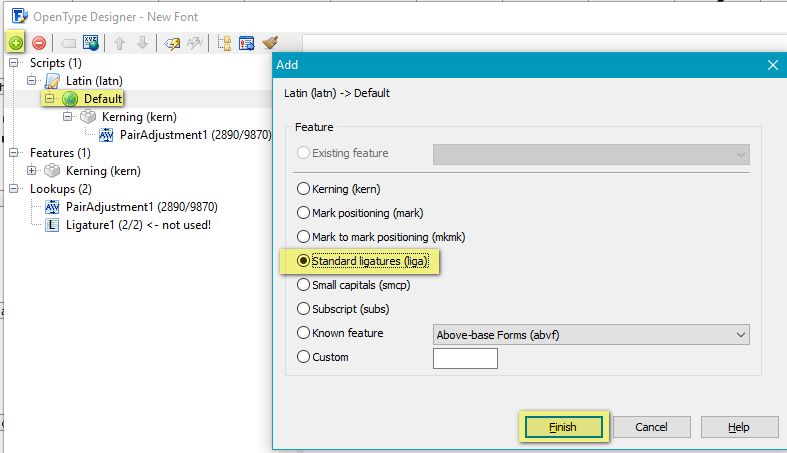
In the OpenType Designer select the default language and add a new feature (Green + button)


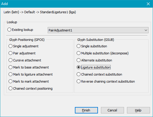
Now select the Standard Ligatures feature and add (Green + Button again) a lookup table. Select the Ligature Substitution.

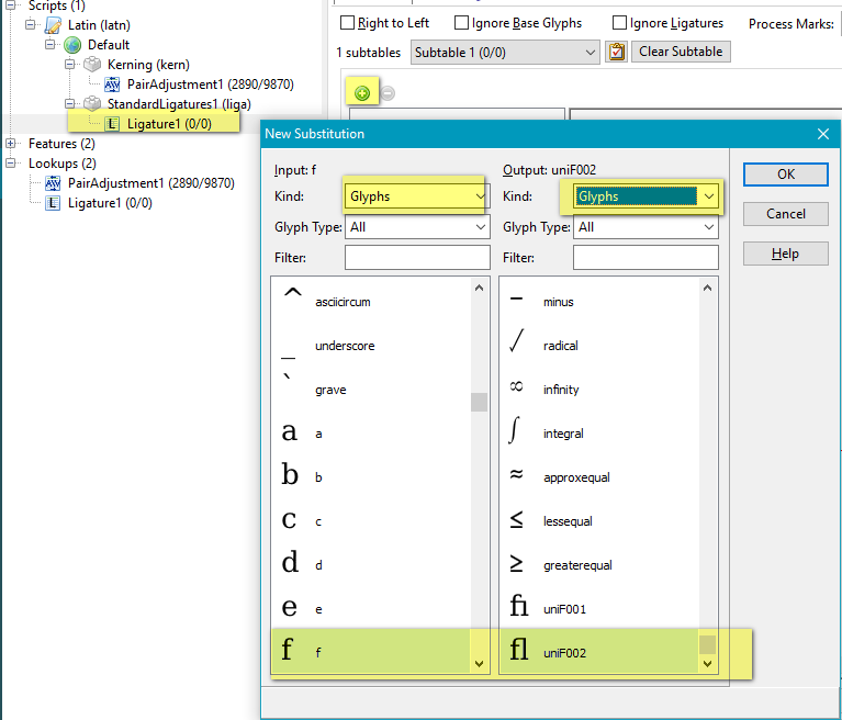
Now select the empty lookup table and add a new substitution (the other Green + Button highlighted in the screen shot)

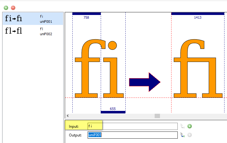
For this fi and fl standard ligatures substitution we must use glyphs, not classes, so select the Glyphs filters on both sides of the new substitution dialogue. Type f in the left list to find the lowercase f, scroll to the bottom to find the fl ligature (did you create it yet with complete composites?)

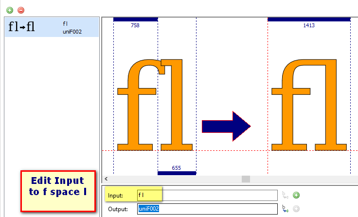
Edit the input string from “f” to “f l”


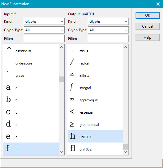
Repeat for the fi ligature substitution. Add the fi substitution:

Edit the input string:

That’s enough to get started on adding and editing features.

I spent a lot of time creating some video tutorials to get users started. They are not perfect, and some need updating, but there’s a lot of the basics there about adding OpenType features etc. The videos have no sound; pause them to read the captions at your leisure while repeating the steps in FontCreator.

I have updated my tutorial on Adding OpenType Features for FontCreator 10.1 with more details:

  1. Adding a default set of features when opening the Code Editor for the first time on a font without any features
  2. Clearing existing features to start over from scratch
  3. Adding a kerning feature, after first adding some Kerning Classes to use with it
  4. Adding a Standard Ligature feature for fi, ffi, fl, ffl, fffl, showing how to navigate in the Add New Substitution dialogue
  5. Adding a Discretionary Ligature feature for ck and cky.
  6. Adding a feature for Alternative Fractions (Stacking Fractions), which also uses a ligature substitution: “1/8” typed by the user will be replaced with stacking fraction one eighth, etc.
  7. Applying changes made to avoid losing them
  8. Exporting OpenType Layout Definition scripts (*.otlfd files) as backups or to reuse in other fonts or other styles of the same font
  9. Importing the OpenType Layout Definition script
  10. Testing features using the Preview Toolbar

Oh, funny, it must have been your previous version of that video that I actually ended up turning to the other day when I got a bit confused – and it answered all my questions! I’ve been on a roll with it ever since, actually, and things are coming along great… thanks largely to your help! Thanks so much once again, Bhikkhu! :slight_smile:

I’ve read through all your recent posts here (along with watching a couple of your videos), and I think I might have some more questions, but I’m a bit busy this weekend – I’ll get back to you with more soon! :slight_smile:

Okay!

Firstly, thanks so much once again for your help (and videos!), Bhikkhu! And that thanks goes to everyone else who has offered assistance here, too, of course. :slight_smile:

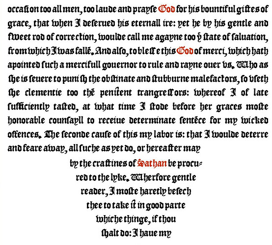
I do have some questions about where I guess I’m a little bit stuck now, but perhaps it might help to explain (and show you) where I’m at now. You’ll see here a screenshot of my font – it’s called “Wickednesse.” :smiling_imp: I made it from scans of a little 1561 book (more like a little pamphlet) called “The Detestable Wickednesse of Magicall Sciences,” and what you see in this screenshot is how it displays in an ebook version of that work which I’ve been making, too – the font, and the ebook, go hand-in-hand together (although anyone could then use the font however they might want, of course). The text itself isn’t actually all that interesting, really – the usual “hellfire and damnation” sort of thing from that period, but this is hardly a significant work in that genre – for decades, though, I was intrigued by the font used in that original 16th century document, and wanted to make a font from it. I actually started working on this font a dozen years ago or so, but then put it aside. In more recent years, though, I started getting into ebook design, and a few months ago it occurred to me to do up this curious little text as an ebook, and have it display in the original font – and that meant finally finishing up that font, of course.

And so this was my re-introduction to type design, after having not really done anything with it (other than minor tweaks to third-party fonts) for over a decade. The only actual “fonts” that I’ve made in the past, all those years ago, were one of my own handwriting (with a reasonably complete character set) and the first – and very basic – version of this Wickednesse font.

Anyway, so here’s where I’m at now with this font. From scans of that 1561 text, I was only able to glean a basic upper- and lowercase character set – not even any numbers or anything beyond that. I had to come up with all the various additional punctuation, accented characters, etc. – basically everything in the various extended character sets, including Cyrillic, Greek and Coptic (all of which I had to “invent” myself), not to mention all the math symbols and other icons and whatever else. I currently have 1163 glyphs in all. :slight_smile:

I don’t know if it matters (or if it’s of interest), but whenever I got to a point in my font where I wanted to test it out in my ebook and see how it looks (and how everything renders out, as far as ligs, kerning, etc. go) I would do the following…

  • First, I run the script to set all my left/right bearings to 62 (I have NO idea if that’s a good number, I just came up with it somehow – long story – but it seems to have worked out okay, as far as the end result goes). The only thing I changed afterwards was my space – the “letterspacing” seemed to come out okay, but the “wordspacing” was too close (if you know what I mean), and so I set the L/R bearings for that (space) to 123.

  • Then I run autometrics.

  • And then I run autokern.

And then I generate my font, embed it in my ebook, open up that ebook in Adobe Digital Editions (ADE – which is great for testing ebooks in) and that’s where this screenshot is from.

Now, looking at the screenshot, if you look closely enough you’ll see TONS of ligatures – I’m rather delighted about that, all my lig lookups seem to be working perfectly now. :slight_smile:

But the kerning is off (or, rather, non-existent) on virtually all of those ligs. :frowning: This is what you were helping me with in these latest posts – I needed to add in pair adjustments for all the glyphs in my private use area.

So here’s my questions…

  1. Is it only the characters in my private use area that I need to concern myself about, i.e. that aren’t automatically added in as pair adjustments when you autokern? Or are there other glyphs that I should be adding in manually, too?

  2. From your explanations here (including your video tutorials), I’ve managed to create classes for all the various characters in my private use area, and can see them all listed in the Class Manager, and then from your tutorial I know how to create a new pair adjustment… but is there no automated way to do this step, to kern that character with every other character (AND to also include this character when kerning other characters as well)? Please don’t tell me that the only way to do this is to do so manually, one-by-one, one character combination at a time. :open_mouth:

  3. Back to the screenshot, as I mentioned the kerning is virtually non-existent for all my various ligatures, but apart from those there also seems to be some other more common character combinations that I would have thought that autokerning would have doen a better job at. In particular, the kerning for the lowercase “i” seems rather off in quite a few places. I would have thought that that would have been handled reasonably well with autokerning???

  4. Lastly, d’ya like my “it” ligature? I stole the idea for that from you, Bhikkhu! :smiley: You can find an example of it fairly easily in this screenshot in the third line from the bottom (“thee to take it in good parte”). I also have one for “ip” as well that’s similar. :wink:

Well, I think that’s about it for the moment, but that’s basically where I’m at right now – and where I’m a bit stuck and/or confused about.

Thanks once again (in advance)! :slight_smile: