Okay, I’m trying very hard to do this kerning thing right this time – I think it was a combined effort of miscommunication on Bhikkhu’s part and misunderstanding on my part in why I went off in the wrong direction with this before. In entering into this (as a newbie) I assumed – perhaps naively, but not unnaturally – that when creating a font, at a certain point (when you’re reasonably happy with your glyphs) you run autokern, first, and then you start tweaking your kerning from there, whether that’s by making additional adjustments to those now-already-existing pairs, or else adding in additional pairs that autokerning didn’t take into account (like one’s PUA glyphs).
It was from this standpoint that I approached this forum with the query for how to kern those PUA glyphs (where I have a LOT of ligs, etc.), and Bhikkhu very kindly and generously provided me with assistance – but the one thing he did NOT say was “Forget about autokerning completely and just do it all yourself, from scratch.”
And aye, there’s the rub, and where I’ve been pulling my hair out for weeks now trying to figure this out and understand this.  I do hope I have that understanding correct now (and Bhikkhu, even though you weren’t clear about that, and do think this was a “combined effort” in it taking so long to sink in, nevertheless I’ll still take the bulk of the blame for this for being soooooo dang slow in grasping it), and that’s what I’ve been endeavouring to do.
So I started by deleting ALL my pair adjustments completely – and then looked at various samples of my font, and said to myself “Hey, without any kerning at all, it actually doesn’t look too bad! So I guess I’ve done a pretty reasonable job on getting my bearings right, at the very least.” However, I couldn’t help but notice that some of my ligs (in the PUA) did need additional kerning, and so that’s what I’ve been working on.
And this raises TWO issues for me (and perhaps might be an issue for FontCreator’s engineers, too, if there’s a problem with the software itself).
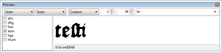
To explain, after working on my font (off and on) for the past few days, here’s a revised version of one of the images I loaded up earlier (elsehwere)…
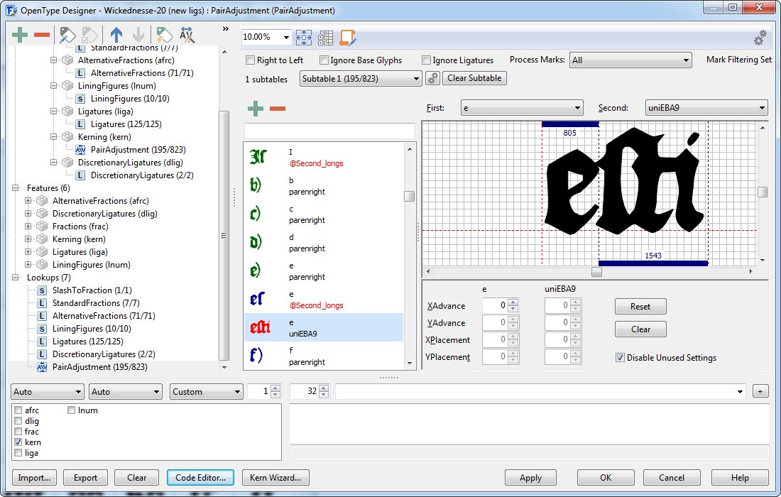
For the most part, I’m quite happy to see that the kerning looks pretty reasonable (even with rather limited pair adjustments – indeed, almost none at all on the main glyphs, but mostly just on some of the ligatures in my PUA). The bulk of the kerning issues that I had cleared up had to do with fixing the spacing between those PUA ligatures and whatever characters came
after them, but if you look at the above image, just a few lines down on the left-hand side you’ll see the word “testefieth” (or “teſtifieth,” rather, with the longs), and there’s too much space between the “e” and the “ſti” lig.
So I take a look at that pairing in my preview and I see this…
…which reflects what I see in my Photoshopped image above, of course – i.e. there’s too much space in-between the “e” and the “ſti” lig.
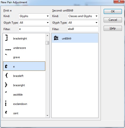
So I go in my OT Designer, and create a new kerning pair for those…
…then I press ok and then THIS is what I see…
Without making any adjustments at all, not only is there not “too much” space, but if anything there’s too little and the glyphs are bumped right up against each other.
Huh??? What’s going on there? Shouldn’t what I see at first (before moving anything around) reflect what I saw before, i.e. too much space between those two glyphs? Am I not grasping something here, or is there an issue with the software itself?
And then comes my second conundrum…
Having added in that one additional kerning pair, my code won’t validate because I added in that “a” on it’s own, and I already have it included in a class for kerning it “second” with regard to other pair adjustments (I would have had the same problem, of course, if I had tried to create an additional “first” class including that “a”).
Clearly I don’t understand classes. Like, for each of the vowels (especially) I created basically two sets of “second” classes – for example, one for “a” (no accents) and accents that, say, hung from the right-bottom corner or wherever, which wouldn’t affect kerning next to glyphs to the left, and then another kerning pair for all the “a”-characters that did have accents up top.
But now I have to kern the “a” (and all its variants) as the first glyph in the pair adjustment – but clearly those classes that I made before wouldn’t apply to this, you need different criteria for picking/choosing which glyphs are included in each class.
I’m not sure if I’ve explained that well, but do you see the dilemma I’m having here? It’s totally different to kern glyphs based on their right-side shape and their left-side shape, and yet you can only create classes for each glyph once.
So what’s a poor dummy like me to do?