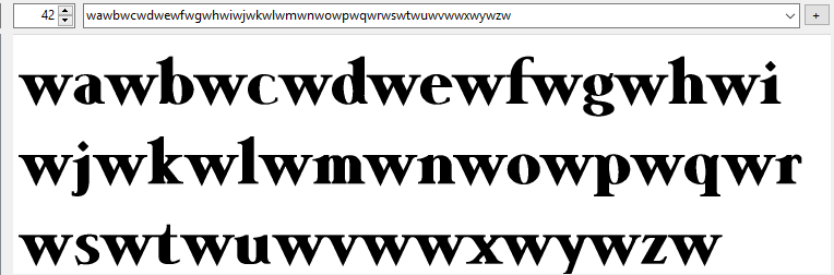
Oh, that definitely helps – thanks for that! I have something similar that I got years ago from typophile.com, but your seems to have a lot more kerning pairs to check out.
So I guess the answer to my question, with regard to getting autokerning to include the glyphs in the PUA, it’s just not possible to get FontCreator to include those? I realize that there’s still manual kerning that has to be done after that anyway, but at least that would give on a start – it’s beyond me why FC doesn’t allow that, even if it were a checkbox option to include, or not include, the PUA glyphs.
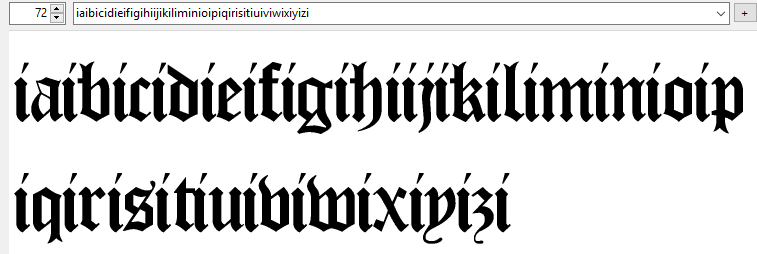
My black letter font has far fewer pairs than most other fonts.
Well, that’s interesting! If anything I might have thought that it needed more? Like, with my font – which I see still needs a LOT of work, the more that I look at it  – it’s all the various longs (and other) ligatures which would seem to be creating a fair bit of extra work for me. Even using that text file with the various kerning pairs to check out, I still have to adapt that in order to kern a whole slew of additional ligs and other things – stuff like double-longs, etc.
The test file also highlight if a glyph needs different side-bearings. Always fix those before kerning.
That’s one thing I have no idea about, really – as you agreed, blackletter fonts like this should be set quite tightly, but exactly how much or how little I just don’t know.
And then there’s autometrics, to boot, where it asks you to specify the “glyph spacing factor.”
Can you explain what exactly the difference is between how much space you give between the glyph and it’s side bearings, and how much “glyph spacing factor” you give it when you run autometrics? I don’t quite get that, it seems like one is doing the same thing twice.
black letter fonts were often tightly spaced to save on expensive vellum.
Well, that’s not entirely correct, actually. In the days of scribes, when they were copying texts by hand, I can see where that might have been the case, but by the time printing with movable type came around in the 15th century, the papermaking business was booming in Europe, and vellum wasn’t really used much any more except for particularly special or expensive books. If Gutenberg and his successors had emulated that tight spacing, I would rather suggest that it was more of a continuation of style, not due to the expense of vellum.
At any rate, it certainly does look like I have my work cut out for me still with this font – I started it a decade ago, and it might be another decade before I finish, at this rate.