Evening of creativity,
I’m developing an Arabic font that supports both basic phonetic diacritics (such as fatha, damma, shadda…) and special signs used in the Uthmani Quranic script, like the Small Alef (ٰ), Maddah (ٓ), and some Waqf (pause) signs.
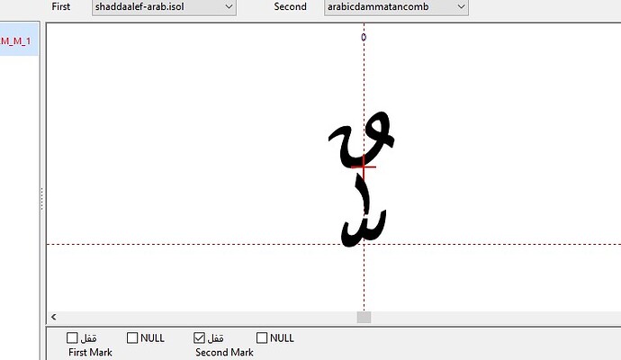
The issue I’m facing is that these marks tend to overlap or conflict visually when more than one is applied to the same base letter.
For example, in the word “هَٰذَآ”:
The letter “ه” carries a fatha (basic diacritic).
The letter “ذ” has a fatha plus a Small Alef (a Quranic mark stacked above it).
The letter “ا” carries a Maddah mark.
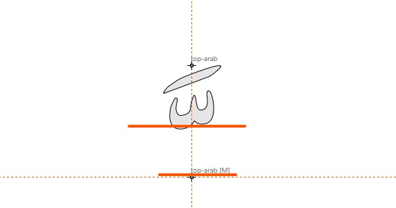
When I implement these in the font using mark-to-base and mark-to-mark positioning, the stacking becomes inconsistent:
Sometimes the fatha disappears beneath the Small Alef.
Sometimes the Maddah appears too low or overlaps other marks.
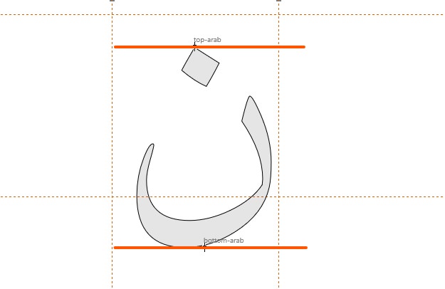
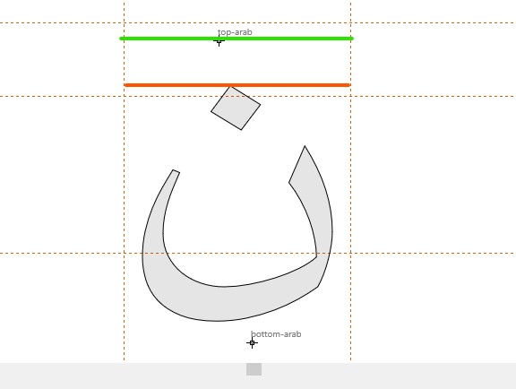
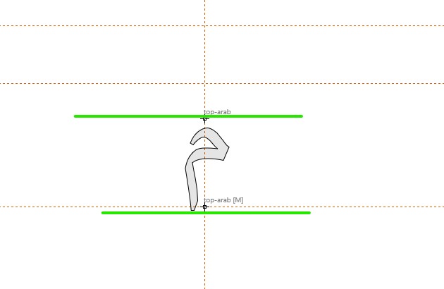
I’m already using anchors like top, top2, etc., and applying GPOS features, but I’m not sure how to properly structure the anchors and lookup order to ensure clean positioning without visual clutter.
My questions are:
-
What is the best way to separate regular diacritics from Quranic marks in the font’s logic?
-
How should I set up anchors (e.g., top, top2) on base glyphs to accommodate multiple layers of marks?
-
How can I structure the mark-to-base and mark-to-mark rules so that each mark stacks correctly without collision?
I would highly appreciate any guidance, best practices, or practical examples—especially since my aim is to support accurate Quranic rendering in the font.
Many thanks in advance!
