I noticed that an instance of my font is in one of your responses. Could you delete it if you please as i have plans for it.
Thanks and many blessings,
Jonne
I noticed that an instance of my font is in one of your responses. Could you delete it if you please as i have plans for it.
Thanks and many blessings,
Jonne
I deleted one instance from Erwin’s Post
Erwin and company,
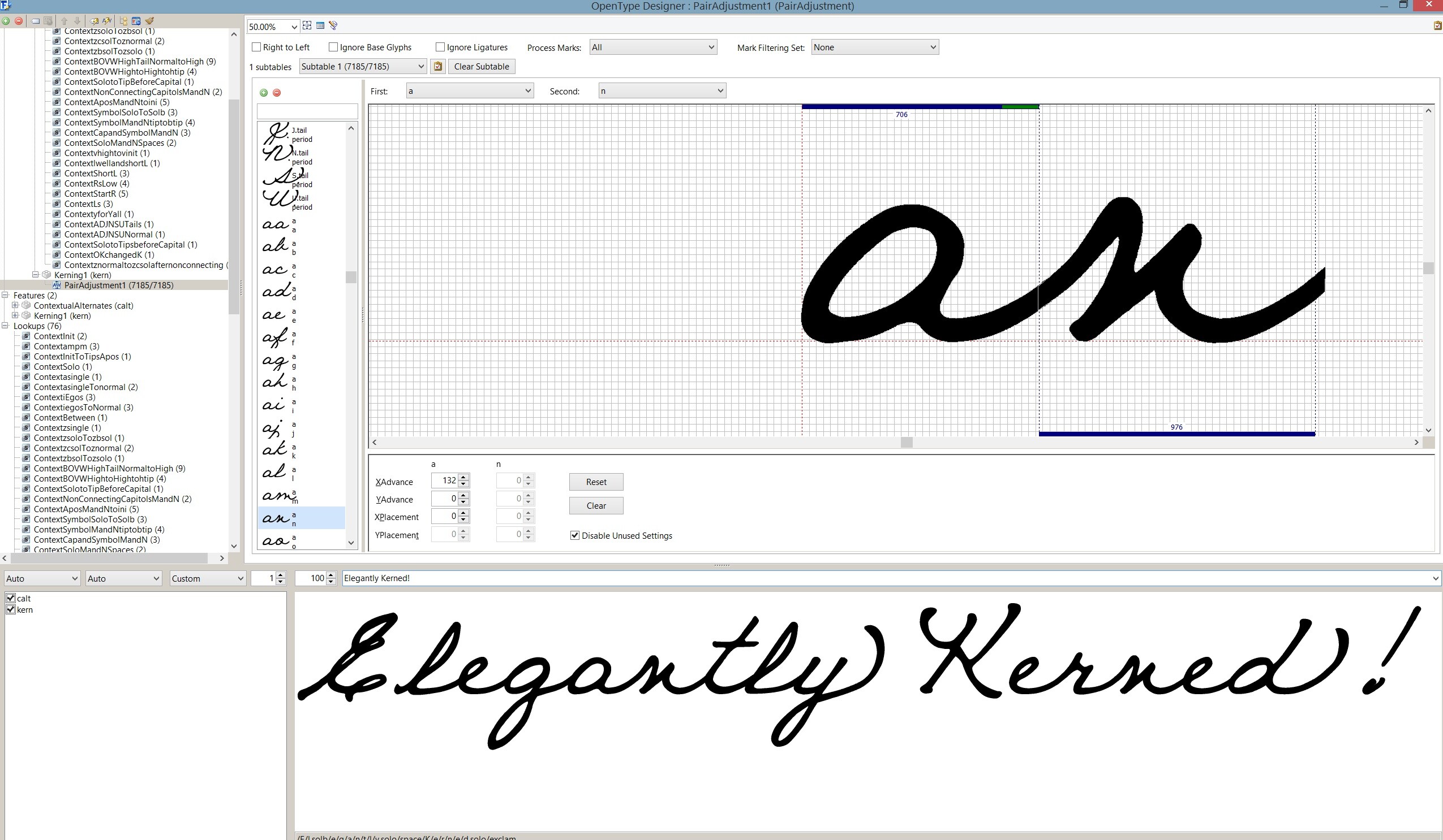
I have a font with two versions. They’re exactly the same except the glyphs on one of them is bolder (using the glyph transformer). It is very time consuming to manually kern this cursive font (can’t autokern) and up until this point I have been simply copying and pasting the kerning pair values from the code editor from one font to the other…however this fails because the bolder font does not line up and kern properly. So that way is out. Is there another way I can transfer the kerning changes from one font to the other in a timely manner? I don’t have it in me to kern 7000 manual kerning pairs for TWO fonts. I would like to have the identical fonts (identical except in boldness) kerned properly without having to manage them separately. Is this a possibility or am I chasing rainbows on this one?
Thankyou guys!
Jonne,
PS Erwin, what did you think of my winamp marketing idea I emailed you?
Exporting the OpenType Layout Feature Definition script *.otlfd from the regular font and importing it into the bold version will transfer the other OpenType features too, besides kerning, but it will only copy the kerning pairs the same as you’re doing now.
If the two styles need different kerning values, then you’re chasing rainbows. Nevertheless, either method will still save a lot of work.
Using Kerning Classes will reduce the work load a little, but not much for your font I suspect.

Bhikkhu,
Thanks for the quick response and the information, yes I was aware of exporting and yes that’s what I was in essence doing…and even though I’m chasing rainbows, it’s good to know it for sure and puts my mind at ease. Ease in the fact that I’m not missing something.
So thank you for the peace of mind.
Blessings Bhikku,
Jonne,
PS - How do you pronounce your name. It is so deliciously unusual!
Bhikku!
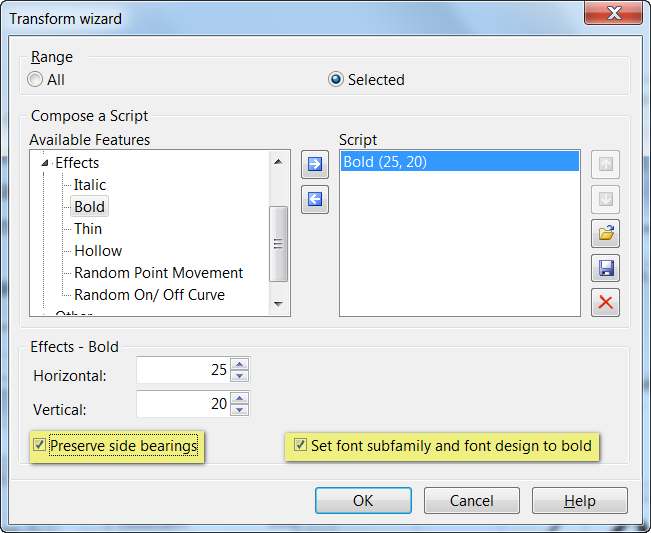
I captured the rainbow! And there is gold aplenty. My goal of increasing the weight of the font without doing much work has realized itself. Instead of making a separate font, I saved my original font under a different name then used the glyph transformer AFTER everything was neatly kerned. So copying font values does not work, but as per the example, using the already kerned font information translates perfectly with the glyph transformer!
So happy now!
Be well as I am.
Jonne
Bhikkhu (alms mendicant) is a Pali term for a Buddhist monk. Pesala is the name given at my ordination and means “well-behaved.” Pali Pronunciation
I am glad that you found a more efficient route to kerning your bold font style. It takes years of experience to learn the right order of doing things so that you don’t waste time repeating steps.
The Bold Transformation will also change the font’s settings to bold for you in recent versions of FontCreator.
Erwin and friends,
I’ve nearly finished my contextual cursive font and I wanted to thank you all for your support. I don’t know how to thank you for your individual attention and interest in my project. So to thank you all enjoy the pic. If you’re interested in my code I’d be happy to share it with you.
Blessings,
Jonne
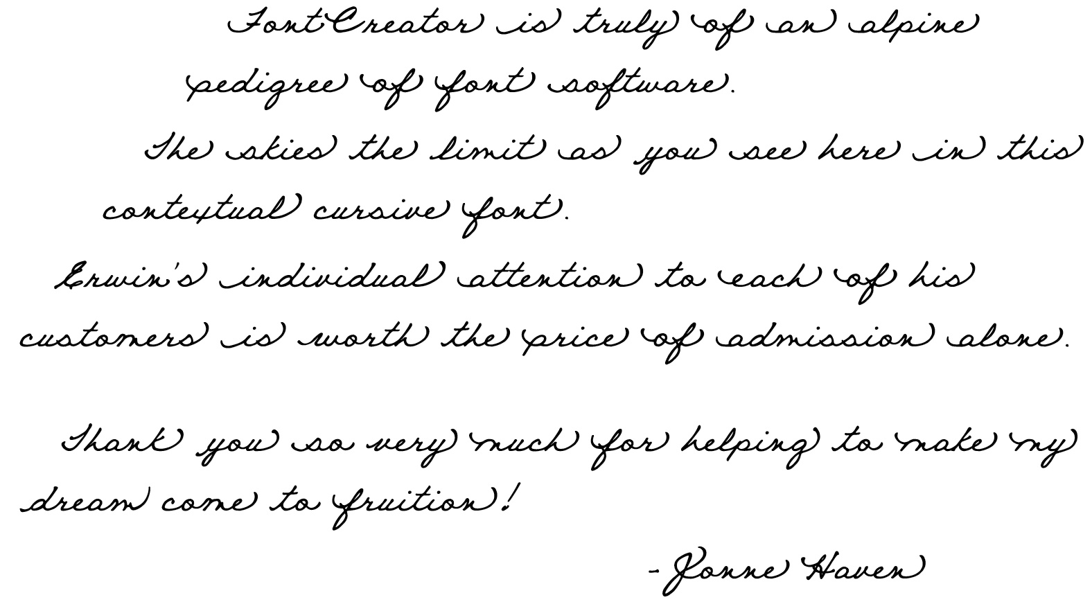
Thank you for showing your font. Awesome result of you efforts!