In the fonts I’m ‘enhancing’ the circumflex vowels tend, as far as I can see, to be simple glyphs.
My ignorance about the uses of composite glyphs.
My suspicions about which applications can actually handle composite glyphs.
I’ll experiment with applications I know to draw text with (UTF-16 versions of) some very old-fashioned Windows APIs, and if my fears are allayed on (3), then I’ll take the bold step of rectifying (2) trying to use them
The other thing on which I’m painfully aware of the depth of my ignorance is OTF ligatures and their uses. Questions 2 and 3 should be in large bold type for those!
I would be surprised if any applications do not support composites. There are many that do not support ligatures.
Typing f then f then i, for example, in an application that does support OpenType ligatures will replace ffi with the alphabetic presentation form ffi
Here is a brief example of Standard Ligatures as defined in my fonts (with some explanation in )
feature Ligatures liga { <Feature name and OpenType layout tag “liga”.>
lookup ligaSub;
} lookup ligaSub { <Feature definition is {within braces}, lookup table name, { begins lookup>
sub f f i → ffi; <If user types f, f, i, then substitute ligature ffi.>
sub f f l → ffl; <“f” and “l” are the postscript names for lowercase “f” and “l”.>
sub f f → ff; <“ff” is the postscript name for the ligature “ff”.>
sub f i → fi; <If user types f, i, then substitute ligature fi.>
sub f l → fl; <If user types f, l, then substitute ligature fl.>
} <End of lookup table. Lookup table is within {braces}.>
Thanks! I was vaguely aware of the way ligatures worked, but vaguer on the syntax for introducing them. Your reply has tempted me to do a bit of reading
I am more or less happy about the principles of having (eg) fi always replaced by a single glyph representing the ligature. I’m less clear about substitutions, and how you might choose differently between having a substitution or not. I suppose in some cases there is a context which will determine it, like ‘s’ followed by an alphabetic character could be made tall, but left short when followed by space or punctuation. But if you have two styles of a certain letter, one as a substitution of the other, it isn’t clear to me how you’d choose one or the other when writing the text.
An example I have in mind is that there are two very different styles of bass clef in music. I would be elegant to have them as variants at the same code point. But as I am printing it as a “string of one character”, it isn’t at all obvious how I could choose which to print.
But what I have learned is that these features work by referencing glyph names, rather than their code points. The importance of a sensible naming scheme for characters in the private use area is now suddenly clear to me. And I now know (in principle) why some fonts have glyphs which have no code point!
Standard Ligatures like f f i > ffi are always used when the user types ffi if the Standard Ligatures feature is enabled.
What you want is Contextual Ligatures, which only makes a glyph substitution in a particular context. The user doesn’t have to make a conscious choice which variant to type, they just enable the Contextual ligature feature, and the substitution is made according to context, “e.g. in Caflisch Script, o is replaced by o.alt2 when followed by an ascending letterform.” Your bass clef could use such a feature.
My fonts use the ordinals feature, which also makes context-sensitive substitutions. If it is enabled, when the user types letters after a digit, they are superscripted.
feature Ordinals ordn {
lookup Ordinals;
} group @Ordinals [zero one two three four five six seven eight nine A.sups B.sups C.sups D.sups E.sups F.sups G.sups H.sups I.sups J.sups K.sups L.sups M.sups N.sups O.sups P.sups Q.sups R.sups S.sups T.sups U.sups V.sups W.sups X.sups Y.sups Z.sups a.sups b.sups c.sups d.sups e.sups f.sups g.sups h.sups i.sups j.sups k.sups l.sups m.sups n.sups o.sups p.sups q.sups r.sups s.sups t.sups u.sups v.sups w.sups x.sups y.sups z.sups];
group @Alphas [A B C D E F G H I J K L M N O P Q R S T U V W X Y Z a b c d e f g h i j k l m n o p q r s t u v w x y z];
lookup Ordinals{
context (@Ordinals) @Alphas; <If alpha glyph follows a glyph in ordinals, then …>
sub 0 Super; <In the above context, use this lookup table.>
} lookup Super {
sub A → A.sups;
…
sub Z → Z.sups;
sub a → a.sups;
…
sub z → z.sups;
}
This contextual lookup Ordinals feature first checks to see if a digit has been typed. If it has, then it checks to see if an alpha character is typed next. If not it does nothing, so 123 remains as usual. However if the user types 1s, the Ordinals feature superscripts the s. If the user continues to type “t” or any other alpha characters, they are all superscripted. However, as soon as the user types a space, or some punctuation, any following characters are normal again.
After some thought, I think what I’m asking here is: is there some special invisible character - let me represent it by * - such that you can enter *x and define a substitution of the form “Replace *x by the first alternative version of x” ?
Otherwise I can’t see that it is possible to use substitutions in a string of one character (as I’d need to do in the case of my clef). [At least not elegantly. As a clef only ever appears by itself, I suppose a string of two of them could be replaced a single clef in an alternative style.]
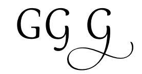
You could use Stylistic sets, but that requires manual intervention by the user. This is used by Gabriola to select from variant forms of the letter G, for example.
In my Guru and Garava fonts, I have implemented a Contextual Alternates feature which uses the Velthuis system to substitute Pāḷi letters when the user types the appropriate pair of letters:
aa > ā, ii > ī, uu > ū, .d > ḍ .t > ṭ etc.
Will your font allow users to type the Bass Clef, or will they have to select it from a character map?
I am aware that this thread has evolved from support on compound glyphs (as it turned out) to support on other complex OTF features. I hope that this is OK as I am learning a lot from it, and appreciate it greatly.
The user uses a menu, to enter a bass clef. The clef is stored in the file as an abstract quantity, but when the program comes to draw it, it knows it must use character U+E015 in the font and constructs a “text string” with this (followed by U+0000 which indicates the end of a string in C/C++). Then it uses standard windows UTF-16 text-drawing APIs to “write the string”, ie “draw the clef”.
Now in music there are two very different styles of bass clef, but my program and font only know about one of them at the moment. If I am to give an option, there will be a global flag in the program, indicating that it should draw one or the other. It would be easy to put the other one at another code point and just tell it to use that if the flag is set. But as they are two variants of the same symbol, it feels more elegant to use a substitution. So maybe, for the second kind, I could define a string “* U+E015 U+0000” and have the font make the substitution “* U+E015” goes to the variant clef glyph.
Anyway, following your encouragement, I am starting to try and make ligatures work in one of my fonts starting with i j → ij and I think it’s working in the test window!
But I may be managing to run before I’ve learned to walk! I’ve added “Δ7” as a kerning pair (to bring them slightly closer together so the top of the 7 overlaps the foot of the delta) but I’m not seeing this at all in the test window (though it does appear in the preview toolbar). Is that normal?
I’ve checked that the Windows APIs I’m using to draw text do appear to support ligatures, so I’m hoping they’ll support kerning too.
I have split the thread — it will make it more useful to others searching for information on Glyph Substitutions.
So why not use a menu to select from two or more Stylistic sets. Only one glyph needs to mapped, the others can use glyph substitutions. In PagePlus, hovering the mouse over the OpenType toolbar flyout previews the glyph that will be substituted — in this case for an asterisk.
Yes — that’s normal. The Font Test window doesn’t support kerning, but the Preview Toolbar does.
It’s the mechanism for drawing the substituted glyph I’m not sure of. You indicated that you replace strings something like uu with a substitute u-like glyph: is this the way it is done in general? Ie choosing a sequence of characters which will not appear naturally, and then using the OTF feature to replace that string when it occurs with a substitute glyph? [I can see the repeated symbol might be useful, as deleting either one in an editor window will leave you with the original symbol.]
I was already mulling over a related question: ligatures like oe. Sometimes you might want to replace oe by the ligature (eg Oedipus) but in other cases it would be wrong - eg coefficient. So you can’t leave a general rule (even a contextual one as far as I can see) to replace oe by a ligature. Unless, I guess, you list all words where the ligature is to be used! I assume this is why the ligature has its own code point, and you can enter it explicitly where it is wanted, and leave it out of the substitution table in the font? [Come to think of it, I think ae exists as a separate letter on Danish keyboards!]
So you’d only need unlikely strings like uu to signal an optional substitution, when the substitute glyph does not have its own code point?
Sorry if I’m being slow - it’s all very new to me!
Meanwhile it appears that the basic Windows UTF-16 APIs I’m using in my program TextOutW() ExtTextOutW() DrawTextW() do handle substitutions but do not handle kerning! Like FontCreator’s test window (which probably uses one or more of them). This feels weird, as surely kerning is a rather older font technology than Open Type ligatures and substitutions?
I suppose one could effectively do kerning by defining an AV glyph (not necessarily with a code point) and using it as an A V → AV ligature. Is that an intended procedure with Open Type technology, or am I dreaming up ways to abuse the system?
My use of uu > ū etc., is a non-standard method that happens to be convenient because some Pāḷi scholars are accustomed to typing Paa.li using the Velthuis system. It’s similar to Discretionary ligatures that substitute ct or st for single ligature forms.
OpenType Kerning doesn’t use substitution — it defines pair adjustments for Glyph Positioning. Type AV and it moves the V closer — type VV and it does not.