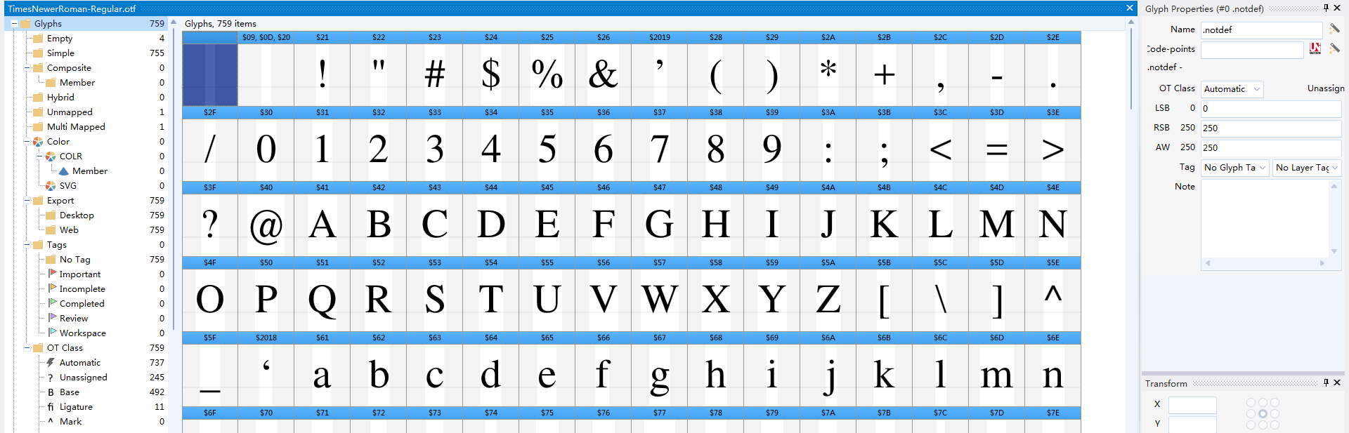
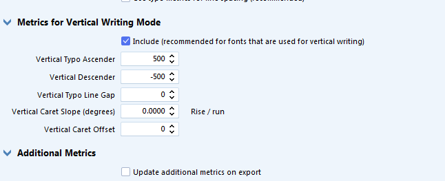
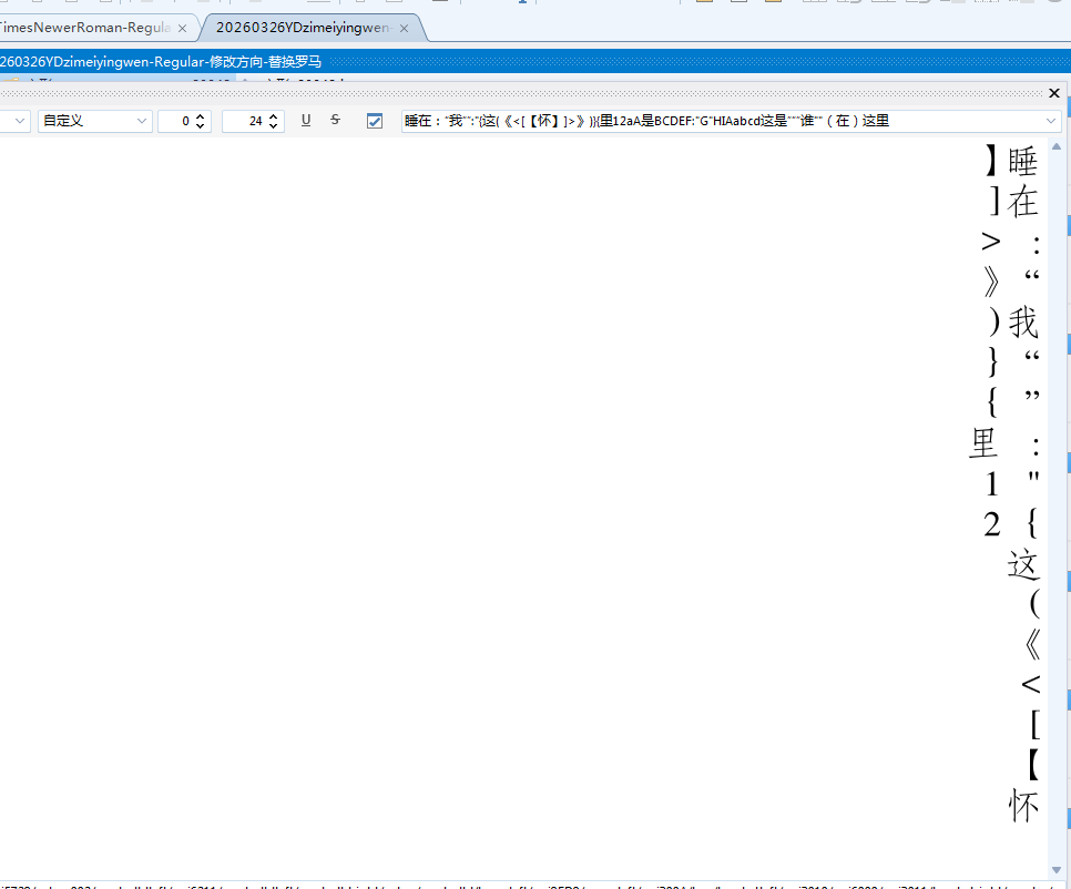
I have been testing a vertical writing feature for Times New Roman. Since the original font does not support vertical orientation, I added the vertical writing feature and specified a uniform height of 1136. However, during the vertical writing preview, the English characters do not display at all.
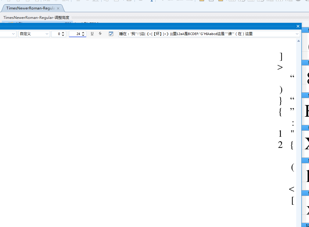
Initially, I thought it might be a font-specific issue, so I tested it with another font, but the problem persisted. Interestingly, the vertical display works perfectly fine in Photoshop. I suspect this might be a software bug; I am currently using the latest version (15.0.3048).
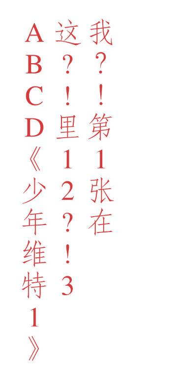
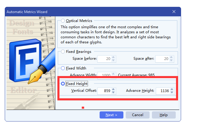
Additionally, I have a technical question regarding the Automatic Metrics Wizard (Fixed Height) for adjusting vertical spacing. Specifically, how are the values for Vertical Offset and Advance Height determined? The official manual is quite vague on this.
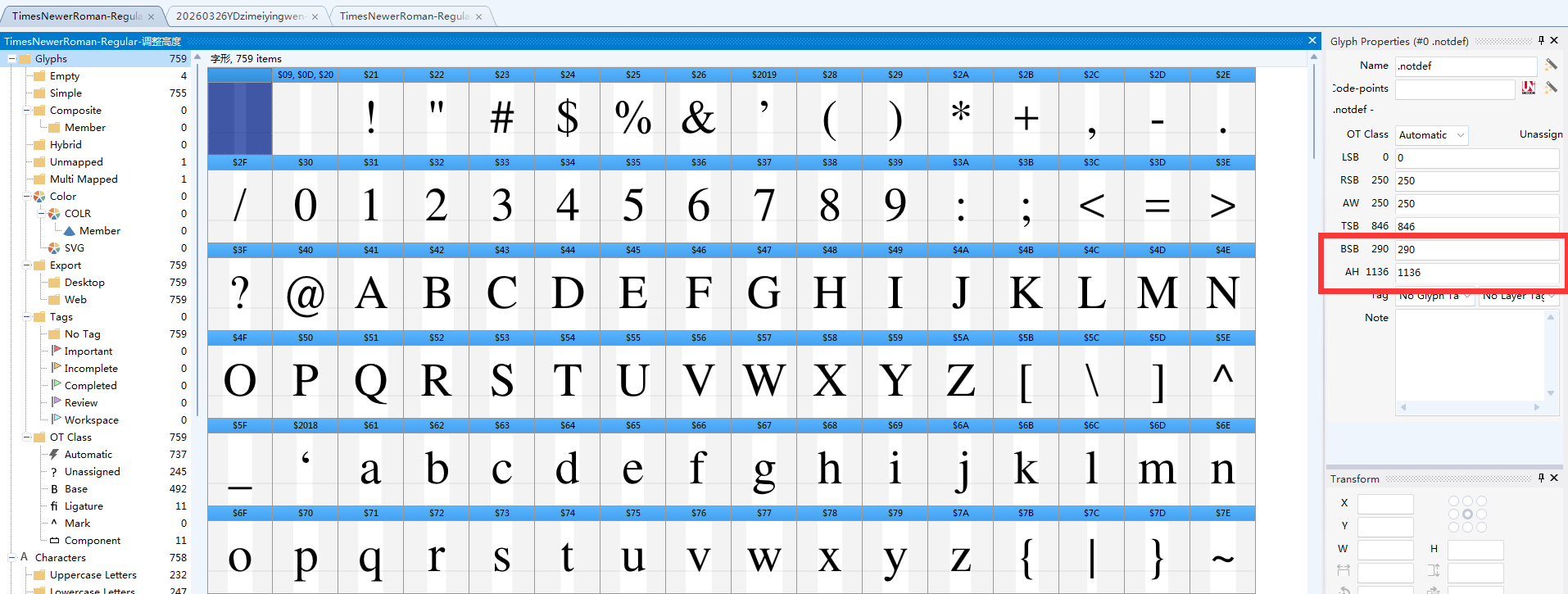
As a user from Asia, vertical writing functionality is essential for us. Through testing, I’ve found that the Advance Height represents the character space height I need to set. However, I am unsure how to calculate the other value. I am currently setting a vertical height for Times New Roman to integrate it into a Chinese font that utilizes vertical characters. Since the Chinese font height is 1136, I set the Times New Roman unit height to 1136 as well. Given this, how should the Vertical Offset be calculated?