I would prefer the font file if possible, but if that is not possible, then so be it.
William
I would prefer the font file if possible, but if that is not possible, then so be it.
William
If you have downloaded the 7z archive, then you already have the font file. If you download and install 7-Zip, you get a host of useful options on the context menu in Windows (File) Explorer, including several ‘Extract’ options for any archive file type that 7-Zip understands.
The name Kelvinch is a joke, it seemed like a good idea at the time.
My main character on the MMORPG Guild Wars 2 is called ‘Kelvinch Twock’. Apart from that it has no real meaning.
Do you still want the raw font file uploaded or did you install 7-zip? I will post the font file if you still want it.
I didn’t include a legacy kern table because it triples the size of the file. But you are correct, older applications do work better if it is included, as time passes it’s significance will diminish.
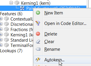
I don’t like the way that Autokern adds a whole load of adjustment pairs that nobody needs, especially positive kerning pairs.
If you take the trouble to manually create your own groups, you will get better results. My Pali Regular font has over 20K kerning pairs, but the legacy table doesn’t make too much difference:
So, for the sake of just 8 Kbtyes added to the download it is well worth while.
Although it does take considerable time and effort to create your own kerning classes and adjustment pairs, once you have completed one typeface, it’s a simple import/export process to add all of the OpenType kerning and features to other typefaces and fonts. Then, autokern the existing adjustment pairs to suit the new font.
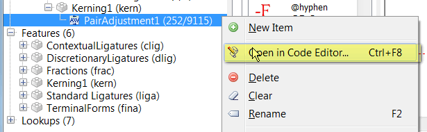
I imported the attached OpenType Layout Definition script into your font, ignoring the unknown glyphs, then deleted the unused features and lookups. I then ran Autokern on the Kerning adjustment pairs to let FontCreator recalculate adjustment values. Just run it again in the OpenType Designer if the kerning is too tight or too loose for your tastes.
Take a careful look at the Class Manager and the Kerning tables.
The way that I do it is not necessarily the right way to do it — it’s just what I discovered for myself over several versions of FontCreator.
Pali Regular.otlfd (80.6 KB)
Kelvinch.7z (203 KB)
Dear Bhikkhu,
Thank you for your reply. You’re right of course. Auto Kern does generate a lot of pairs that will probably never occur in real text. And I thought it was such a good idea, it enables a noob like me to cheat and let the machine do all the hard work.
I am not an expert in typography. I’m an electronics engineer, I could work out a bezier curve by hand given a good calculator, a pen and sufficient paper but I had never even heard of kerning until I downloaded Font Forge in January.
I have a lot of experience with CAD systems and I thought font editors are just another variant on a CAD system, should be easy to master, err … yeah, right.
I now realise I have much to learn. Not about the process of desiging characters but about the background knowledge which is likely to make the process easier to understand.
I spent some time this evening messing about with open type designer and I think I am starting to understand what is going on, I should have done this earlier instead of avoiding it and using the automatic tools.
But I think there are some things I can do which might make things easier.
For instance it should be a trivial task to write a Python script to generate a text file with all the expected permutations of pairs of characters in columns. This text file could then be imported into a word processor and formatted in the font of interest and the columns could be scanned by eye for pairs which look as though they need to be kerned.
Has two large paragraphs of common kerning pairs. I use it in a couple different layout applications to test. I just change the font to my test font for checking.
Mike
Here is a demo of how to remove excess control points with before and after screen shots of the tail of the capital Q.
After you have finished tidying up to your satisfaction, run the Font Validator to remove redundant points.
Since there are 129 languages that use the Latin Script, trivial is not a word I would use, but it is easy enough to cut and paste kerning pairs into the code editor.
Select the kerning adjustment pairs lookup and right-click to open it in the code editor. Some prefer to work in the code editor, but the visual designer makes things a lot easier for the average user.
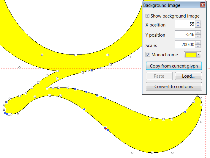
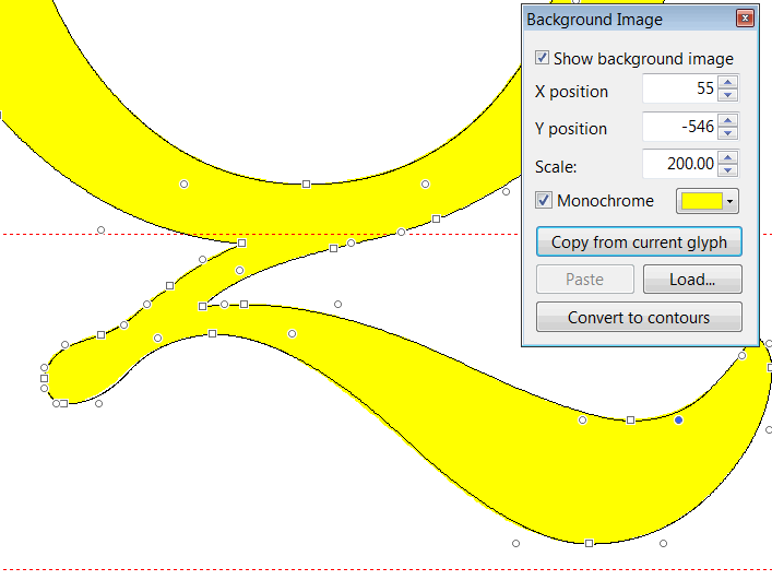
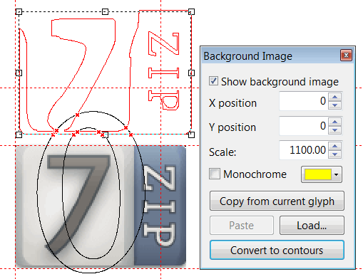
The Background Image toolbar is new to me. From a quick test, the ‘Convert to contours’ button doesn’t seem to do anything apart from briefly flashing up a small window. Is it meant to have a more permanently visible effect? Apologies for the slightly off-topic question!
Try deleting the contours first or show the Validation toolbar before you use that feature.
No, I still don’t see any effect. On revisiting that toolbar, I also noticed that the background image is yellow (or whatever) when the ‘Monochrome’ checkbox is checked, but black when it’s cleared, which seems the wrong way around to me.
I didn’t know that it was possible to display a background image behind a glyph you are editing. It is possible in Font Forge but I haven’t noticed it in Font Creator.
If it is possible then this is a very useful facility.
The name Kelvinch is a joke, it seemed like a good idea at the time.
My main character on the MMORPG Guild Wars 2 is called ‘Kelvinch Twock’. Apart from that it has no real meaning.
Thank you for explaining.
It is entirely a matter for you as to what you name your font.
However, I am thinking of using such a beautiful font for a publication that needs two of the Esperanto characters, publishing to a pdf. The pdf will list the names of the fonts, so a joke name would be in the pdf. The pdf would become archived in the British Library. It seems unfortunate that if I try to produce a high-quality piece of writing, typeset in this high-quality typeface, that in the list of font names would be a joke name.
By the way, mentioning the British Library, the British Library will accept for legal deposit an original font provided that it is published, and that it is produced or published In the United Kingdom. As you are publishing your font you might like to consider depositing your font. I have deposited a number of my fonts.
http://www.bl.uk/aboutus/legaldeposit/index.html
Some years ago I produced a Venetian font, which I use as my personal font, using Scanahand on some specially hand-drawn artwork, drawn with a fibre tip pen onto a print out of a Scanahand template, then scanned into the computer, making a few minor alterations with FontCreator so as to have some ligature glyphs in the font. That was with a very early version of Scanahand. So the font is somewhere between a handwriting font and a type font. I named the font Gallery. Alas it has no Esperanto accented characters. I mention the fact of it being an early version of Scanahand because now one can, if one so chooses, include the Esperanto characters in the artwork for a font produced using a modern version of Scanahand.
A good name for a font is very important.
One option would be something associated with Venice, like Gondola.
Or something stylish not related to Venice.
Do you still want the raw font file uploaded or did you install 7-zip? I will post the font file if you still want it.
Yes please, I would still like the font file please.
Please note that it might not only be me who would like the font file directly, not everybody who reads this forum posts in it.
William
Dear William,
Here is a snapshot of the project as it exists at the moment, uncompressed as you wanted it. But understand this is a moving target, it is still a work in progress. I probably posted it too soon but I was interested to see what people thought of it. It is still under development so not all the glyphs are present in each file, some glyphs are wrong and/or incomplete and the kerning might be out of date.
However what is present is probably usable.
Sorry for the massive data files Erwin. I wish I had a website so I could host the files myself.
As to the name, you must understand the humble beginnings of this font. For years I have searched for a font which had all the characteristics which I like. I have tried many fonts, all of which had a subset of the characteristics I wanted but no one font had them all.
Around Christmas 2014 I discovered Font Forge and thought why can’t I cobble together a font which has everything I want. It was only ever intended to have basic latin characters, numbers and punctuation, so the name didn’t really matter. I got hold of a copy of Gentium which had a license which allowed me to do whatever I liked to it and deleted most of the characters (a bad move) and started to hack it.
Then the mission creep started.
My wife wanted some of the accented characters which would allow her to type in her language and I decided to put some of the mathematical characters in there just so it would be convenient to me.
By this time I was using Font Creator and I discovered ‘Complete Composites’ and went wild adding all sorts of wierd and wonderful characters, because it was easy to do.
I never expected it to be good enough that anyone else would be interested in using it.
But don’t worry about the name being a joke, I won’t tell anyone if you don’t, it’ll be our little secret ![]()
I probably won’t post any more updates until it’s finished, it would be unfair to Erwin.
Regards
Paul J. Miller
No worries, we don’t even spent half the bandwidth of what we are allowed to. I really enjoy reading the work-in-progress, and all help you get from experienced users of FontCreator. IMHO several are professional font designers and I’m proud they use our software and spent time on this forum to help other people with their font design!
And while we’re at it, I really like your font, so keep up the good work ![]()
Thanks. Its working now; I’m not quite sure what I was doing wrong before.
By using a background image with plenty of variation in the lightness levels, I’ve also satisfied myself that the ‘Monochrome’ setting is working correctly.
Once again, apologies to Paul for the off-topic post!
No problem, I discovered that you can put a background image behind a glyph just like Font Forge, yes it is in the documentation, yes i missed it in the documenttation … Doh!