Here are some images that I have produced using the font.
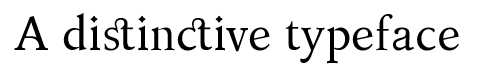
Using two of the ligatures:
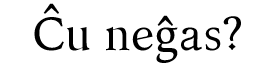
Using two of the Esperanto accented characters in a sentence in Esperanto:
The Esperanto translates into English as follows:
Last week I said it would be this week when I finished Kelvinch. It is still this week (only just).
It still isn’t finished but this one is usable. I have made many cosmetic changes, the bridges of the n m h and u have been thickened up as they disappeared at low point sizes. The metadata for the ascenders and descenders and a few other things has been equalised between the fonts.
As this is a body text font it had to work at low point sizes.
I have added some of the dingbats provided by Bhikkhu Persala in the sample font supplied with Font Creator (I resisted the temptation to add them all), thanks Bhikkhu. I even included a hot beverage for William.
This is not the end but at least its a beta test version rather than an alpha test version.
Microsoft Word (or at least the Word 2007 which I am using) does not kern by default you have to apply it as a format but even then it will only kern when a Legacy Kerning Table is present in the font. Therefore I have done these with a legacy kern table, sorry about the massive files.
I would welcome constructive criticism.
There will be another version soon and that one will probably be the final version, I then have to think about options for distributing the font. Anyone know any good websites for this? Kelvinch-BoldItalic.fcp (197 KB) Kelvinch-Italic.fcp (182 KB) Kelvinch-Bold.fcp (180 KB) Kelvinch.fcp (167 KB)
If anyone is wondering where the files went for the earlier versions of Kelvinch.
I took the liberty of deleting the files from the earlier posts I made. This saves Erwin some space on his server. The previous files were embarrasingly full of mistakes and inconsistencies.
The latest files are the ones you should be using.
In fact Paul has provided a different glyph for hot beverage in each of the four fonts. This is excellent.
The glyph in the Roman version has a stylish way of producing the visual effect of showing that the cup has a curved surface: the contour used to produce the effect is amazing.
I would welcome constructive criticism.
Well there is something I noticed. It is very specialised.
You have used the same glyph for ezh and yogh: the yogh has the postscript name uni021C for capital and uni021d for small.
This is an interesting matter in the history of Unicode because ezh and yogh used to be together under ezh using the ezh glyph yet were later separated with yogh having a different glyph.
If you choose to make the glyphs for ezh and yogh different each from the other then It is the glyphs for capital and small yogh that need changing.
I just thought I would let people know how things are progressing.
It was on 17th January 2015 that I downloaded Font Forge and Gentuim in order to start work on my very own font. It has gone a lot further and gotten a lot bigger that I ever expected.
It was in May 2015 that I purchased Font Creator and suddenly things got a lot easier.
Some might say that it has gotten out of hand, they may be right. It was fun at first but now it is starting to drag, I just want it to be finished. But on the bright side I think I am nearer to the end than the beginning.
Kelvinch now has Cyrillic, Georgian, Celtic Runes and Armenian.
I am currently in the process of cleaning things up and making sure everything is consistent. This process has now reached the end of Georgian { $10FF }, everything up to that point should be OK and finished, beyond that point there are no guarantees.
The files I have uploaded are just a snapshot of a work in progress. Many of the left and right side bearings are not set to anything sensible and the kerning is not done. But the characters which have been marked as complete should be OK.
All the characters which will be in the final font are in Kelvinch_Roman but are not guaranteed to be in Italic, Bold or Bold-Italic yet, but the characters below $10FF are in all four files. Many of the characters above this are either missing or are just unmodified copies of the character in the Roman file (unless they have been marked as complete).
Kelvinch is now very near completion. It probably still has mistakes and probably still needs attention, but then I think that will always be the case.
This is now nominally finished, it still needs kerning but that is underway right now. If anyone finds any mistakes or inconsistencies could they please let me know and I will do my best to correct them.
It has been a long time in the making, I don’t know if the wheel stayed upright at the end of it’s travel or not but I have tried my best.
Now I have to find some way to distribute it. Maybe ‘FontSpace’ or ‘Deviant Art’, does anyone have any suggestions?
Thankyou to everyone on the forum for your help and suggestions, especially to Bhikkhu for his video tutorials and forum tutorials.
Alas, some people might be looking for a stylish Venetian font with long-s glyphs and so on.
Kelvinch is a good font, yet there are many good fonts.
If the font with added MUFI were available it might possibly become more used than Kelvinch, simply because of the availability of a font with lots of MUFI glyphs in it.
I suggest not basing whether to produce the new font upon whether Kelvinch becomes popular.
As the font is Venetian, I suggest a Venetian name.
How about
Gondola
as the name for the font?
If the font were named Gondola then you could, if you wished, produce a glyph of a line-drawn glyph of a Gondola, not too detailed, it needs to look good at 18 point and 24 point and include that glyph in the Private Use Area.
Then a document could have something like the following in it, in the colophon.
Typeset in the Gondola typeface
and then have the line-drawn glyph of the Gondola below it.
Actually, I have now checked the meaning of the word colophon.
I was using it in the sense listed in 1.1 historical, which, in fact, until now was the only meaning that I knew for the word.
I always thought that
Press Mark
is the symbol on the title page and colophon is the text about the printing of the book, included after the printing of the book.
So I suppose that I am suggesting a Font Mark specific for the font.
I wonder if that has been done before.
There has been a Fontmakers’ Mark, the same in every font made by a particular fontmaker, yet I wonder if a particular font has had its own Font Mark.
I had made a good start on the MUFI characters but when I checked the MUFI website they had come out with MUFI 4.0 which contained hundreds more characters. So I might be forever playing catchup as new MUFI standards are introduced.
I reasoned that without the commitment to do MUFI the font would be almost finished already.
I could do with a break. This past year has been intense, virtually all my spare time has been spent doing this font. I never intended it to get this big. It is overwhelming.
Maybe a bit of background would help you understand. I am one of those annoyingly neurotic people, I am on the autistic spectrum (high functioning I hope) and I am mostly oblivious to social nicities but also I cannot abide incomplete sets. Originally I had intended Kelvinch to be just a normal font with maybe 300 or so characters but then I started filling in the gaps and before I knew it the font had grown way beyond it’s original remit.
And by the same logic if it does not contain Hebrew some people might not want to use it and if it does not contain Thai some people might not want to use it. This is the trap I have already fallen into with Cyrillic, Georgian and Armenian. I only intended to add Cyrillic because there are an awfull lot of people who use the Cyrillic alphabet, the others were added because I couldn’t abide the incompleteness of just adding Cyrillic.
The point about it becoming popular is that there is little point to me adding MUFI characters if I am the only one who is going to use the font because I have never had occasion to use a MUFI character.
I kept the MUFI characters which were in regular Unicode blocks but not the characters which were in the Private Use Area.
Niether this font or the next one is going to be called Gondola, sorry but it ain’t going to happen.
The name Kelvinch was selected because just about every other name I thought of was already taken. Indeed Gondola is already taken (Gondola SD Font | dafont.com) so there is no point in suggesting it.
The name Kelvinch is not carved in stone, if I could find a viable alternative then I might be persuaded to use it.
At the moment I am part way through doing the kerning, I have added some rudimentary open type features but not as many as I would like.
But once the kerning is done I will try to find some way to release it to the general public and then go into maintenance mode where I fix mistakes and inconsistencies.
If it becomes popular then it is worth doing more work on but at the moment I could do with a break.
Perhaps I forgot to clean up some of the tables. I did a lot of deleting of kern pairs which I considered to be useless (i.e. this pair of characters will never occur in any text). Maybe I forgot to delete empty tables after I was finished.