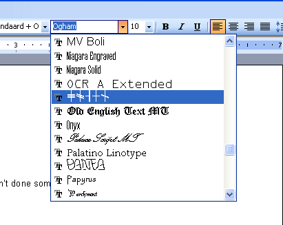
I have created a new font. However when this font is display in the MS word drop down list it looks bad (everyother character is bold and spaces between chars).
Is there a way to fix this within Fontcreator?[/list]
I have created a new font. However when this font is display in the MS word drop down list it looks bad (everyother character is bold and spaces between chars).
Is there a way to fix this within Fontcreator?[/list]
The quality has a lot to do with hinting, as hints are what make a font look good at low resolutions. FontCreator does not fully support hinting, but there are other tools that can help.
If you want to hint your font then you could use Microsoft Visual TrueType to add hinting to your fonts. VTT is a professional-level tool for graphically instructing TrueType and OpenType fonts. But do keep in mind screen fonts are incredibly complex to make well.
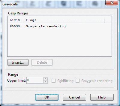
Another solution is grayscale support. To enable it select “Format → Grayscale” from the main menu . Delete all entries. Now add a new entry and set “Grayscale rendering”.
Let us know your results.
changing the Grayscale rendering did not fix the problem.
The new font in the Font drop down list of MS word is still shown with every other character Bold and each character is spaced too far apart.
You can send me the font to look at if you want.
I’ve done some more testing, and it seems the font drop down menu in Microsoft Word 2007 (running Windows Vista) does show all previews in black and white, so the grayscale setting won’t help here.


I thought Word 2003 on Windows XP did show the fonts in grayscale, but I’m not sure.
What version of Windows and Word are you running?
I forgot all about it, but Word 2003 on Windows XP has the same problem.