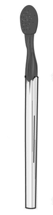
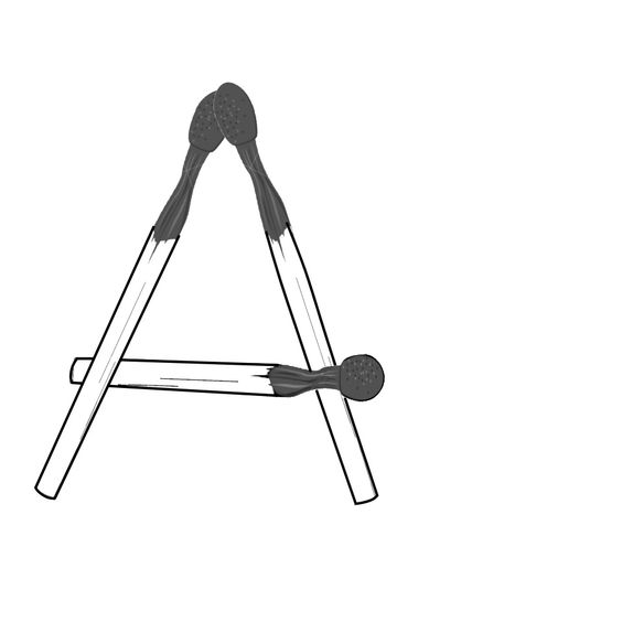
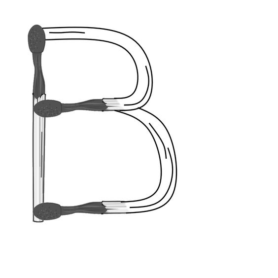
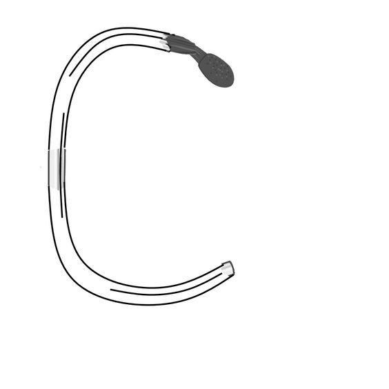
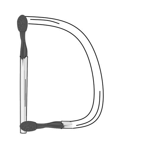
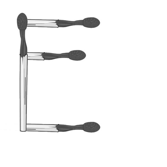
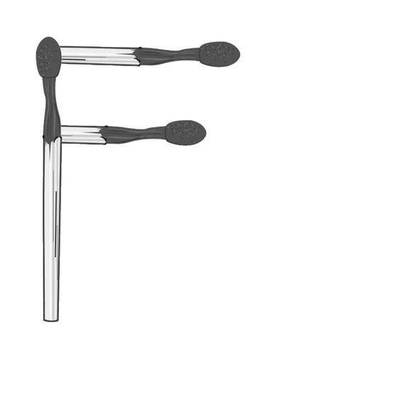
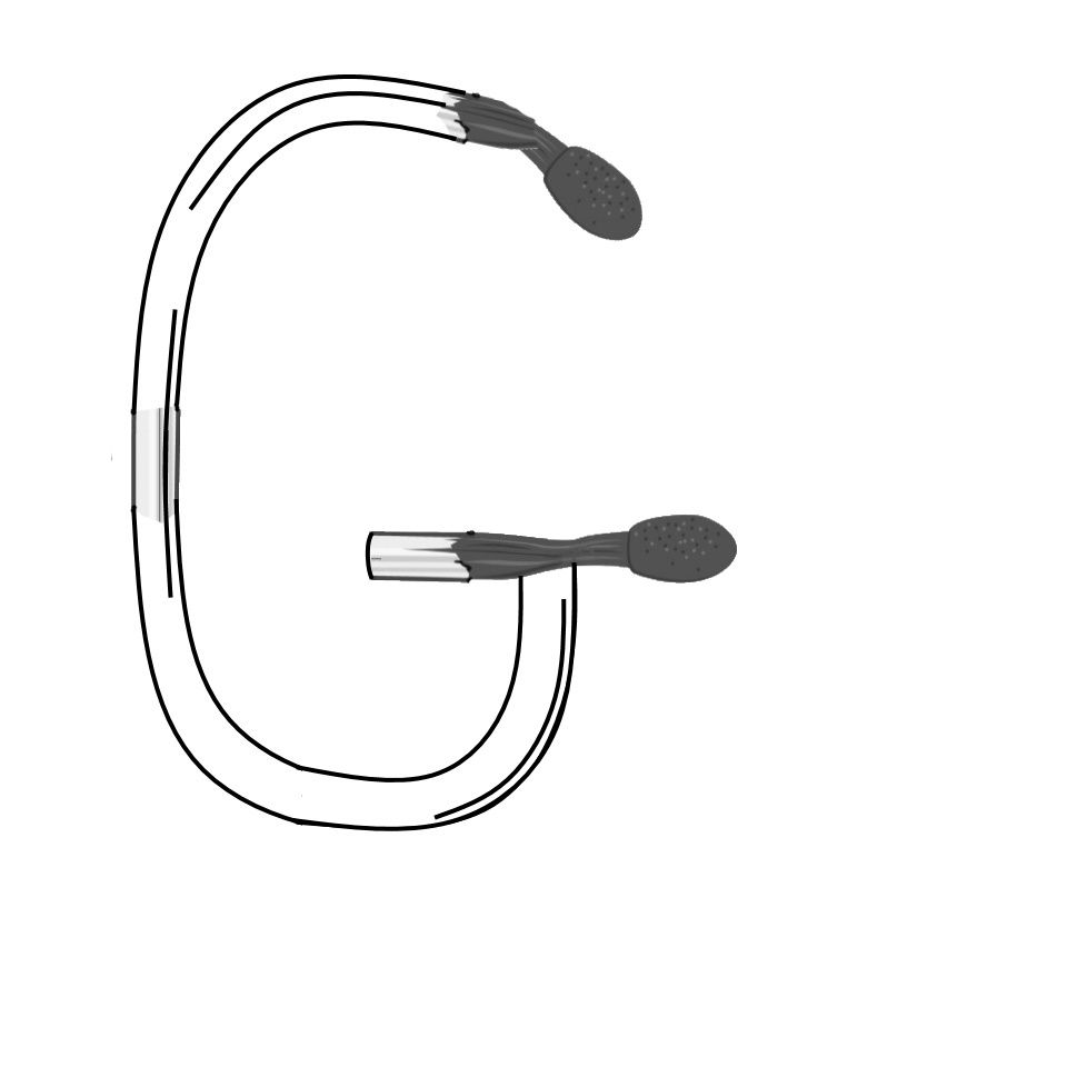
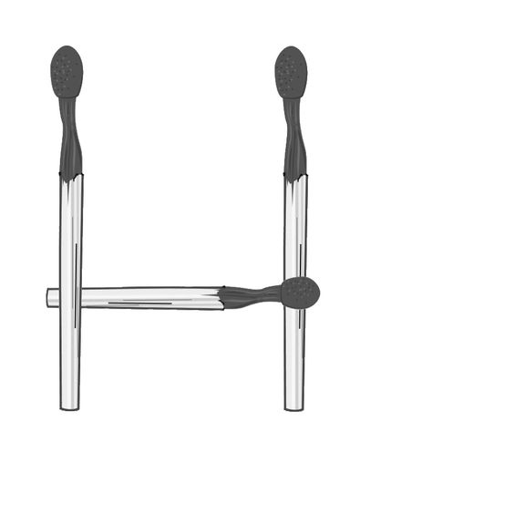
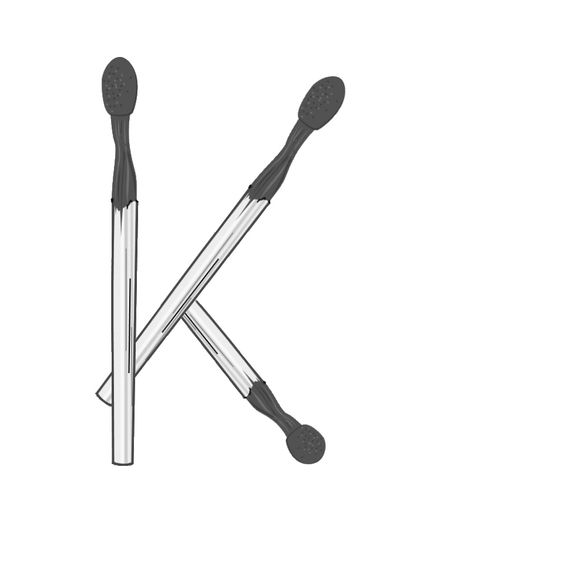
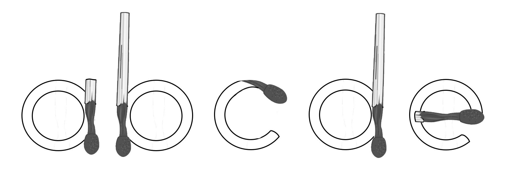
I thought about creating a new “Matchstick” font, took a look at what was already out there, and was not impressed.
I started my own, but at 83 my hands are too shaky. Here are my beginnings, the challenge is to finish the font.
I thought about creating a new “Matchstick” font, took a look at what was already out there, and was not impressed.
I started my own, but at 83 my hands are too shaky. Here are my beginnings, the challenge is to finish the font.
It looks great ![]()
Curious about the full character set.
I like it and hope someone finishes it.
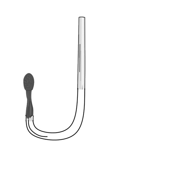
I’ve never seen curved matches ! They might be a little awkward to use ![]()
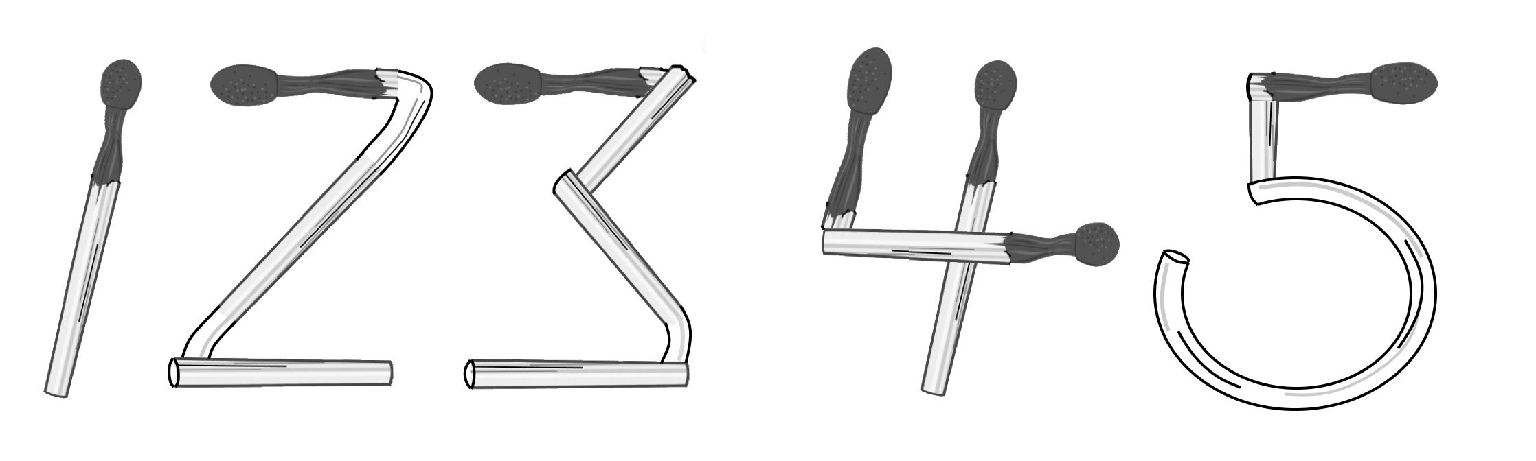
I thought about “breaking” the matchsticks to make curves, but decided that would add too many points, but perhaps the numbers could be like this:
Some curved letters could be illustrated with curled up burnt matchsticks, don’t you think? They sometimes curl up in a spiral or in a circle when they burn for all of their length.
I’m thinking this would make a great exercise for a college class.
My wife, Vera, teaches a course at FIT - a State University of New York school with a heavy focus on design. They do have courses that involve font design … I’m just looking at the course catalog, for example at Graphic Design …
Maybe she could pass it on to the appropriate department or teacher …
Is there a starting point (FCP project)? or just the graphic images …
I hope there has been some follow up on this. I think it is a great opportunity.
COVID. Sad … she went on-line (actually, we did the course together, on-line) and doing a hands-on font project was not in the cards …
Now the school is less than half the size and shrinking …