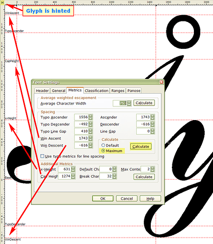
While developing a copperplate script and after doing more than 4000 kerning pairs I realized that I ignored the Capital diacritic or accented vowels. I thought I would do those at the end. Now that I am at the end I have no space left to put the accents on top of the Mujuscule vowels. That is a lot of work down the drain unless I can increase the Win Ascent height by another 600 points above the current 1825 points.
Question: Is there a limit set by Windows OS as to the maximum height of the metrics?
Data: To avoid having a 12 points copperplate script look like a 5 points Times New Roman (TNR), I started by setting the x-height of the small letters equivalent to TNR. Following the rules of Copperplate that yields a Capital height of 1825 points which is also the level of the Win Ascent line, as in this script the C-Height is equivalent to the Win Ascender Height. I can increase the Win Ascender line by another 600 points and solve the problem. But does this cause a problem with Windows?
Al
You can just use Format, Metrics, Calculate (maximum) to recalculate the WinAscent and WinDescent for your font to accommodate the highest diacritics. If any glyphs cross the WinAscent (or WinDescent) line they are likely to be clipped in applications.
From the Properties dialogue from the Font menu, then you can locate the highest diacritic by double-clicking on the “Y Maximum” entry.
The effect of changing the metrics will be to make all glyphs slightly smaller at 12 point, so your x-height will no longer quite match TNR.
You can save a lot of work by using composites. The “Complete Composites” feature will position diacritics vertically and horizontally using the font’s metrics. I suspect that horizontal positioning will not be good on a Copperplate script, and may need some manual adjustment afterwards.
BTW: To avoid confusion, the units used in FontCreator are “funits” not points.
Thank you for your reply Bhikkhu. I have solved the problem by raising the Win Ascent line by 600 funits. The result is to reduce the 12pts size by 20% relative to TNR. I guess I will have to accept that. The highest diacritc is the circumflex accent and that might enable me to reduce the funit to 500 from 600. Anyway when I finish the composites, using the “complete composites” menu - I will still have to optimise the accents manually in each composite glyph - but the macro is still helpful and does speed up theat process significantly.
The other effect of increasing the overall height is to reduce the maximum number of rows that can be written on a page. A small price to pay for the beautiful look on this font on a page.
Thank you for your prompt and good advice.
Incidentally, I do have another issue which I am trying to resolve. This copperplate font has joint ligatures to comply with the optional Copperplate rule that the pen should never be lifted from the paper. This implies that a few letters have to be made available with alternative starting strokes: for example the letter “r” when following the letter “o” requires a short leading thin stroke rather than a long one such as when the previous letter is an “a” or an “i”, etc.
Any ideas on how I could adapt the Microsoft IME pad or Atok pad, or even the Android IME Pad to enable the pop-up dialogue to come up whenever such chosen letters are typed thus giving the user the option to select a different style of letter according to what he or she are writing?
Cheers
It would be better to start a new thread in the General Font Discussions forum as this topic is not related to FontCreator.
I would solve the problem by adding OpenType Contextual Ligatures, but of course not many applications support Open Type Features yet.
