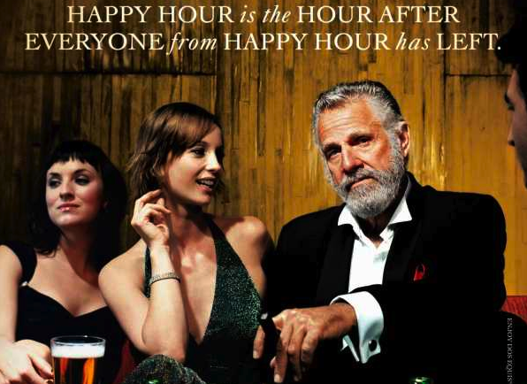
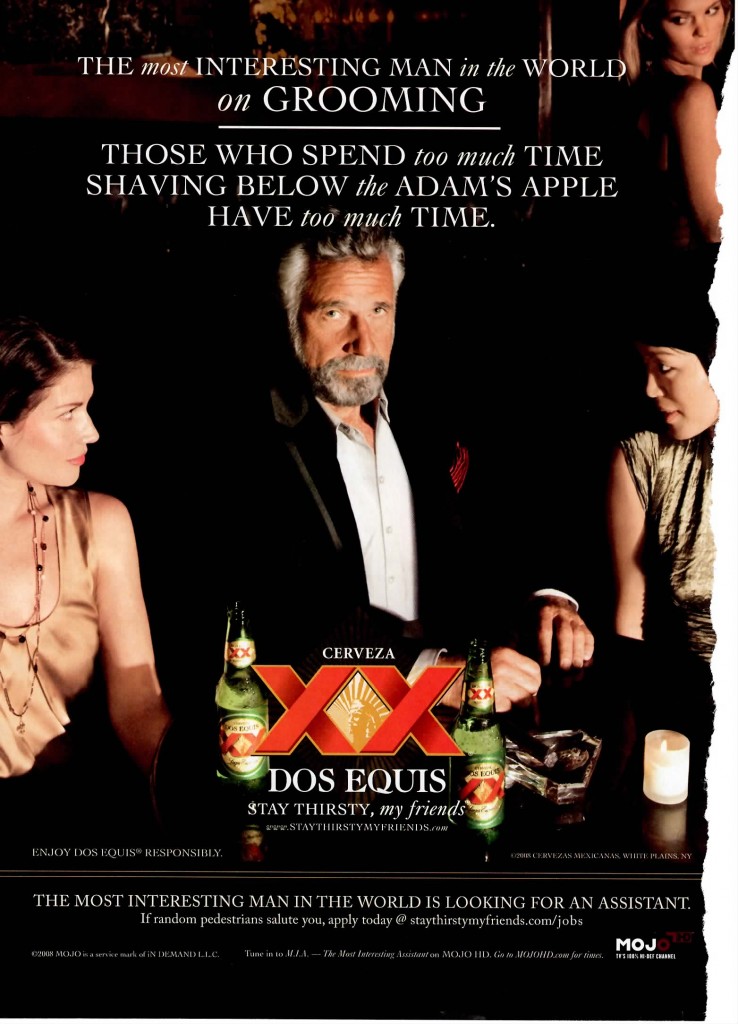
I’m wondering if anyone can identify the font used in those Dos Equis “Most Interesting Man in the World” commercials. I’ve uploaded some examples.
Now that I did a comparison with the same text from MS Word, it looks a LOT like Times New Roman.
Not the most interesting font in the world, but it cannot be that bad if its used so much.
For a formal typeface, I prefer Goudy Old Style, Garamond, or Perpetua. They have a bit more panache, and are not quite so overused.
Don’t think it’s Monotype/Adobe Times New Roman. The G “shelf” is too high, the A doesn’t have flat apex and the cross bar is too low and the M has parallel legs and no dual serif on top. Also looks like the O isn’t round enough for the sample.
Other than that I don’t think any ad agency/designer would use Times New Roman, just because …
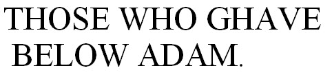
The round O made me wonder whether it might be Perpetua, but that doesn’t match in several other respects. Monotype Sabon looks a better match, but that dual serif is missing from the top of the M and (like TNR and Perpetua) the legs aren’t splayed enough.
I think it might be Engravers’ Oldstyle 205.
Yes, it looks very much like Engravers. Especially, how those serifs (if that’s the correct term) on the T and the E are shaped. And that middle row on the B curves down a little bit, too. Yeah I think that’s it.
I agree it would be strange for an ad to use TNR, it was just a font I’ve seen a lot of, so I noticed the similarities. But this ain’t my day job, so I’ll just chuckle at that idea. ![]()