Hello!
When you select Post Script, the program selects 1000 as the default page size.
All of the Glyph Transformer settings are configured and compatible with 2048, not 1000.
I prefer to use the 1000 size, as the smaller sizes are required.
Every time I try Glyph Transformer, I find the settings excessive.
I think the Transform settings should be in two folders: one for 2048 and the other for 1000.
The truth is that FontCreator is the best program for beginners.
I don’t understand what you mean by “smaller sizes are required.”
I believe the size of the file on disk has nothing to do with funits/em; the number of nodes, contours, and glyphs; and the number of OpenType features are the determining factor.
You can define your own glyph transformation to suit your needs, and save them in a separate folder; or give them a prefix of 1000 to make them easy to select.
Thank you and sorry for my poor English.
You didn’t understand what I meant.
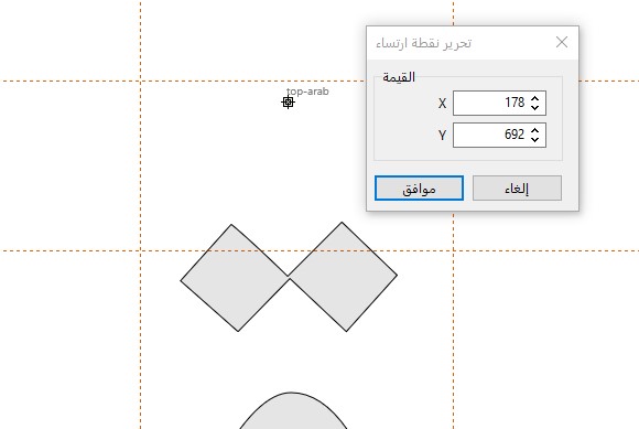
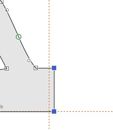
My point is that I prefer to work with a size of 1000 because smaller numbers like anchor, LSB, X, Y, etc. are more suitable.
I don’t have any problems with the file.
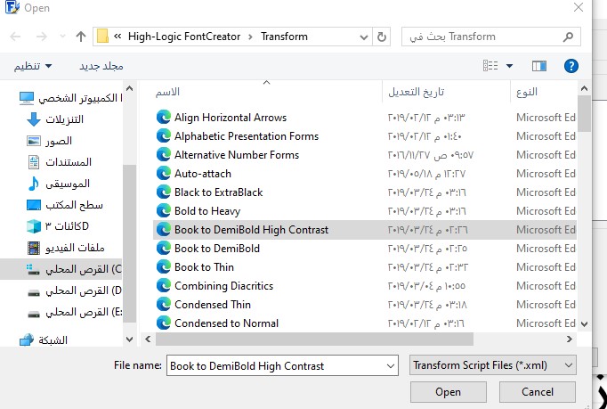
I’m talking about the Glyph Transformer and the preset settings in the Transformer folder. All the sizes are compatible with 2048.
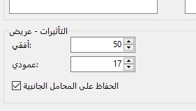
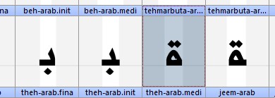
Notice the difference between the first image at 1000 and the second at 2048?
With the same settings, no changes.
It’s very clear now that the settings match 2048 and appear don’t look good at 1000.
Larger funits/em settings allow for greater precision. For large fonts on old hardware, performance may be an issue too, since computers work best with multiples of 2, than with multiples of 10.
You can write your own transform scripts. I spent weeks writing these, just so that users would have something to start with. They obviously will not be ideal for all font designs or for all users’ tastes.
For fonts with fine detail, e.g. calligraphic scripts, a value of 4096 or 8192 may be more suitable. I used 8192 on some of my fonts, as the contours include fine detail.
Thank you, my friend.
I’m having no trouble adjusting the Glyph Transformer settings.
I posted this as a suggestion to improve the program for beginners.
