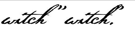
I think I figured out how to resolve my previous conundrum – I just kerned the period (etc.) away from my “h,” which then pushed the quote mark away, too, of course.
But without a quote, that period looks kinda far away – but then, that’s how Thoreau often wrote them himself. If I had my druthers, though, I think it would look nicer if it was closer – but what can ya do?
If anyone knows a better solution, fire away!
In the meantime, Erwin, if you catch this, my next question might be right up your alley (as a software designer)…
When I’m in Photoshop, as with many word processing programs, “smart quotes” can be turn on so that when I type a regular, straight apostrophe, or straight double-quote mark, then it converts them to smart quotes, somehow knowing whether it should be an opening or closing one.
That would be nice to add in my font – indeed, all my fonts! – because I’m always frustrated having to dig for smart quotes in some programs, and with my Thoreau font, especially, users will undoubtedly want the “smart” ones, not the “dumb” ones.
I suppose that I could set that up basically like I did with my opening-letter and ending-letter contextual alts, but smart quotes in software seem “smarter” than just that – I’m not sure what criteria they use in their coding, but it seems to know if the opening quote was used before (anywhere, not just at the start of a word), and whether or not the next one should be a closing quote.
And same with apostrophes – software just seems to be pretty “smart” about that, more than just what I know about re contextual fonts.
And so, Erwin (or anyone), do you know how the coding in software (like Photoshop or whatever) does that, and can that be replicated in a font?