Need Help with Handwriting Font

Oh, so you mean it’s not so much for my own use, but rather to make it more user-friendly for the end-user? My glyphs are mapped to a codepoint because I’d like people to be able to access them if they don’t have OTF-capable software – I can just change the name of a particular glyph in the Glyph Properties box (without touching the codepoint), right?

You have me thinking that I also have all these ligatures (especially in my other fonts more than this one) which don’t have very descriptive names, but could probably use them.

If I change the name for a glyph in the Glyph Properties box, then does that change get reflected in the ligature lookups, classes, and wherever else, too, without my having to then go have to also edit those?

I’ll definitely go back and change all the glyph names for my ligs in all my fonts, if that’s the case. :slight_smile:

Re that @latn_letters class…

It is fine to have a glyph in more than one class. It is only an issue when you use them in class based kerning.

Oh! Okay.

Then I’m still not quite sure what to put in that @latn_letters class – do I put, like, literally every single character that I have, basically the whole, entire set of latin letters, numbers, punctuation, not to mention all the accented/extended characters and everything – indeed, basically “everything,” including the new alternate enders themselves, too, except for the space/nbspace characters (and notdef, etc., of course)?
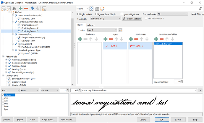
The FontCreator documentation is indeed not very extensive on this subject, but the backtrack is used in an example here:
OpenType Designer - Chained Context

I’ve googled all over the 'net, read tutorials for entirely different software – all to no avail.

And so I’ve been approaching this like a puzzle – like one of those games where you have to solve a mystery, where you must find the key to unlock the correct door in order to receive your reward – and no matter what I try, I keep losing.

Surely someone out there has done this before, i.e. done contextual alts for both beginning letters and ending letters?

For the life of me, I can’t figure out how. :unamused:

Okay! Further to my last reply, I just finished re-reading that other thread you shared here earlier, Erwin, from beginning to end. Of the 4 pages of discussion there, only the first one really deals with contextual alternates, and the rest is all about kerning and other issues the guy had.

Which is fine, of course, but on that first page, you basically just handed the guy a script to install – and I can’t just replace my script with yours, of course, because then I’d lose, well, everything.

And then further down that first page, I see a screenshot of the OTD, and I can see the structure in the “tree” on the left, but I have no idea how you got there, what the steps were, what things you entered in this box and that box – and that’s what I want (need) to know, i.e. how you got there, step-by-step.

And I tried eeeeeeverything I could think of all last night, and I just couldn’t get anything to work correctly – so basically, I’m as stuck now as I was before. :unamused:

One interesting idea for a font like this might be to make slight variations of letters, then use the random function to select which variation is used.

This would make it so that the same letter would look different in different places on the page and this would make it look more handwritten.

Yes I know it’s a lot of extra work but it’s just an idea. Take it or leave it.

I am glad to know you are getting more experienced with OpenType layout features.

To make a contextual substitution in the middle of a word, just add a backtrack, input, and a lookahead.

Oh, I thought these things “had” to have 2 rules. Okay, clearly I’m not getting this as well as I thought I was, and need to revisualize the whole thing.

I’ll be back… :unamused:

Okay! Thanks for straightening me out on that, Erwin – I think it’s all working correctly now.

Here it is again (attached) – although obviously this is nowhere near the final version yet (the latest version will always be via the link in my original post here), but in case anyone is curious to see what I ended up with here.
Walden.ttf (615 KB)

Yes, this is looking great!
Walden.png
You are no longer a novice, but in case you missed this tutorial:
Enrich Your Fonts with OpenType Features

It shows a mirroring character in Contextual Alternates.

Oh, thanks! I personally don’t feel as though it’s anything spectacular, as far as script/handwriting fonts go – there’s so many far more “beautiful” fonts like out there, after all – but that wasn’t my goal, of course. I was striving simply to have it look like Thoreau’s handwriting, but I guess I can’t complain because what with these enders, etc. that I’ve added in recently, I’ve greatly exceeded my own expectations for this.

You are no longer a novice, but in case you missed this tutorial:
Enrich Your Fonts with OpenType Features

It shows a mirroring character in Contextual Alternates.

Well, I still feel like a novice – or at least, maybe I’m “intermediate,” but definitely not an expert – but indeed, that mirror thing looks interesting! I don’t know where/how I might use it on this font, since the letters are at such an angle that they don’t flip over very well, but I could see maybe using it on my Alde blackletter or roman fonts in places, for sure!

I also had no idea that that “Generate and Update OpenType Features” thing even existed, too! Gee, there’s so much to this program that I don’t know – definitely not an expert. :wink:

I just had to say… I’m just absolutely giddy with delight over what I’ve learned over this last week, and how it’s truly transformed my font completely! I thought I wasn’t doing too badly at trying to create a font out of Thoreau’s handwriting before I started getting into these contextual alts, but now that I’ve done so, it’s truly taken my font to a whole new level! All sorts of “problematic characters” that I couldn’t get connecting together very well before, so many imperfections that I’d basically just surrendered to accepting as unresolvable, I’ve now been able to fix up quite easily, and my font seems to work really well, with letters fitting nicely together better than I ever dreamed of.

Indeed, I genuinely dreamed of making a font of Thoreau’s handwriting for decades, and just never bothered to try because I simply thought it would be impossible – and I’m just flabbergasted that now I’ve actually done it!

Thanks so much for this wonderful software, Erwin, not to mention all your help in these forums (and outside, too!), along with Bikkhu and PJ and everyone else who has helped me over the years to make ALL my “type-ical” dreams come true! :smiley:

Okay, I’ve made tons of headway with my font, but what’s going on here?

If I type the word “wœvres” or “vroom” in FC then it comes out like it should – with the “vr” combination swapping out the “r” for “r.alt” – and it works fine in FC, but not when I run a WOFF test.

The issue seems to be somewhere with that “vr” combo – I can’t figure out why it works in FC but not embedded in a web page??? :unamused:

Attached is my font, as it is now…
Walden.ttf (646 KB)

I’m still stumped on my previous question, so in the meantime I popped open the very first font I ever did, way back 20 years ago or so, of my own handwriting, and which I’d never really finished up. That one has no opentype features at all, no kerning or anything, and I remembered something I saw that you mentioned earlier, Erwin…

Near the beginning of that page, just before the first screenshot you see, there’s a paragraph that reads: “Within the OpenType Designer window click the first icon from the upper left corner to open the Generate and Update OpenType Features window. You will now be able to select which features you want to generate and/or update.”

And then there’s the screenshot – but I can’t find any sort of menu/dialog like that. In the OTD, the “first icon from the upper left corner” is the big + sign, to add a new script, but not a thing to add a bunch of basic stuff (that you select from) all at once.

Where do I find that “Generate and Update OpenType Features” dialog box?

Well, I’m back again, to make more of a pest of myself! :laughing:

Does nobody know the answer to my previous problem, re that “vr” contextual alt working okay in FC, but not when you do a WOFF test? I seem to have been on hold with working on that font, ever since that problem arose. If it helps at all, the lookups in question are “ChainingContextv” and “SingleSubstitutionv” (note the “v” at the end of both). Everything else seems to work just fine in the WOFF test – I haven’t come across anything else weird happening yet, anyway – but just that one combination. Works fine in FC, but not in the WOFF test.

But anyway, just to complicate matters more, here’s another dilemma! While taking a hiatus the last few days from my Walden font, I thought I’d open up the very first font I ever made, 20-odd years ago, of my own handwriting, and see if I could finally finish that up after all these many years, and maybe add some OT stuff, too.

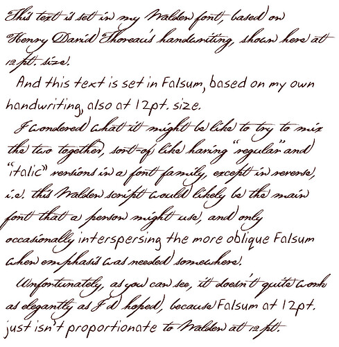
I think the easiest way to explain my latest query to this forum is graphically, to actually show you the problem…

Thoreau-Falsum Comparison 1.jpg
Thoreau-Falsum Comparison 2.jpg
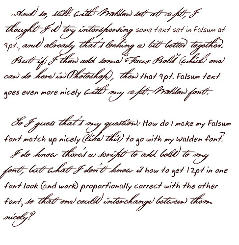
I assume that to fix up my Falsum font so that it matches up nicely with my Walden font (in that direction, not the other way around), then it’s a matter of changing my WinAscent and WinDescent of the former to match up with the latter? Is that all it takes? Do I have to change the x-height and capheight, too?

I have NO idea what to do, what the easiest/best way is to go about this, and I don’t want to screw anything up.

ALSO, as you probably noted in the above image samples, one other thing I need to do is get both fonts to match up to the baseline better – but I can just use that “Move” function in the glyph transformer for that, right, and just bump up the entire font a tiny bit all at once?

Lastly, is this a dumb idea, what I’m trying to do here? :mrgreen:

It seems class0 is not working as expected. We are not sure if it is a bug in FontCreator, but for now better avoid it.

I was about to reply “But I didn’t use that class0 anywhere,” but I figured before doing so I better check my font – and instantly found what you were referring to.

My bad! That should’ve been my @LATIN class instead. I’m not even sure what that class0 is supposed to be used for? I read the description of it, but I still couldn’t quite understand it.

In any case, thank you for pointing that out! I’ve fixed that, and presume it should fix the problem. :slight_smile:

Any suggestions on how to get my two fonts the same size (so to speak), to work well together as I described? I can only think that there must surely be a fairly simple way to do that – but I just haven’t a clue what that might be. :unamused:

Yes, you can use the Transform Wizard to move outlines of several glyphs at once. You can use the Undo in case you do not like the result, and try again.

Yeah, come to think of it, I now remember that I already used that “move” function before, when I created my Alde family of fonts – so that’s the easy part!

I haven’t the slightest clue how to get my two fonts the same size in the first place, though. I’m assuming that it’s a matter of “getting all the lines to match up” (so to speak), that is, getting my x-height, cap-height, etc. to all be the same, but the easiest way that I can think of to do that is to just start practically from scratch – open up my Thoreau font, “save as” as a new Falsum font (the one of my own handwriting, which I want to match up to my Thoreau font), and then copy/paste each glyph, one at a time, from Falsum into the slots that were my Thoreau font.

If that makes any sense – but all I can think is that surely there must be an easier way? Like, in the Font Properties dialog there’s all those tabs, with various buttons to “calculate” different things. I always do run those “calculate” things, but I don’t entirely know what they all mean.

If I wanted to make my Falsum font match up with my Thoreau font, then I presume I could just simply copy/paste certain numbers from within the Font Properties dialog from one font to the other, and that would do the trick?

But which numbers? There’s a LOT of different numbers, lots of different “calculate” buttons.

Or maybe I’m off in the wrong direction, and there’s another, better way to do this??? :unamused:

Y’know, if I could get my two handwriting fonts to “size up” nicely along with my 5 Alde fonts…

http://www.psymon.com/fonts/alde.html

…that would be AMAZING. As it is now, the 5 Alde fonts work well together – and they were designed to do so, of course – but if you switch the text to my Walden (Thoreau) font then it comes out disproportionately “smaller.”

It would be just AMAZING if I could get all of these fonts working well together, though! Like, if I was so inclined, I might create something with an “antiquarian look,” as though it was made back in ye olden days, with text that was “printed” with moveable type (my Alde fonts) interspersed with handwritten text (my two handwriting fonts).

And for the user to be able to just simply have a bunch of text they want to put together, and change the font indiscriminately anywhere within that text, and not have to also then change the point size, too.

If anyone can explain how to go about doing that, you’d have a friend for life! <3 :laughing:

I’m surprised nobody seems able to answer my query re how to get two separate fonts to “size up” nicely together. I would think that that would be a fairly straightforward thing to do – I just don’t have a clue how to go about doing it (except a long-winded, rather laborious way of going about it).

I wonder if I should post that particular question separate from this thread? It’s not specifically about handwriting fonts, but could be used for all sorts of contexts, of course, and so perhaps if I posted that particular question separately, maybe that might help elicit a response?