I am tying to add a New Pair Adjustment. The two glyphs I am working with are “W.”. In this situation I need the “.” tucked in near where the “W” meets the baseline on the right side. In the Open Type Designer I select the the + button to add a new pair. First I select a “W”. There are 43 of them to pick from. I just picked the first one in the list. I am assuming they get renamed when I create the new pair. Then I added the “.” in the second window. Using the mouse and the shift key I move the “.” to where I want it. The XAdance value is -212. I select the Apply button and the new pair is created. Then I go to the Font Test page and type “W.”. It appears on screen as I want it but when I print the test page the “.” jumps to the right of the “W”.
How to I make the period stay where I placed it in the new pair? Additionally is there a way to control the width of the space bar key?
Printing through the Font Test dialog is not that sophisticated, kerning and other OpenType features are left out.
While this Test Font dialog is open, you can also use your font in other software. The font has a temporary name as shown between brackets in the window caption bar, which is usually the original font name followed by a number.
Word 2010 and up do support several OpenType features, like kerning, ligatures, and contextual alternates, but you will manually have to enable such support in your documents. Within Word do open the Font dialog, and select the Advanced tab. Then check the options you want to enable, e.g. “Kerning”, “Standard Ligatures” and/or “Use Contextual Alternates” and click OK.
Before adding a new kerning pair it is best to create kerning classes. I doubt if there are 43 uppercase variants of W to choose from; at most there may be seven: W, Ẃ, Ẁ, Ẅ, Ŵ etc. Open the Class Manager from the icon at the top of the OpenType Designer dialogue and create a new kerning class for Uppercase W (lowercase w will also need to be kerned with the fullstop (period), but by a different amount).
Also add a class for the comma/period: for many fonts, the comma will need to be kerned by the same amount with all glyphs, and perhaps also the ellipses …
Then, when you go add a new kerning pair, you select class @W_Caps to kern with class @comma
By using class-based kerning, in this case will add 21 kerning pairs at once.
This looks like a problem with older versions of FontCreator if you run the Automatic Kerning Wizard multiple times.
What is your version, and have you run the kerning wizard more than once? It creates kerning classes for you automatically, which might be easier, but I prefer to create my own kerning classes manually. For one font it may be slower, but one can export/import the script to add the same classes to a whole set of (four or more) typefaces, or to other fonts with similar glyph sets.
I have not used the kerning wizard for a long time, but I see that it is running again on a font that already contains a kerning adjustment pair feature and lookup. I thought that had been fixed, but apparently not.
Edit: Looking back through the archives, I see that I brought up this problem, but Erwin said that fixing it would cause other issues, so he left it as it was.
After running it the first time, open the OpenType Designer dialogue to edit/add/delete kerning pairs.
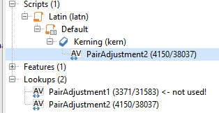
In the OpenType Designer dialogue you can see which lookup is actually used by the kerning feature. All of the unused lookups can be deleted from the last Toolbar button (Permanently delete all unused lookups). In my case, to retain my manually created classes, I could change the kerning lookup to PairAdjustment1 and delete PairAdjustment2 which has been created by the kerning wizard.
When version 12 was released I asked Erwin Denissen “What has changed in FontCreator 12 vs FontCreator 11.5 concerning the performance of the Optical Metrics and Auto Kerning? I’ve read FontCreator 12 released but don’t see much mentioned there regarding these topics.”
He said “We haven’t put effort in that part, so I’m not sure if it is faster or slower.” so I didn’t see the point of upgrading to version 12.
The kerning wizard is rather slow, but you only need to run it once. Its performance has not changed in FontCreator 12 as far as I can tell: about 3 mins for a font with 464 glyphs and 20 seconds to regenerate with a different spacing factor.
Thereafter, you can adjust the kerning with a different glyph spacing factor from the OpenType Designer, which is four or five times faster as it already has a list of pairs to work with.
There are lots of other features that got attention in FontCreator 12, Anchor Based Complete Composites, adding OpenType features, and Glyph Naming, among others.
The one font I am working on will probably be the only font I ever do. I am restoring a film made in the 1970’s. The font was hand drawn. I have the original cells that had the fonts printed on clear plastic. That was the source for the glyphs used in this creation. I need to redo all the end credits on the film updated with all the new people who have worked on it.
The issue with the “W.” will probably occur only once. The image below is what I need to replicate.
Will the way I created the New Pair work for what I need to do? I would rather not build many layers of text in Photoshop to get the same look if possible.
When you run the kerning wizard again, the PairAdjustment1 lookup is replaced with PairAdjustment2 lookup, etc.
You only need to ensure that the lookup used by the kerning feature is the one that you are editing. I advise deleting all of the unused lookups to make sure that you cannot edit the wrong one.
One is to generate a new kern lookup, and generates new glyph classes. The other (right-click a kern lookup) auto kern option will update the kern pair values.
If you use the first option more than once, you will end up with numerous glyph classes that are not in use. You can clean up the classes through the class manager (icon to remove all unused classes).
Lookups 9-11 have more pairs, but 23, which is in use, presumably uses the glyph spacing value that you prefer, so yes delete all of the unused lookups and classes.
If you prefer another lookup, add that to the kerning feature and delete lookup 23 and the rest. Rename your preferred lookup to Pair adjustment 1 just to tidy up.
Since they are not used, I think it makes no difference which option you choose.
Another way, if you have no other OpenType features, would be to clear the script in the OpenType Designer, then run the kern wizard once more when you have finished designing your font, adding glyphs, etc.
Side-bearings should be right first, before thinking about kerning.
Bhikkhu, I have watched many of your videos trying to figure things out. In one of your videos I saw you setting the Fixed Bearings at 10. The first time I used the Automatic Metrics Wizard I used the default of 100. I had trouble getting the spacing of each glyph close enough to replicate the hand drawn font I am working on. I ran it several more times and right now I am down to 60. Is it better to set everything at 10 and then adjust the Glyph Spacing factor to get the spacing I want. I realize you do not use the automated tools that much but I am new to this and I will be using them for what I am doing. I do realize that I may have to adjust some individual glyphs manually to get the look I need.
Autometrics is a bit crude — it just sets the same fixed value for each selected glyph. Optical metrics in the Professional Edition calculates suitable metrics based on the shape of glyphs. I suspect that hand-written scripts will need each glyph to be adjusted manually, especially if you want the script to be joined.
Yes, I use the font validation wizard to check for errors.
The hand drawn fonts I am replicating are not script and do not need to be joined. I posted a screenshot of a real sample in a prior reply of what I am actually working on. Does using the Fixed Bearing setting of 10 give me more flexibility for spacing?