Hi Dave, Hi Dave.
I have stopped using the information within fonts. NOTHING is reliable. Too many people have had their hands and their footprints inside the body. Thieves remove dates and copyright attributions and change the names to hide their tracks. There are too many conversion programs which change from format to format so you lose track of the original font and sometimes even the original design. Fonts coming apparently directly from Adobe also seem to have traces of “fat fingers” all over (font dates of Jan 1, 1904!)- so I’ve given up.
My fonts are organized by internal font name (changing the external file name). Any name or family can be found in seconds using a standard directory search. Font name is the only absolute identifier easily available.
The internal font name may not adequately or correctly describe a font of course. For instance, a “Bold” font may have various weights depending. A properly calculated PANOSE weight (Weight Factor = Cap(H) / Wstem(E)) would resolve such naming problems to where a bold font is not one that is simply darker than another in the same family.
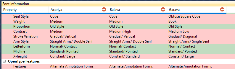
I have set up a separate classification scheme to describe a font in detail. The design is based on questions of character shapes (Identifont). A “Keywords” variable has been added to ascribe specific design traits, such as Adult, African, Airplanes, Ancient Languages, Animal Life, Architect, Art Deco, Art Nouveau, Australian and so on. I can get very close to the final font (or really group of fonts) very quickly but it’s taken years to write everything down.
What’s good is that the criteria are consistent and what’s bad is it takes alotta time to record those variables (maybe 15 minutes a font). It’s an application written in MS Access. Currently there are more than 21,000 fonts described in gory detail and over 12k more candidates in queue. This design has been sufficient for this size database. To describe a 50k data base it should be automated and new classifications should be added as you end up with too many almost duplicates of Arial or Times New Roman.
PANOSE is losing support in the industry. Perhaps only Adobe and Microsoft (The Monotype Corp.) still encode their fonts. There are too many very good fonts which don’t have it, so what good does it do? Edwin can’t program around the lacka data problem. (If you were to “survey the population” or something to see the percentage of fonts that contain valid PANOSE values in the very easy first position (Family Type - 2-Text, 3-Script, 4-Decorative, 5-Symbol), the result would be surprising. Possibly 25% ?? Not enough. It goes rapidly downhill thereafter).
The font user community has grown a whole lot more sophisticated and demands far finer nuances than given with PANOSE. Every designer has list of “favorite fonts” which may have very similar PANOSE numbers but offer more subtle differences in feeling and shading.