I read a news report about Pantone issuing its Colour of the Year for 2011.
I found the following.
http://www.pantone.com/pages/pantone/Pantone.aspx?pg=20821&ca=4
http://www.pantone.com/pages/pantone/pantone.aspx?pg=20824&ca=10
The first of the above two web pages has, almost at the end of the page, a table of colour values.
I decided to try to use the colour with some of my fonts.
I used the Serif PagePlus X3 program.
I decided to use the CMYK values for “fashion + home CMYK” as follows.
C=4, M=75, Y=24, K=0
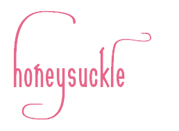
The colour is called Honeysuckle.
I started a new publication within PagePlus X3 and I added the colour to the colour palette of the publication.
In fact, I chose the publication in PagePlus X3 to be A4 landscape, though I had no intention of producing an A4 landscape publication such as a print or a pdf document: the idea is to export a graphic from within the publication as a png graphic file. The A4 landscape publication that I am using simply provides an environment for adding graphics.
I keyed the word honeysuckle, using my Sonnet Calligraphic 029 font at 120 point, 120 point being one of the preset sizes in PagePlus X3 (other, non-preset, sizes are also possible). I then changed the h, the y and the lowercase l for calligraphic alternate glyphs from the Private Use Area of the font. I then added a space before the h so that there would be some white space at the start of the graphic and three spaces at the end. I then exported the graphic as a 24 bit png.
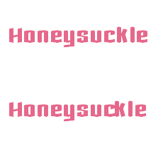
I then decided to try my Chronicle Text font, as it is a much heavier font and I wondered how the colour would look with a heavier font. I used 24 point. As the font has a ck ligature available I keyed the text twice, once without the ck ligature and once with the ck ligature.
William Overington
11 December 2010