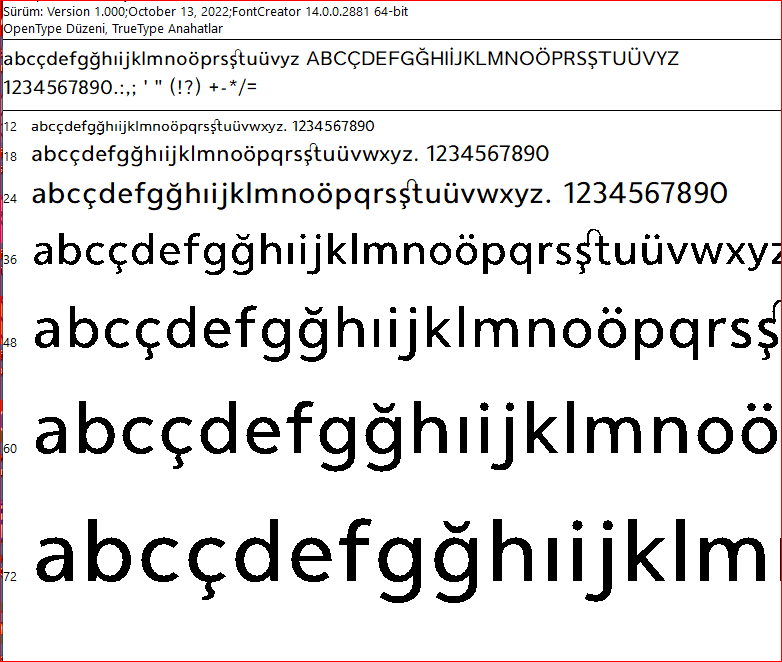
When I export the font project I’m working on, the image of the characters looks jagged. What could be the reason for this? Has anyone encountered such a situation before? By the way, let me tell you this: When the font is installed on the computer, this rough does not appear in the programs that use it.
I suspect the font has a gasp setting without specified rasterization techniques.
Usually a font has settings like this:
Either fix those settings or enable auto hinting on export.
Hint settings of my font are shown in the image below. How do I apply a setting to repair the font? I already choose Auto hinting option when exporting the font. The file named Cumhuriyet–5 with the same settings does not have the same problem.
Do send the font and the font project to us and we will look into it.
There is one glyph with issues as it has a brevecomb out of bounds, see iebreve-cyrl.
You found the source of the problem. Thank you.


