Well, this is really weird. I was adding in the four pointing hand symbols to my font, and everything was coming along fine… until I added them to the preview window, then weird things start to happen.
If I add in all four glyphs to the preview (with or without a bit of text afterwards) then they show up no problem.
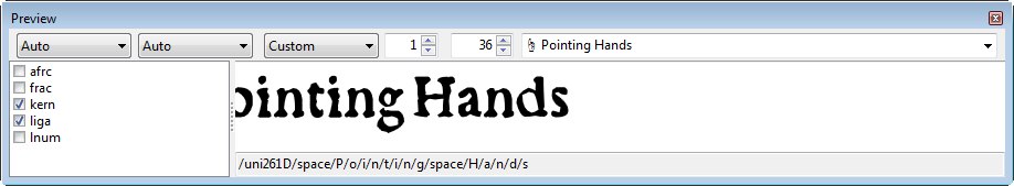
But if either the up or down pointing hand is the first character in the preview, then it’s as though my glyph had moved waaaaaaay over beyond the left of the left-hand bearing, and that glyph (and any text I might have typed in after it) scoots over and partially disappears to the left in there, like this…
It’s only in the preview window that it’s doing this. If I do a WOFF test on my font, everything seems to work fine, so I guess it’s not all THAT serious an issue, but still… what the fudge???
Oh, wow – interesting. Y’know, all this time I’ve been using FC, I never even noticed that offset thing there (nor the AW thing either – whatever that is). I just poked around at different glyphs in my font, and it seems that there’s all sorts of different offset values. Now I’m wondering if all my fonts are screwed up like that, with certain glyphs having an offset that they shouldn’t.
What “should” that value be? Should it really be 0 (zero) for all glyphs? How do you change it? It seems you can’t change the value in that dialog box. I just looked in the help files, too, but can’t really find any info at all about “offset.” Nothing that seems helpful, anyway.
I do hate to trouble you, but can you explain what these values “should” be? Am I right that they should be 0? And how/where do you change it/them?
Ah, okay. All this time I thought there was “supposed” to be space on the left-hand side of each glyph, too! Don’t ask me why I thought that, I just did.
I haven’t done anything with this yet – and please forgive me if I’m slow, but I’m actually really sick with the flu at the moment – but I did try this out on one glyph, and I see that it reset that offset, but didn’t actually change my LSB (that’s what I was a bit concerned about, thinking that it would mess that up). I’m sure I’ll get this eventually, but right now I don’t.
Also, I see that if I select more than one glyph then that checkbox is grayed-out – can one not fix this on all one’s glyphs in one shot? Do I have to go through each/every glyph one at a time?
Oh, never mind – it just occurred to me that there might be a script for that, and lo and behold, there is!
I’m still a bit confused about that, though. If one checks that box – or runs that script – and does what it says, i.e. “Set left side bearing point at x=0,” then how come the LSB field above that doesn’t go to 0?
Aren’t those the same thing? That’s why I never checked that box before, since I have hardly any glyphs with an LSB set at 0.
Well, it’s a few days later now (since my last reply here) and I still don’t understand this. I did run that script on all my fonts (to make sure “x=0”), but interestingly it didn’t seem to make any impact at all on how my fonts render – I thought all my kerning, etc. would end up coming out totally out-of-whack, but I couldn’t see any difference at all between the before/after versions.
Not to say that it’s not a good script to run (as evidenced by my original query here), but I still don’t understand the difference between what left side bearing that checkbox is referring to and the LSB field above that – are they not referring to the same thing???
Most of the characters would be unaffected if they were correctly positioned but the combining diacritics would all be set to the wrong positions if they were correctly positioned before you ran the script.
Oh no! I already ran it on all four of my fonts (that I’m currently working on)!
Most of the characters would be unaffected if they were correctly positioned but the combining diacritics would all be set to the wrong positions if they were correctly positioned before you ran the script.
Is that the only reason? If so, I did convert all my composite characters to simple, so I presume they wouldn’t be affected in that way – should I be okay, then?
I still don’t understand this thing with there being two references to the LSB in the glyph properties dialog.
Thanks, Erwin! I’m not quite sure how that affects this issue here that we’ve been talking about, but nevertheless… thanks!
But that’s what I don’t get – “LSB” means “left side bearing” – so that’s rather like saying “There is the left side bearing, and then there is the left side bearing.”
No it would not. As pointed out several times, the Left side-bearing is not the same thing as the Left side-bearing point or origin of the y axis. If combining accents have a negative side-bearing they will still have the same negative side-bearing when the Left side-bearing point is set to zero to remove the offset.
See my screen shot where the down-pointing index still has left and right side-bearings of 62 funits, but the Left side-bearing point has been reset to zero, removing any offset.
Well, as also “pointed out several times,” I’ve been left more confused by the answers here than I was finding things resolved.
Thankfully, however, I think I am now starting to grasp the difference between “left side bearing” and "left side bearing point" – I kept thinking you were repeatedly talking about the same thing – but what you said about running that script (to set x=0) not having an effect on things like diacriticals doesn’t seem to be true. In the previous version of my fonts – before I ran that x=0 script on my entire fonts – in one of them my circumflex accent (for example) had an offset of 70, but after running that script it now is set at 0 (while the LSB/RSB didn’t change).
So that would seem to disprove what you just said, regarding what supposedly wouldn’t happen with what clearly did happen with my font, but here’s some related questions…
I have no composite characters in any of my fonts. I did at first, of course, when I first ran the script to create all the extra composite characters (with accents ‘n’ stuff), but then converted them to simple because my understanding is that composite characters in fonts can cause issues sometimes, and that it’s better not to have them – please do tell me if I’m wrong about that! In that regard, however, if my font isn’t creating accented composite characters “on the fly,” then what difference does it make whether those various diactriticals have an offset anyway? I don’t even see what purpose those diacritical glyphs serve other than if, for some odd/unusual reason, one wanted to type in just an accent without any character at all with it.
With that said (#1 here), if there’s still a reason to have an offset on some characters, is it only diacritical marks that I should be concerned about having an offset? If the answer to that is “no,” then which other characters should have an offset?
I don’t even know how I ended up with an offset on so many of my characters in the first place – not just diacritical marks, but tons of my glyphs had an offset to them before (but now they don’t, after running that script). I can’t seem to find where/how to change that (other than to set x=0). Any idea what I might have done “wrong” to make that offset occur in the first place (and all over the place), if only so that I don’t make that same mistake again?
Back to diacriticals (and any other characters that might need an offset), although I as yet don’t know how to change the offset for any particular character (re #3 here), assuming there is a way to change that, how does one know by how much to change it, i.e. how much offset to give any particular diacritical (or whatever)? Is it a matter of “eyeballing” it? Like, in the preview window would I type in, say, a lowercase “a,” then next to it add whichever diacritical mark, and then change the offset on the latter until the mark is floating above the “a” such that it looks correct? If that’s right – I’m just totally guessing here – then again we’re back to #3 with regard to how one changes the offset.
For the fonts that I just “screwed up” by running that script on my entire font(s), is my easiest solution now to simply go back to my previous version (before I ran that script) and just copy/paste those specific characters to the latest version? That does seem to be a simple solution to correcting things as they are now, but how do I know that the offset was set correctly in that previous version? Just because there is (was) an offset before, doesn’t mean that it was right. In that regard, I would do it all from scratch now instead, if that’s better, and just make adjustments manually now and get everything right, rather than just simply “how it was before.”
Once again, my apologies if I’m a bit slow here, I’m still sick-as-a-dawg and my head is still rather foggy (it’s been two weeks now that I’ve had this dang flu!).
Why can’t I get any answers to my questions? I’m starting to think that there must be something so ridiculously obvious that I’m just not “seeing,” but in the the glyph edit window I don’t see any indicator for that, and nowhere can I find anything (re changing the offset, or whatever else), and the help files provide virtually no information at all on that (if you search in there for “offset” there’s literally nothing at all that’s of help).
Come on, guys, am I that clueless? I’m not even sick any more (after two weeks of illness), I’m as clear-headed as can be, but I haven’t done any work on my fonts in the last week because I have no idea what to do about this (or these) issue(s).
I’m not going to answer all your questions, but I’ll try to explain what I think is best.
While designing fonts, it is usually smart to keep composite glyphs, unless they are just a way to get a start for a final result. Most composites can remain a composite, some examples are agrave, aacute, acircumflex, ograve, ntilde. Other glyphs are too complex but can get a good start through complete composites. They require some fine-tuning. For example the Bitcoin Symbol.
In general composites which end up with overlapping contours require attention (manually adjustments).
While it is perfectly normal to design your glyph outlines without taking care of the horizontal position, most font designers will ensure the final font only contain glyph outlines where the left side bearing point is set at x=0.
Usually marks (non spacing / combining diacritical) will have a negative LSB and a AW which is zero.
Do inspect fonts like Garava and Bahnschrift to see how other font designers have set these values.