The reason for the request is that it would be helpful in building up the text for pictures such as the following in WordPad and then be able to copy and paste them straight into the text box of the preview panel.
Also, it would help with being able to produce nice displays of text in the preview panel without having to try to juggle with lots of space characters.
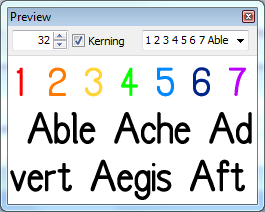
I am pleased to view the image in your post of a colour font: have you any images for the Gallery please?
I understand now. When I first read that post I saw that you had added lots of space characters, but I didn’t appreciate the significance of this.
Thank you for the suggestion, but that is simply Dave Crosby’s basic font with the seven popular colours of the rainbow applied to the first seven numerals. I hardly think it belongs in the gallery!
The reason for the space characters at the top of the picture is because the first line on the preview panel seems always to start with a small space. When I am trying to produce a design with a font where all of the glyphs are of equal width, that small space stops the first row being directly above the second row, so I worked round the situation by making the first row all spaces.
Well, I think it would be good to have as many images using colour fonts from as many people as possible in the Gallery.
I like to encourage people to have a go at publishing something. I have found that if I get started with something basic then that is then my starting point to have a go at something else and then that is my new starting point. So I encourage everybody who has started to design a colour font to consider posting an image in the Gallery please.
By the way, I have just realized that the top bar of the preview panel in your image is a much lighter colour than the top bar of the preview panel in my images: why is that please?