I have used the Optical Auometrics for all my fonts with apparently good results.
The exception is the greaterthan sign. In all the fonts the bearing on the left is
far too wide and the bearing on the right is maybe a little too small.
The lessthan sign is ok.
Bhikkhu,
I agree and furtheremore I would like a way of choosing which characters to omit.
Maybe the Optical Metrics could be a Wizard with the first tab asking if we want to
omit any characters, and if the answer is YES, Font Creator would make select
all the characters it proposes to process.
We would then at least see what CF is about to do!
The user could then deselect some of the characters.
I may want to deselect some of the characters used commonly in both Hebrew and Latin
so that the sidebearings can be set by me to work (as a compromise) for both
left to right and right to left typing.
I’m using Autometrics again and have searched for the list of characters that are processed
by default. Pretty sure I saw it somewhere…
Could someone please post the list again.
Autometrics is a bit overzealous and I’d like to write a transform script to undo the (few) results
I disagree with.
Erwin,
Sorry I did not understand you. What I meant to ask was
what glyphs does optical autometrics process? True I can see them in
the window as they briefly pass by, but I might miss seeing some of them.
Mike
Mkv,
I’ll just add this to your query so somebody more knowledgeable than I can answer a broader question.
If â is a composite of a and has â has ‘Use this glyphs metrics’ checked in its composite window, then when a is adjusted by optical metrics, â will also be adjusted in the same way. Can someone confirm that?
(My Hebrew font doesn’t have any characters like â, so I can’t be sure of thsi answer)
Mike
If your font includes composite glyphs with accents like àèìòù, then after running autometrics, select all composites, make them simple, and complete composites.
If they are not composites already, you will need to select them manually, and use complete composites.
Note that kerning will also have to be changed after running optical auto-metrics (or regular auto-metrics).
So, run optical metrics a few times until you’re satisfied with the results, before completing composites, or doing any kerning (auto or manual).
See this feature request thread to see how different values for optical metrics are needed for different typefaces. Don’t assume that the default value is right for your font, or that the right value for the regular type style is right for italics or other type styles.
Complete composites is designed to create dcroat from d + combining short stroke overlay. If short stroke overlay doesn’t exist in the font, then underscore will be used instead. The metrics of dcroat will be taken from lowercase d, so after running optical autometrics, it will be the correct width. Some editing may be needed.
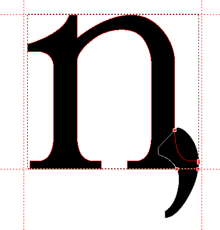
Complete Composites composes lowercase eng from lowercase n + comma. This is a design aid to use the same metrics and basic glyph shape as lowercase n.
However, the designer may decide that the metrics need to be different for lowercase eng. Either way, if you run the autometrics first, then design the glyph, it will match the lowercase n. If the glyph is already designed, then don’t run complete composites, and manually adjust the metrics to match lowercase n or to suit the design of lowercase eng.
Right now there is no easy way to set the metrics of those at once. We will most likely improve the auto metrics feature. We are thinking of making it group based, e.g. the a and â can both be in the same group, which will get the same left and right side bearings. However before we actually decide to implement this, we first need to have more feedback from current users of FontCreator. Maybe people have other needs, or a better approach, so do let us know your opinion!
No, the â will keep its current values, and the ‘Use this glyphs metrics’ will become unchecked.
The “grouping” sounds like a pretty attractive alternative. If it can be implemented as an optional way to carry out this task (and maybe others) it should not break anything, either.
I have not done any font design for two decades but what from what I have seen I cannot say very much has changed since Windows 3.11, really
I did a search of OS(C:) for “CompositeData.xml” and did not find it.
It did find “Subscript.xml” but I don’t know why. Where can the file be hiding?
Mike
The folder ‘High-Logic FontCreator\Composites’ will usually be in ‘Program Files (x86)’ on 64-bit Windows, but ‘Program Files’ on 32-bit Windows.
I don’t think Mike is likely to have a ‘Bhikkhu Pesala’ folder in C:\Users’!
On Windows XP, the ‘My Documents’ folder is usually found at ‘C:\Documents and Settings{username}\My Documents’ (where ‘{username}’ is your login name). On Windows Vista or later, it should be at ‘C:\Users{username}\Documents’.