Hello, I’m happy with what I see in Test tool after applying optical metrics tool and automatic kerning but when I test the font in Word, Photoshop or even online it shows different (bad) kerning. I have FontCreator 13 Pro. I’ve spend hours trying to sort this out but I give up. Any ideas what might cause this trouble? Any particular settings that should be „on“ or „off“, „yes“ or „no“ to prevent this from happening? It seems that my preferred kerning gets exported from Project file to ttf and otf properly, because when I test ttf or otf in test tool after export it shows good results again, but never outside FontCreator.
Some older applications do not support OpenType kerning. If you include legacy kerning tables, that should fix kerning for them.
Just how old are the versions of Word and Photoshop that you are using?
Do they support kerning in other fonts?
Thank you Bhikkhu! Yes, they are both quite old, but the problem also appears online when I post the fonts to Dafont or 1001fonts for example. The kerning looks odd in their preview boxes too.
Legacy ‘kern’ Table
The kern table is mostly useful for fonts to stay backwards compatible with older word-processing software, but we recommend that you no longer include it. Instead use OpenType Layout Features to include kerning (also known as pair adjustment).
No - No legacy kern table is added to the font
Yes - A legacy kern table is added to the font. The kern table will be built from the first pair adjustment lookup located in the Latin script, default language, kern feature. The lookup must only contain values for XAdvance for the first glyph.
Note: The legacy ‘kern’ table is never included in CFF based fonts.
I tried but it doesn’t effect the problem I described if I export with or without the legacy kerning table. And it is hard to use pair adjustment when it looks OK in FontCreator but different afterwards in other software or online. I mean the pairs are OK when I see them in FontCreator kerning tool but their spacing is than different in WORD, Photoshop or online.
Can you attach the font project file?
Sure, thanks, here it is…
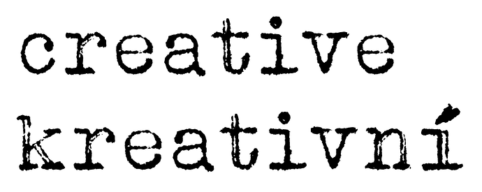
Thank you! Here are two samples, one is as I see it in FontCreator test tool and the other one is WORD. Please focus on different spacing between e-a ans i-v. I believe you see the difference. Could you please test for me the same words creative and kreativní in your browser with on and off kerning?
Thank you Bhikkhu, I really appreciate your help!
So I guess it means that the problem only exists on my computer for some unknown reason and other people get correct kerning when using my fonts?
As far as I know dafont does not support OpenType layout features, so modern kerning fails in their preview.
Unlike most other text processing software, in Word you need to explicitly enable kerning. Select the text, then open the Font dialog, go to the Advanced tab and enable Kerning.
Thank you guys for your help! I appreciate!


