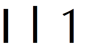
I have enjoyed using Calibri because it is a very smooth and readable font, but every once in a while I wish there was a better way for these sans-serif fonts to display 1, capital I, and lowercase l, because they look very similar.
Has a sans-serif font been produced that has these three characters “serifed”?
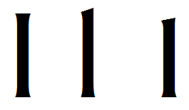
Thanks, Bikkhu, the Optima font retains a nice classy look (rare IMHO for a sans font), while at least managing to distinquish between the one and the other two characters. I don’t suppose I’m going to have much luck finding a sans serif font that has the serifs on the uppercase I, will I?
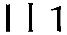
Consolas looks pretty good (a bit like the fonts on those old-fashioned computers), and the uppercase I looks like an actual I, with feet/serifs on both top and bottom, so this looks pretty good for what I want—certainly pretty good for a sans font.
I’ll look at other Monospaced fonts and see if thsi is a trend.
Thanks for the tip, Bhikku, much obliged as always.
There is an image about a tenth of the way down that web page showing how digit 1, Capital I and lowercase l are distinguished in the Source Sans Pro font.
For OpenType users there is also available a version of Capital I that has serifs.
There are also an article about Source Code Pro and another article about Source Sans Pro in the blog.
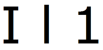
William, Source Sans Pro is looking very good right now. It actually looks a LOT like Calibri (a good thing)–smooth, rounded, gentle on the eyes, not too flashy or attention grabbing–, with a good one, uppercase L, and lowecase i.
I’m going to give it a test drive for a couple of days, but man this looks just like what I was looking for…