I have an evaluation copy of FontCreator 6.5 and needs to figure out if the software can do what I want before I purchase.
I run a sign webshop. In the shop there is the possibility to generate a preview of the sign. The sign size (width and height) and text size is fixed for all products. Currently there is only one font available for each product. However I would like to add more fonts to the same product. The problem then is that the font might not have an optimal “width” or “height” for the particular sign product.
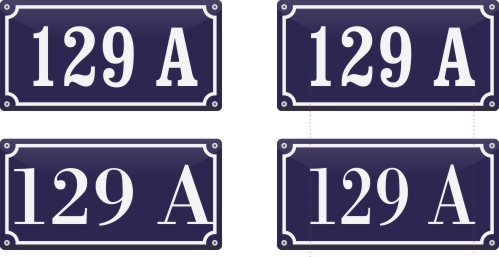
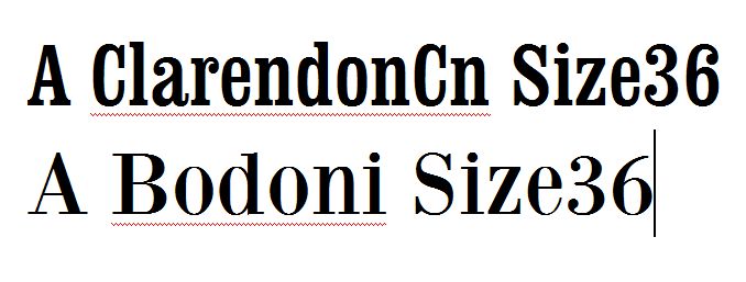
Please see the below image. On the top row the font is Clarendon Condenced which we use on a regular basis. On the lower row the font is BodoniXT, and as you can see the with the same font size the text is very close to the borders of the sign (lower left sign). What I want to acomplish is a “narrower” version of the BodoniXT font so that it matches the width of the Clarendon Cn font (lower right sign). The same might also apply to font height.
Could this be done with Font Creator and how?
I have played around with the transform wizard but since the fonts cant be saved in the evaluation copy I can’t verify that the result is OK.
Thanks!
It is possible to test your font in any application by opening the Font Test Window in FontCreator, then select the temporary font “FC Test Font #####” in the application.
You would need the Professional Edition to get the Glyph Transformation feature and to use FontCreator for commercial purposes. Editing Commercial fonts is usually prohibited by license conditions, and since this is for commercial use, you could well run into legal issues. If you want to go down this route, look for OpenSource Fonts that allow you to modify them. Designing your own fonts to suit your needs would be the best solution, but it would take considerable time and patience to get it right.
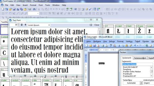
Although FontCreator would give you more control over the font’s design, it would be much easier to do this in a graphics or DTP software simply by adjusting the font’s “set width” and kerning. The middle row in the screen shot below uses only the set width adjustment, i.e. it just squashes the text horizontally. The bottom row uses manual kerning first, then horizontal width adjustment.
Dear Bhikkhu Pesala, thank you for your quick and valuable input!
I tried opening up the “Test Font” window, but unfourtunately the font does not appear in any of my programs. I run Windows 7. Im I doing something wrong?
I wasn’t aware of the potential legal issues. There are some good OpenSource fonts that I can use instead.
Since the sign previews are generated by the webshop software there a very limited controls to kerning in PHP or CSS as far as I’m aware (I’m not a coder myself), it just seems that there would be more “control” using FontCreator to modify the font to fit the application.
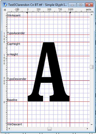
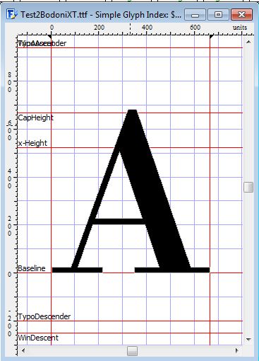
One more question that I have when comparing the “A” of ClarendonCn vs. Bodoni and can’t figure out is that the “width” of the ClarendonCn “A” seems to be 1000 and the BodoniXT “A” seems to be 650. But when I look at this in Word or any other software it seems that the BodoniXT is “wider” than the ClarendonCn, i.e. reversed compared to the numbers in FontCreator. What I’m I not getting?
Cheers!
I am running Windows XP, so I don’t know if this trick works in Windows 7. I presume that it will because FontCreator has to install the font temporarily to display it in the Font Test Window. Maybe your application is not updating its font list until it is launched again.
The Bodoni XT Font from Manfred Klein uses 1,000 funits per em, whereas the Bitstream Clarendon CND font uses 2,048 funits per em. Your screen shot clearly shows the difference in the grid size. This accounts for the different widths: 650/1000 > 1000/2048.
FontCreator will give you all the control that you need, e.g. to modify stroke weights to compensate for the reduction in glyph width. It does take more effort, but its worth it if you are using a font repeatedly.