Hello!
I got a request to make a dotted version of my school font for kids to trace. I’m trying to do this now, but when I import the glyphs, the previously perfectly round circles get distorted. Some are better than others, but none are really round anymore.
Is there a way to avoid this?
(At the moment I’m still using 11.5 because it’s been over 2 years since I last worked on a font.)
Do you import vector or raster based images?
Vector imports should result in a perfect conversion, but be aware font units are rounded to integer values, so if you try to include curves that are only a couple of units, results will be more affected by the rounding.
I import vector images. I work with Corel Draw and export the images as eps files. I have an ancient version of AI that imports the images perfectly. So the eps must be alright. Only when importing them to FC the circles look like that. They are small, but not that small. Every dot is 37x37.
I guess your version of FontCreator is not importing as vector but as raster. You might want to consider upgrading to the latest version.
Yes, I do consider doing that and I hope it’s as simple as that. But is there a free trial to first test if it makes a difference?
The solution is to increase the font units per em value from the default 2048 to 4096 or 8192 if your dots are tiny. A diameter of 20 font units should give you a decent circle; 16 or less will not. However, unless you view the font had huge sizes you won’t see any dots; just a shaded fill pattern.

Resizing Fonts and Changing Unit per Em Values
Since you are starting a new font, change the font unit per em values before importing the glyphs.
Importing vectors will also help as importing bitmaps is much slower and introduces rounding errors. Multiple EPS or PDF files can be imported rapidly by dragging and dropping them from Windows Explorer into the glyph overview.
You can use the unregistered version of FontCreator 13, but it will include logos in random positions in the exported font. The font project itself will appear normal so you can test Font Creator thoroughly before upgrading.
To install FontCreator 13 (64-bit) without changing your existing installation, press Windows Key + R and enter the following command line. I recommend saving your font projects in a new folder too as they cannot be opened in older versions. Many improvements were made in the two years since 11.5 and the font project formats are incompatible.
"%UserProfile%\Downloads\FontCreatorSetup-x64.exe" /DIR="C:\Program Files\High-Logic FontCreator 13"
Thank you for all those hints.
I don’t actually start a new font though. I have my existing font and want to replace letters and numbers with the dotted ones instead. Most of the other glyphs will remain as they are because they are not necessary for first graders that learn how to write letters and numbers. My font doesn’t have an italic version because that’s also not necessary for a beginners’ school font, so I’m planning on making this dotted version to be used as “italic”, so it’s easy and fast to switch to the dots.
So can I change the font units per em anyway or will that affect the existing glyphs? (I haven’t worked on fonts in a while, so I’ve forgotten things.)
As for the dot size - they are 37 in width and height. And yes, this font is supposed to be used in pretty big sizes so a 6 year old with not very advanced motor skills can trace it.
It sounds like you just need to upgrade FontCreator and import vectors.
If this solves the problem, I gladly will. I’ll try it as soon as I get the chance.
Thank you for your support - now and in the past. Without you and this forum my font wouldn’t exist, and it’s been a huge success.
You could try replacing the dots with a circle placed exactly over the dot.
Get a background image of the glyph (Copy from current glyph), delete the mis-shaped dot then paste in the perfect circle and re-size it to be the same size as the dot and in the same place.

Thank you, PJMiller, but there’s just too many dots in every glyph to do it that way.
Also, I just realized that it doesn’t only happen when I import a glyph. Even when I draw a circle directly in FC, I get the same bad result. Even when I increase the units per em to 8192.
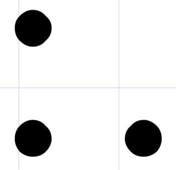
I tried the recent FC version too, but still no round circles (see attachment, which has been drawn in FC 13.0 with 2048 units per em).

I found another font that has small dots and I imported it so I can compare.
That font has only 1000 units per em and the dots are 20x20 and yet they are very good. Looking at the connection lines between the points, they are different though.
The left one in the screenshot is one of mine, the right one from that other font.
What’s the difference and is there a way to achieve this on imported vectors?

The difference is between the two types of curves that FontCreator supports:
Cubic or Quadratic Bezier Curves.
Most vector editing software uses cubic bezier curves while FontCreator supports both quadratic and cubic bezier curves
The curve type can be changed in the font’s Export Settings
The issue you see is clearly due to the fact contour points are rounded to integers. However the virtual on-curve point between two off-curve points is not stored in the font, so a rasterizer will most likely draw a perfect circle, even though FontCreator makes you believe there is an issue.
Since the circles are so tiny, I recommend to use circles with only four on-curve and four off-curve points, like:

Okay, thank you both once again.
I’m glad that there IS a way to get decent dots, although I’m afraid importing will never bring good results, even when I change the type of curves. So I guess I’ll have to do it the hard (hard) way and copy/paste a good dot and place them all (all!) manually. ![]()
One more question though. As I said, I want to make this an “italic” font although it isn’t italic, but I’ll never need a real italic version of this.
My original font is exported as TrueType. Will there be problems if I export this one as CFF (since it’s gonna be the same font family)?
You should avoid mixing different outlines types in a font family.
I was afraid you were gonna say that. ![]()
So I’m making my dots with cubic curves now. That way I get the best result. I will also be redoing the existing font so as not to mix up different outline types in a font family.
But I’m having a new problem now. I have glyphs with intersecting outlines. When I click “Get union of contours”, my shape will be turned into a quatratic curve and I get a notification in the top left corner, warning me about mixed contours.
How can I avoid this?
Unfortunately the operation that unites contour outlines only works with quadratic curves. You could right-click the cubic based contour to revert it back to a quadratic one after you applied “Get union of contours”.
Phew. This project grows and grows because then I need to manually fix all the outlines that get distorted again when turned into a quadratic curve.
What happens if I leave intersecting outlines? What would that do in the finished and exported font?