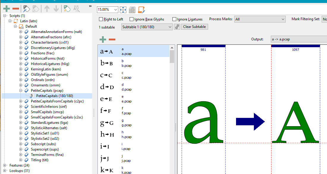
Ah, okay, I see what I did wrong before. I had selected the “Lookups” item in that menu, and then hit the “+” sign from there – and then promptly got confused. 
The feature needs a lookup, so you add the lookup to the feature. The lookup needs a table of glyph substitutions, so then you add those a = A.pcap etc.
Okay, I’m doing this right now…
I right-click on “Default” in the list of scripts, choose “New Item,” then under “Known Feature” I add “Petite Capitals” – and what’s “Petite Capitals From Capitals”? – and then click “Finish.”
Now I right-click on “PetiteCapitals1 (pcap)” in the list and again select “New Item”… and then what? Is this where I select “Single substitution” (as PJ mentioned)?
If I do that, then under “PetiteCapitals1 (pcap)” in the menu I have a new “SingleSubstitution1” item, not a “PetiteCapitals” item, like you have – did you just change the name yourself? Or did I do something wrong here?
As when using the Insert Characters dialogue, the Transform script cannot insert characters that already exist. It will just skip them and add nothing at all if they all exist already.
Ah, okay. Now my universe makes sense again – at least, that small corner of the universe.
I use only applications (Serif apps), which do support OpenType features, so I add them all to one font. It is easier to manage edits and updates, and easier for users to install one set of four fonts, instead of two or three sets. If the Small Capitals are in separate fonts, every time they want to use them they have to switch fonts > MANUALLY > when OT features will do it > AUTOMATICALLY> . However, they have no choice if their favourite application does not support OpenType features.The only other way would be to insert individual glyphs from the PUA.
My own view is that it is best to encourage people to upgrade to better applications rather than trying to support legacy applications forever. PagePlus X5 added OpenType support in October 2010. PagePlus X9 is now at the end of the road, but it’s only £20, so what incentive is there to use Word if they want good typography? Those who don’t care won’t use small caps anyway, they will just set Capitals in a smaller font size. It is all the same to them.
I totally agree with most of what you said there, except the bit about encouraging people to upgrade to better apps. I don’t mean that you shouldn’t encourage them to do so, but encouraging them is one thing – expecting them to actually do it is another thing entirely. If I learned anything from my years doing freelance web design, it’s that you always design for the lowest common denominator – at least, if that’s what constitutes a part of your target audience. Nowadays, I think most web browsers update themselves automatically, but I remember years ago when it was a hopeless endeavour to try to get people “out there” to upgrade their browsers – there’d be, like, whole companies and entire government departments, where every computer was using a browser that 2, 3, even 4 versions behind, and you just couldn’t get them to get everyone to updgrade. And web browsers are free!
When it comes to design software, though, often that’s VERY expensive – and not everyone has money to throw around (I certainly don’t), not to mention students and stuff. I don’t want to design a font that can’t be used by “anyone,” even if the only way some of those people can make use of all the glyphs is in a kludgy sort of way. I did things the kludgy way for years – heck, probably decades – until I finally was able to afford Photoshop and stuff.
Anyway, just my 2 cents on that subject.