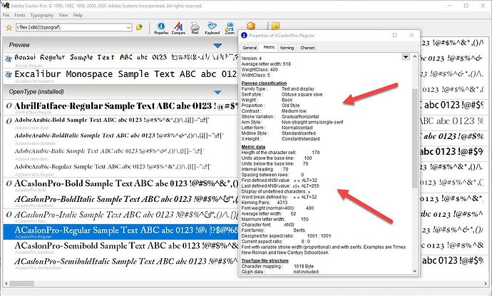
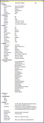
Thank you, I am aware of the font information that is displayed by MainType. One of the reasons that I bought MT, after becoming utterly fed up with FontSuitcase, is because you at least have some information. I want to be clear that I’m not complaining about MT; I’m answering this so that my comments are clarified.
We might add some more of these metrics, but only if they are really useful.
Well, I suspect that our needs, while not unique, are rare. We are a commercial producer of eBooks; font embedding is one of our specialties, and why we are in demand, and thus, we do a lot of it. I would be surprised if you ever had another request for it, or more than one other. Every font manager software company with which I have spoken looked at me as if I was speaking Martian, when I said I needed the info.
MainType shows if a font contains kerning. Does the number of kern pairs mean something? What if those kern pairs all all for Greek while you need pairs for Latin?
You are correct in that the number of pairs, by itself, is a relatively meaningless piece of data.
I don’t understand the use of the other metrics, and some of them don’t even exist in the font, so you might make decisions based on inaccurate information. For example “units above baseline” (100) refers to Windows metrics. Apple uses other metrics, and in this case it is probably 73. Also important is the “Use typo metrics” option, so you miss important information.
Sure, you are right in that. BUT, what I can do is to compare a variety of fonts, using TG, and I can compare the metrics of each font to the others. It doesn’t matter, essentially, if the data is only for Windows, e.g., “Height of the character cell” (although I think that’s universal, not Windows only, no?); what matters is the relative size of one font to the other.
For example, let’s say we have a client that’s done a how-to book, and she’s structured sentences to have an opening defining term in one font, and the description in the other, something like:
Dog: A companion animal that…yadda.
Pretend for a moment that she wants the bolded “Dog:” in one font, and “A companion animal…” in another. In print, you can pretty much do whatever you like. You could use, for example, Ivory Headline, for Dog and you could use our old friend ACaslonPro for the body. Right? Easy-peasy.
However, in an eBook, even though you can embed both, and it will look good on those devices that behave and render the way you tell them to render, you have to think about the millions of devices that won’t or can’t or will have the user override what you’ve done. According to TG, Caslon has a “height of character cell” of 170; whilst Ivory has a height of 115. Now, truth be told, these are quite close, but pretend for a moment that they aren’t–many, many handwriting fonts, for example, are wee–really tiny. So, you tell the software that Caslon should be rendered at, say, 1em–about 12pt, give or take a lie or two. To make the Ivory look “right” against the Caslon, let’s say that we tell it to display at…1.4ems, or even 2ems.
When the book is rendered, in a single font–let’s say, Caecilia on an older Kindle–then the unintended consequence of the Caecilia being used for both fonts, right? And it will obey the CSS that tells it to display the body at 1em–and the run-in heading (the Ivory portion) at 1.4ems, and it will a) look dumb and b) affect the relative line-heights of the lines of text, looking even dumber.
Typically, this issue is more pronounced than what I’ve described; we run into it constantly around decorative fonts like Papyrus clones. (Don’t ask. You cannot tell authors that they oughtn’t use Papyrus for headings. I blame James Cameron for this.) For a few years, Papyrus proper wouldn’t work, at the KDP (Kindle), so we had to use similar/look-alike fonts. Many of them were QUITE small.
Anyway, I digress. The point is, while the “height of the character cell” may be irrelevant, in any other context, it gives us something that we can compare, one to the other. Right? I mean, any measurement mechanism is fine, if you are comparing like to like. That’s how we use it. It would be very helpful, to us, if we had another comparative measurement–e.g. “if you compared this font to TNR, what size is it?,” which we also do, using the like-to-like metrics in TG. (FYI, TNR has a char cell height of 114, with an average character width of 40.) Ideally, if I had some magic way to look at a font and see that it’s approximately the same ascender line height, same x height, same Cap height, same meanline, THAT would be awesome, but I don’t, so we make do.  (FYI, I also use an inexpensive app, Typography Insight (Microsoft Store) which allows me to do a custom waterfall, in which I can compare the “12pt” size of one font to another. It’s not great, but it’s a quick way to see very rapidly if a given font is dramatically different, at its base font size, than the font I’m planning to use with it.
(snipped an image)
Don’t get me wrong, as I totally understand your need for specific metrics. I’m not sure if you’ve ever used FontCreator. It will show you way more information, and if you can tell me what information might be useful in MainType, we’re happy to consider it!
Well, as nice as MT is, other than “width,” really, it doesn’t offer much in the way of sizing information. That’s my need. And, I don’t blame you forr not providing it; as I said, most folks will never need it. (Until making higher-end/designed eBooks becomes the norm.) I believe I only mentioned it to clarify why I have so many font managers.
(n.b.: I’m completely over FS. I agreed to be a beta tester for their new release, and lo–their beta version overwrote my existing, professionally-licensed version, and now I cannot use it, at all, without removing the beta and reinstalling the older version, losing ALL of my custom work in the app–or, I can pay to “upgrade” to a version that EVERYONE hates. I don’t know what they were thinking when they designed it, but if you’ve perused their forums, it’s a universal hatred for the new layout and design, and from a time-motion standpoint, utterly idiotic redesign. I felt so aggrieved, taht they thought that this was appropriate behavior that I decided that my relationship with them was over.)
So, that’s my story. The genesis of the metrics isn’t as important as the simple ability to compare one to the other in a consistent fashion. Yes, it would be groovy if we had a basis to compare (“this font is 80% of the meanline of TNR”), but…as I said, given that we have a rare requirement, I don’t expect to see that, really, from any type manager. I’m lucky that it’s in TG.
Oh, I forgot to mention–I have and have licensed FontCreator. Yes, I could use that, too, but that’s a few extra steps. (Honestly, I only needed it once, because it’s easier than FontForge, but I got tired of my last version of MT haranguing me CONSTANTLY to buy it–even AFTER I bought it. I’m glad to see that that’s fixed or removed or whatever in V8, because it was really starting to tee me off. Nothing worse than being spammed in a program you’ve paid for, to buy another program that yes, you’ve already paid for and installed.)
Thanks for your detailed replies.
Hitch


