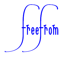
Sonnet Calligraphic

Last Saturday morning I experimented with adding some glyphs each of a letter b each with a high sinewave-like calligraphic swash.

The idea is that the sinewave-like calligraphic swash is produced with a minimum number of points. I began with just off-curve points spaced either 256 font units or 512 font units horizontally apart and each with one of just two vertical positions. Thus the sinewave-like calligraphic swash is produced largely by the mathematical nature of the Bézier curves used in TrueType fonts. I then added an on-curve point mid-way between each pair of adjacent off-curve points.

Here is some transcript.

---- Start of transcript

7:33 am

Open SONNC021.TTF.

Save as SONNC022.TTF.

Use Tools AutoNaming… so as to adjust the name and date.

Add U+E5EF Alt 58863 as a copy of U+E5E7 and then delete all except the basic letter b.
Add a sine-wave-like flourish.

Add U+E5F0 Alt 58864 as a copy of U+E5EF and try to make the flourish diminish as it goes along.

There are eight blocks of 256 to go in by 256 either down or up.
So that is 32 font units per block for a linear diminishing.
This leaves one point as off-curve extreme, so use automated validation to fix this problem.

This seems to be too much diminishing, on a purely subjective aesthetic basis.

So, try again by adding U+E5F1 Alt 58865 as a copy of U+E5EF, this time using a diminishing of 16 font units per block.

---- End of transcript

When producing the diminishing curves, I first deleted the on-curve points that were between the off-curve points of the sinewave-like calligraphic swash and then moved most of the off-curve points vertically. I then added an on-curve point mid-way between each pair of adjacent off-curve points. This left one point as an off-curve extreme point, so I used automated validation to fix this problem.
SONNC022.TTF
Here is some text ready to copy onto the clipboard and then paste into WordPad and then format at 72 point using the Sonnet Calligraphic 022 font in case any readers would like to try the font.

banana
anana
anana
anana

William Overington

10 May 2010
On Monday 10 May 2010 I produced the Sonnet Calligraphic 023 font, which adds one glyph, a calligraphic f somewhat lower than the previous calligraphic letters f.

Here is a transcript of the notes that I made at the time.


Monday 10 May 2010

12:33 pm

Open SONNC022.TTF.

Save as SONNC023.TTF.

Use Tools AutoNaming… so as to adjust the name and date.

Add U+E5F2 Alt 58866 as a copy of U+E5C3, the second of the large calligraphic letters f.

Try to redesign the U+E5F2 glyph of an f so that the phrase eautiul cairap looks good.
Try to use a copy of the flourish with the going back piece from U+E5BB, a glyph of a b.
Yet maybe somewhat higher.
Various moving of points tried so as to get a first attempt.
That includes some from the lower flourish so that it looks more balanced.

1:04 pm


Earlier this morning I used the font with the Serif PagePlus version X3 program to produce both a pdf document file and a png graphic file of the phrase beautiful calligraphy.
SONNC023.TTF
beautiful_calligraphy.pdf
beautiful_calligraphy.png
William Overington

15 May 2010

Here are two typecase_ pdfs.
typecase_Sonnet_Calligraphic_023_calligraphic_alternates.pdf
typecase_Sonnet_Calligraphic_023_calligraphic_ligatures.pdf
William Overington

17 May 2010

Yesterday I experimented by trying to add a calligraphic version of a v to the font.

In the event, three glyphs were added.
SONNC024.TTF
I used much the same technique as before of constructing a framework for the calligraphic flourish using on-curve points and then making them become off-curve points and then adding an on-curve point between each pair of adjacent off-curve points. However, there was some difference this time as up until now all of the lines had been either horizontal or vertical, yet this time one of the lines is at an angle.

The line was extended by a process that was started by making a copy of the original v contour and pasting it into the glyph and then moving the contour to the right by 400 font units and then deleting the left side of the contour so that a copy of just the right side of the contour remained.

The coordinate values of the upper left point of the right side of the v were noted.

The coordinate values of the lower left point of the copy of the lone right side were noted.

The lone right side contour was then moved using the arrow keys, sometimes using the arrow keys in conjunction with the Shift key or the Control key, so that the two points became coincided.

The two contours were then joined. This produced a single contour of a v with a longer right side.

The extending process was repeated so that a still longer right side was produced.

Along the way a few points were deleted from the right side as thought desirable.

Here is a transcript of the notes that I added to a WordPad .rtf file as I went along.

====

Thursday 20 May 2010

6:53 am

Open SONNC023.TTF.

Save as SONNC024.TTF.

Use Tools AutoNaming… so as to adjust the name and date.

Add U+E5F3 Alt 58867 as a copy of v.
Try to make the right side line go up and over to the right.

The glyph seems to curve off at too high a point.

Copy it as U+E5F4 Alt 58868 and try to make the curve start at a lower point.
Try, for each side of the line, splitting the difference and deleting the upper points from where the curve started previously.

Try U+E5F5 Alt 58869 as a copy of U+E5F4 that goes out further to the right.

Which of the latest two glyphs is better? Or does it depend upon the text with which it is used?


about 7:25 am


12:38 pm

Alter U+E5F3, U+E5F4 and U+E5F5 so that each has a three point rounded end on the calligraphic flourish.
Use a height of three-quarters of the width. That is a height of 24 font units with a width of 32 font units.

====

William Overington

21 May 2010

Yesterday I made a new version of the font, adding four glyphs.
SONNC025.TTF
Here is a transcript of the notes that I made in a WordPad .rtf file as I proceeded.


Thursday 27 May 2010

7:22 am

Yesterday I was experimenting with using the font and tried typesetting the following.

beautiful calligraphy in the style of the renaissance

Two matters were noticed.

In the word style, using either of the calligraphic st ligatures results in a clash with the lowercase l. I thought that it would be worth trying to add a calligraphic st ligature that would not clash with a lowercase l that follows it.

In the word renaissance, although a swash end-of-word calligraphic e can be used, the font has nothing that allows the word to stand out. I thought that it would be worth trying to add a calligraphic double long-s glyph to the font.

Open SONNC024.TTF.

Save as SONNC025.TTF.

Use Tools AutoNaming… so as to adjust the name and date.

As a step towards producing a calligraphic double long-s glyph, first add three calligraphic long-s glyphs, by copying the calligraphic f glyphs and adapting them.

Add U+E5F6 Alt 58870, U+E5F7 Alt 58871 and U+E5F8 Alt 58872 as copies of U+E5C2, U+E5C3 and U+E5F2.

  

Make the advance width of each 128 font units.

Try adding U+E5F9 Alt 58873 as a ligature glyph made of two copies of U+E5F7.

Replace the descender of the first s by a copy of the descender of U+E5F8.

The advance width is increased to 256 font units.

Lower the ascender of the second s by 128 font units.

Move the end structure of the ascender of the first s to the right by 128 font units and move the end structure of the second s to the left by 128 font units, taking care to delete the on-curve mid points at the centre top before moving and adding them again after moving.


William Overington

28 May 2010

On Friday 28 May 2010 I made a new version of the font. This version adds two glyphs.
SONNC026.TTF
Here is a transcript of the notes that I made at the time.


Friday 28 May 2010

1:25 pm

Open SONNC025.TTF.

Save as SONNC026.TTF.

Use Tools AutoNaming… so as to adjust the name and date.

As U+E5F9 has two separate contours, try to make U+E5FA Alt 58874 and U+E5FB Alt 58875 as individual letters long-s, one as a copy of one contour and one as a copy of the other contour.

 

Make the advance width of each 128 font units.

The long-s made from a copy of the second of the contours needs moving to the left by 128 font units.


William Overington

31 May 2010

On Monday 31 May 2010 I added four glyphs to the font. These are U+E5FC Alt 58876 through to U+E5FF Alt 58879 by starting each of them as a copy of the b with the long flourish of U+E5F1 Alt 58865 and adapting them for h, k, lowercase l and t respectively.
SONNC027.TTF
Here is a transcript of the notes that I made at the time.


Monday 31 May 2010

12:50 pm

Open SONNC026.TTF.

Save as SONNC027.TTF.

Use Tools AutoNaming… so as to adjust the name and date.

Add U+E5FC Alt 58876 through to U+E5FF Alt 58879 by starting each of them as a copy of the b with the long flourish of U+E5F1 and adapting them for h, k, lowercase l and t respectively.

   

The advance width of the lowercase l needs changing to become 128 font units.

The notes made on Saturday 8 May 2010 show the design of the b going back to a copy of U+E5E7.


William Overington

2 June 2010

Yesterday afternoon I added one glyph to the font.

The additional glyph is mapped to U+E60A Alt 58890. It is a calligraphic lowercase l, designed so that a non-overlapping double lowercase l can be produced when U+E5FE Alt 58878 and U+E60A Alt 58890 are used together. For example in the word windmill.
SONNC028.TTF
Here is a transcript of the notes that I made at the time.


Wednesday 2 June 2010

16:17 pm

Open SONNC027.TTF.

Save as SONNC028.TTF.

Use Tools AutoNaming… so as to adjust the name and date.

Add U+E60A Alt 58890 by adapting a copy of U+E5FE Alt 58878 so that a non-overlapping double lowercase l can be produced when U+E5FE and U+E60A are used together. For example in the word windmill. This is at U+E60A rather than at U+E600 as ten spaces are left unused at present so that hopefully variations on ct and st etc so as not to clash with the ascenders of a following lowercase l can be produced.
Move all of the points above the baseline down by 256 font units. That is, move all but two of the points down by 256 font units.

windmi


William Overington

3 June 2010

On Monday 7 June 2010 I added ten glyphs to the font. They are U+E60B Alt 58891 through to U+E614 Alt 58900 as long ascender and descender versions respectively of b, d, h, j, k, l, p, q, t and thorn.
SONNC029.TTF
Here is a transcript of the notes that I wrote as I made the additions.


Monday 7 June 2010

11:15 am

Open SONNC028.TTF.

Save as SONNC029.TTF.

Use Tools AutoNaming… so as to adjust the name and date.

Add ten glyphs, U+E60B Alt 58891 through to U+E614 Alt 58900 as long ascender and descender versions respectively of b, d, h, j, k, l, p, q, t, thorn. Produce them by moving the end structures up or down by 512 font units in each case.

         


William Overington

9 June 2010

I have been having some fun trying the Sonnet Calligraphic 029 font within a multimedia authoring program named Opus Creator.

I have exported a stand-alone executable file for a PC and I have uploaded it to our family webspace. It is 2,075,106 bytes in size.

http://www.users.globalnet.co.uk/~ngo/calligraphic.exe

In addition, as it is a .exe file and I am making it available on the web, I emailed a copy from one email address to another, the receiving email address holding emails on the server and having a virus-checking system that checks a file before allowing one to download it to local storage and it reported “No virus threat detected”.

The .exe file was exported from Opus Creator earlier this afternoon, by me, on the same computer that I regularly use. For provenance I mention that Opus Creator is made by Digital Workshop and http://www.digitalworkshop.com is their webspace.

However, upon running the program, Windows prompts and says that it is from an Unknown Publisher. At present I do not know how, or if, without disproportionate cost, I can change that.

Anyway, all it does is draw some text on the screen, glyph by glyph, one at a time, using the Sonnet Calligraphic 029 font.

Some of the glyphs used were introduced in the Sonnet Calligraphic 029 font and some were introduced in earlier versions and are also in the Sonnet Calligraphic 029 font.

William Overington

9 June 2010

Some readers might like this link to a thread of this forum that has within it a link to an experiment that I tried using the Sonnet Calligraphic 029 font. I have still not found the answer to the problem, so links to the web pages mentioned in that post have not been included directly in this thread.

William Overington

29 June 2010

Yesterday I was doing some writing about food and produced some text for a forum using Microsoft WordPad.

Later, after I had written the text and produced a title, I decided to try to make a pdf version.

During that process I decided to put the title in the Sonnet Calligraphic font and to try to use some swash glyphs.

Thus the attached pdf is not an example devised to display some particular glyph or glyphs of the font, it is a document starting from the text and then using the font with the text that is there.

The body text is set in a font that I produced some time ago using Scanahand, during the original beta test, and modified slightly using FontCreator. The modifications are small, I produced individual glyphs for some ligatures by extracting them from the signature glyph where I had drawn their artwork. The Gallery Plus version, used here, has the lowercase h moved vertically as I had drawn it too low and it stood out. I use the font as my personal font in situations where I wish to combine the functionality of a serifed book typeface with the personal look of a handwritten typeface.

Thus the document displays text that I have written myself using fonts that I have designed myself with those two aspects independent of each other.
oven_chips_pasta_and_rice.pdf (14.7 KB)
William Overington

20 October 2010

Here are two typecase_ pdfs.
typecase_Sonnet_Calligraphic_029_calligraphic_alternates.pdf (11.6 KB)
typecase_Sonnet_Calligraphic_029_calligraphic_ligatures.pdf (8.74 KB)
William Overington

18 June 2011

I have been experimenting with trying to design some alternate, end of phrase, calligraphic glyphs for the lowercase e character.

I decided to add the designs into a Sonnet Calligraphic 030 font as I experimented.

In the event I produced seven designs, each provided in two glyphs, one with an advance width the same as an ordinary e and one with an advance width to align with the rightmost side of the glyph.

They are located in the plane 0 Private Use Area from U+E63C Alt 58940 to U+E649 Alt 58953.

Here is the font.
SONNC030.TTF (37.3 KB)
William Overington

22 June 2011

Here is the Sonnet Calligraphic 031 font.
SONNC031.TTF (40.2 KB)
The font has sixteen new glyphs.

They are é versions of each of the fourteen glyphs added to the Sonnet Calligraphic 030 font and é versions of the two original non-calligraphic alternate glyphs for e.

The mappings are as follows.

U+E650 Alt 58960 through to U+E65D Alt 58733 for the é versions of each of the fourteen glyphs added to the Sonnet Calligraphic 030 font.

U+E63A Alt 58938 and U+E63B Alt 58939 for the é versions of the two original non-calligraphic alternate glyphs for e.

The two original non-calligraphic alternate glyphs for e are located at U+E5CA Alt 58826 and U+E5CB Alt 58827.

Here is a design produced using the Serif PagePlus X3 program using the Sonnet Calligraphic 031 font.

The design was produced using two text frames that were overlapped and that were then grouped and the grouped object exported as a png graphic.


William Overington

25 June 2011

The Sonnet Calligraphic 032 font adds two new glyphs. These glyphs were added as an experiment so as to determine whether the desired results were possible.

At U+E6A0 Alt 59040 is another alternate glyph for the lowercase g. Starting with a copy of the glyph at U+E5C1 Alt 58817, which is the glyph used in the Café Oregano graphic in the previous post in this thread, the tail of the g goes round and up and over. The loop was designed so that it would go round a space and the letters O, r and e, so that it could be used in a Café Oregano graphic.

At U+E6A1 Alt 59041 is another alternate glyph for the lowercase g. Starting with a copy of the glyph at U+E6A0 Alt 59040, the tail of the g goes round and up and over and then down and under. The loop was designed so that it would go round a space and the letters O, r and e; and so that it would go round the letters a, n and o and a space so that it could be used in a Café Oregano graphic.

When first testing the font I used WordPad with the text at 72 point, using the Alt codes to enter the alternate characters. Later, I found that using the font in WordPad at 144 point using colour produces stylish displays that can be saved onto the clipboard using Print Screen and then pasted from the clipboard into the Paint program, from where a graphic can be produced.

Here are two graphics made using the font, using the Serif PagePlus X3 application program. They are adapted from the design used for the Café Oregano graphic in the previous post in this thread. I found that when producing the oregano_59040 design that I needed to move the text frame containing the word Oregano vertically downwards. The design for the oregano_59041 design is produced from a copy of the oregano_59040 design without any adjustment of the relative position of the text frames.
SONNC032.TTF (40.6 KB)
The images may at first appear with a scroll bar down the right side. Clicking on the image may cause the scroll bar to disappear and the whole image become displayed.


William Overington

12 July 2011

The Sonnet Calligraphic 033 font adds three new glyphs. These glyphs were added to find out what resulted from making a copy of the U+E6A0 Alt 59040 glyph, deleting the curved tip of the tail of the g and replacing it with a copy of a calligraphic flourish copied from one of the recently added alternate ending letters e.
SONNC033.TTF (41.2 KB)
Here is a transcript of the notes that I made as I produced the three glyphs.

Start of transcript

Wednesday 13 July 2011

7:47 am

Open SONNC032.TTF.

Save as SONNC033.TTF.

Use Tools AutoNaming… so as to adjust the name and date.

Add a glyph at U+E6A2 Alt 59042.

Copy the glyph from U+E6A0.

Add a copy of the calligraphic flourish from U+E63C.

Add a glyph at U+E6A3 Alt 59043.

Copy the glyph from U+E6A0.

Add a copy of the calligraphic flourish from U+E63E.

Add a glyph at U+E6A4 Alt 59044.

Copy the glyph from U+E6A0.

Add a copy of the calligraphic flourish from U+E640.

Validate.

Test.

08:36 am

End of transcript

William Overington

14 July 2011

The Sonnet Calligraphic 034 font adds three new glyphs.
SONNC034.TTF (41.9 KB)
The new glyphs are located at U+E6A5 Alt 59045, U+E6A6 Alt 59046 and U+E6A7 Alt 59047.

Each of the new glyphs is a calligraphic alternate of lowercase p.

William Overington

21 July 2011

Here is the Sonnet Calligraphic 035 font.
SONNC035.TTF (42.3 KB)
This font adds four glyphs, each for a calligraphic lowercase f.

Here is a transcript of the notes that I made as I produced the font.


Saturday 23 July 2011

9:34 am

Open SONNC034.TTF.

Save as SONNC035.TTF.

Use Tools AutoNaming… so as to adjust the name and date.

Add a cell at U+E6A8 Alt 59048

Copy the glyph in U+E5C3 into U+E6A8.
The idea is to try to produce a calligraphic f that can be used twice in the word freefrom without an overlap.
The starting design has the right side of the glyph at 1536 font units.
A first thought was to try to make a design that has a right side of the glyph at 1024 font units; yet it could go a little more to the right without an overlap, if so desired, maybe as much as another 192 font units.
Testing, by copying the glyph, pasting on top and moving right by 1024 font units and magnifying shows that there is no overlap, but not by much, so keep this version yet try to make another version so that there is a gap. Try moving 64 font units back.
Add a cell at U+E6A9 Alt 59049 for that version.

Please note that the tail of the f is unaltered in either glyph.
Add a cell at U+E6AA Alt 59050 for a version moved back by another 128 font units.

Add a cell at U+E6AB Alt 59051 for a version moved forward by 64 font units to add another glyph with a glyph width between the previous two.

For convenience, U+E5C3 Alt 58819 is included here.

10:26 am


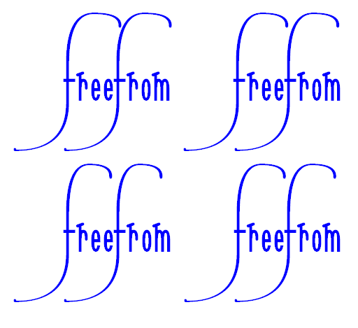
Here is a graphic, made using Serif PagePlus X3, with the word freefrom four times. Clicking on the graphic may remove the scrollbar and display the image in full.


Each setting of the word freefrom uses two copies of the same calligraphic glyph.
Upper left has U+E6A8, upper right has U+E6A9, lower left has U+E6AA and lower right has U+E6AB.

I note that, in the Sonnet Calligraphic font, the word from is wider than the word free: each of the letters r, e and o has the same advance width, the letter m has a larger advance width. So in setting the word freefrom a choice needs to be made as to whether to use the same calligraphic glyph for each letter f or whether to use a wider calligraphic glyph for the second letter f.

Here is a graphic using U+E6AB and U+E6A9 together.


William Overington

25 July 2011

In the thread entitled Pantone Colour of the Year for 2012 and fonts, there is a graphic displaying two new Sonnet Calligraphic glyphs, namely a calligraphic o glyph and an additional calligraphic g glyph.

Here is the font that contains the two new glyphs.
SONNC037.TTF (43 KB)
Here is an extract from the transcript.


Add a glyph at U+E6AC Alt 59052.
Copy the glyph of U+E642.
Move 224 font units upward and change to become a calligraphic o, copying the contours of an o.

Also, try a sweeping back g.

Add a glyph at U+E6AD Alt 59053.
Copy the glyph of U+E5C1


The font also contains four experimental free-standing calligraphic flourishes that I produced while experimenting on 18 August 2011.

Here is some transcript.


Thursday 18 August 2011

2:59 pm

Open SONNC035.TTF.

Save as SONNC036.TTF.

Use Tools AutoNaming… so as to adjust the name and date.

Try to add some flourishes starting at U+E6F0 Alt 59120.

Add a cell at U+E6F0 Alt 59120.
Try to add a stand-alone flourish based on the flourish of the lowercase pp at U+E5DB.

Add a cell at U+E6F1 Alt 59121.
Try to add a stand-alone flourish based on the flourish of the lowercase pp at U+E5DC.

Add a cell at U+E6F2 Alt 59122.
Try to add a flourish based on that in U+E6F0 by replacing the leftmost 1024 font units with a double mirrored copy of the rightmost 512 font units, positioned so as to join together.

That does not seem to look good aesthetically, so add a cell at U+E6F2 Alt 59123.
Try to add a flourish based on that in U+E6F2 by replacing the centre decoration with a horizontal straight line.

3:43 pm


Viewed some months later, the flourish at U+E6F2 Alt 59122 seems much better than I thought at the time that I produced it.

William Overington

23 December 2011