Sonnet Calligraphic

Some readers may remember that I have used the Sonnet Calligraphic font in a title when producing a pdf of some text that I had written about food.

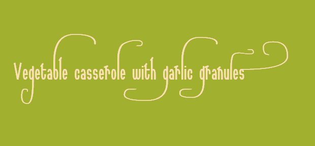
Last Saturday I was thinking about writing some text about using garlic granules in a vegetable casserole, and, thinking that I might try to produce a pdf of the text, I wondered if, following on from the success of making the calligraphic end of word o for the tangerine tango mini-project, whether I could make a calligraphic end of word s for use in the phrase garlic granules in the title of the text that I was thinking about writing.

While fontmaking I added two other glyphs at the same time, both of which are used in the finished example.

Here is some transcript.


Saturday 7 January 2012

16:34

Open SONNC037.TTF.

Save as SONNC038.TTF.

Use Tools AutoNaming… so as to adjust the name and date.
Also, update the copyright notices to 2012.

As the calligraphic end of phrase o was successful, try to produce a calligraphic end of phrase s to use in garlic granules

Add a glyph at U+E6AE Alt 59054.
Copy the glyph of U+E6AC.

Add a glyph at U+E6AF Alt 59055
Copy the glyph at U+E5E2, which is a lowercase l with a calligraphic swash.
Try to make a calligraphic b for use in vegetable casserole.
Try to make the calligraphic sweep slightly different from that of the lowercase l

Add a glyph at U+E6B0 Alt 59056
Copy the glyph at U+E5C4, which is a g with a long vertical.
Try to make a wider version that goes back under the previous character for use in the word vegetable.

Font saved at 17:35:06


Here is the text using calligraphic glyphs, using various Private Use Area characters to encode the calligraphic glyphs. If copied onto the clipboard and pasted into WordPad and then formatted using the Sonnet Calligraphic 038 font at 72 point, the result should be displayed.
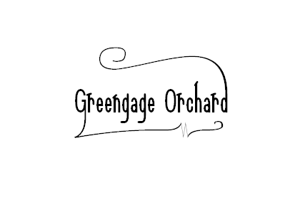
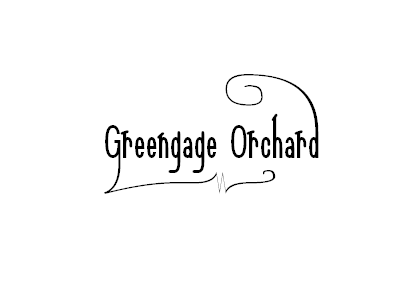
Veetale casseroe with aric ranue

I am not a pen and ink calligrapher and I have no formal training in how to produce calligraphic designs, so what I write here is just my own experiences of what I have tried.
The text started as follows.

Vegetable casserole with garlic granules

I regarded that as follows.

(Vegetable casserole) with (garlic granules)

I regarded garlic granules as the part of the title that I wanted to emphasise, so I made that more calligraphic. I deliberately did not use calligraphic glyphs within the word with.

In typesetting garlic granules I used the same two calligraphic g glyphs as for tangerine tango, though in the other order. This was initially to avoid an overlap in the display, yet works well, as in tangerine tango, the word tango is emphasised whereas in garlic granules the word garlic is emphasised.

tanerine tan

In making the calligraphic b sweep slightly differently from that of the lowercase l, I was trying to avoid making the result appear too automated. I was trying to give the display a look more as if the title had been drawn directly by pen and ink with the natural slight variation that that may produce, that variation avoiding an effect of noticing that two sweeps are identical.

When I am fontmaking for the Sonnet Calligraphic font I use the Font Test… facility of FontCreator to build up the examples as I proceed.

I make the character in WordPad, within the transcript notes, using an Alt code. This appears as a black rectangle in WordPad as I am using the Arial font within WordPad. I then copy the character onto the clipboard and paste it into the test page of FontCreator. This means that I can try how glyphs display within words as I proceed.

Here is the font.
SONNC038.TTF (43.4 KB)
William Overington

9 January 2012

During the winter, one day I was experimenting and I produced the following font.
SONNC039.TTF (44.7 KB)
The font has six more mapped glyphs than the Sonnet Calligraphic 038 font.

The new mapped glyphs are located at U+E6B1 through to U+E6B6.

The Alt codes are Alt 59057 through to Alt 59062.

     

The first glyph is a swash end of phrase w, such as might be used in the word snow. The flourish is copied from the flourished lowercase o.

The next three glyphs are copies of that swash end of phrase w, each with a stylised snowflake. The design was because I was thinking of using the glyph in white upon a dark blue background.

The other two glyphs are letters t, each with a flourish spiral, such as could be used in the word starry. They are different so that two letters t each with a flourish spiral could be used together without each being of exactly the same design.

William Overington

27 March 2012


I produced the above graphic earlier today.

The graphic was produced using the Serif PagePlus X4 program. The text is in 72 point.

William Overington

29 March 2012


I produced the above graphic earlier today.

The graphic was produced using the Serif PagePlus X4 program. The text is in 72 point.

Having used the calligraphic t and the calligraphic w, I wondered what to do about the y and the g. I decided to use the basic y glyph of the font, yet I did not want to use just the basic g glyph of the font, though I did not want to distract the effect of the calligraphic spiral of the t in the word Starry by having too large a flourish on the tail of the g.

After a few tests, I decided to use one of the swash g glyphs that are in the Sonnet Calligraphic font as a result of being in the Sonnet to a Renaissance Lady font upon which the Sonnet Calligraphic font is based.

William Overington

30 March 2012

On Monady evening I was experimenting and I produced a new version of the Sonnet Calligraphic font, namely the Sonnet Calligraphic 040 font. The new version of the font has two more mapped glyphs than does the Sonnet Calligraphic 039 font.
SONNC040.TTF (45.2 KB)
Earlier today, I produced the following two graphics using the font. I used Serif PagePlus X4 to produce the graphics.


Here is a copy of the notes that I made as I produced the font.


Monday 2 April 2012

7:51 pm

Open SONNC039.TTF.

Save as SONNC040.TTF

Use Tools AutoNaming… so as to adjust the name and date.

Try to make a calligraphic s that has a backward flourish so as to be used in the word ingredients in the phrase
no gluten-containing ingredients

Add a glyph at U+E6B7 Alt 59063

Start with a copy of the ordinary s glyph and try to adapt a copy of the flourish from the U+E6A2 glyph, including mirroring it horizontally.

Try to keep the end of the flourish in a grid box.

Please consider the word ingredients.

Each letter i counts as one half width of a grid square, so the flourish back is over the ingredient part, without the s counted.
This is a total of nine grid squares, if going back all the way to the start of the word, yet maybe only go back seven or eight grid squares.

The lower level of the flourish needs to be somewhere between 384 vertical and 448 vertical.

Half way is 416, so try 416.

I feel that the calligraphic flourish needs to leave the top of the letter s vertically and then curve, so adapt the design..


Try to make another calligraphic s that has a backward flourish so as to be used in the word ingredients in the phrase
no gluten-containing ingredients

Add a glyph at U+E6B8 Alt 59064

Start with a copy of the ordinary s glyph and try to adapt a copy of the flourish from the U+E6A4 glyph, including mirroring it horizontally. Try to keep the end of the flourish on a grid intersection point.


William Overington

4 April 2012

Here is the Sonnet Calligraphic 041 font.
SONNC041.TTF (46.8 KB)
This font adds eight mapped glyphs and also three unmapped glyphs including two that will hopefully be of interest to people who download the font and study it using FontCreator.

There are seven additional calligraphic glyphs for lowercase d.

These are mapped from U+E6BB9 Alt 59065 through to U+E6BF Alt 59071.

      

There is an attempt to produce a calligraphic capital G.

This is mapped at U+E6C0 Alt 59072.

This calligraphic glyph is different from every other calligraphic glyph thus far produced in the Sonnet Calligraphic collection of fonts in that the effect that I am trying to produce as if a pen is swept in one general direction then stopped and swept back in very approximately the same direction, producing a cusp type effect, though not intended to be a cusp point as such due to the supposed width of the simulated pen stroke.

Here is a transcript of what I wrote at the time I produced the glyph, which explains the two unmapped glyphs that I mentioned previously.

quote

Try to make a glyph from a G and the tail of the calligraphic p.
This is interesting, yet tricky.
I feel that the result is not quite right, so before joining the two contours, make two unmapped copies of the glyph at the end and delete one contour from each so as to conserve the opportunity to try some more from the same two pieces yet also be able to validate the font correctly.

end quote

Here are two graphics made using the font.

The first one was made using the same colour as used in the greengage.pdf document earlier in this thread. That colour is Serif 05-06 and I used it in the Serif PagePlus X4 program to make the first of the graphics below.

The second one uses black ink though is otherwise the same as the first one.


Here is an image selected from a Print Screen image made from a display of the glyph in FontCreator.

Each of the two calligraphic lines that were joined had points at (32, -736) and (64, -768), which are the coordinates of the two points at the outside of the cusp type effect in the completed glyph for the calligraphic G.

The point at the inside of the cusp was produced by FontCreator automatically when it joined the two contours together. It is at (164, -713).

William Overington

24 April 2012

Here is the Sonnet Calligraphic 044 font.
SONNC044.TTF (47.3 KB)
This font adds two mapped glyphs, each for a calligraphic capital letter G.

A glyph at U+E6C1 Alt 59073

A glyph at U+E6C2 Alt 59074

These glyphs use a design used previously elsewhere in the font.

Here is a repeat of an earlier image and two new images.


William Overington

21 May 2012

Here is an additional image using the same calligraphic G as in the previous image yet using a different calligraphic d.


William Overington

21 May 2012

Here is a later version of the font.
SONNC046.TTF (47.8 KB)
Here is some transcript from my notes.


Tuesday 22 May 2012

3:45 pm

Open SONNC044.TTF.

Save as SONNC045.TTF

Use Tools AutoNaming… so as to adjust the name and date.

Try to make versions of w, W and swash W based on letters v and V, keeping the same width as the original versions.

Add a glyph at U+E6C3 Alt 59075

Add a glyph at U+E6C4 Alt 59076

Add a glyph at U+E6C5 Alt 59077


Friday 20 July 2012

9:41 am

Note that SONNC045.TTF is dated 24 May 2012 in both the name and the settings.

Open SONNC045.TTF.

Save as SONNC046.TTF

Use Tools AutoNaming… so as to adjust the name and date.

Add a glyph at U+E6C6 Alt 59078

Try a t with a calligraphic swash that goes up and back over.


William Overington

24 November 2012

Pantone has announced its Colour of the Year for 2013.

It is Emerald.

There is a thread in the Font Related Information section of this forum entitled Pantone Colour of the Year for 2013 and fonts.

The Sonnet Calligraphic 047 font adds one mapped glyph.

It is for the calligraphic d in the following illustration.


The calligraphic d has been designed specifically for setting the word Emerald so that a calligraphic flourish could go back over towards the start of the word Emerald without overlapping a calligraphic lowercase l used just before the calligraphic d.

The glyph is mapped at U+E6C7 Alt 59079

A copy of U+E42C was used to start the design and its advance width was set to 256 font units.

A copy of the glyph from U+E6BB was then added.

The contours were then edited and merged so as to make an up and over calligraphic d.

Here is the font.
SONNC047.TTF (48 KB)
William Overington

7 December 2012