Version 2.31 adds some more kerning pairs and WOFF2 versions.
Great to know that ![]() . Now, we are experiencing the same problems for Spanish with the Pali and Acariya font faces
. Now, we are experiencing the same problems for Spanish with the Pali and Acariya font faces ![]()
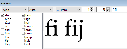
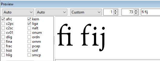
Make sure that you have the latest versions of Acariya and Pali. They both now use Discretionary Ligatures for íj.
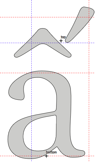
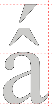
I have them (I made my assignments this week ![]() ). The problem is not with the íj but the fij
). The problem is not with the íj but the fij ![]()
Gotcha ![]() Thanks for your prompt response.
Thanks for your prompt response.
June 2020 ver 2.40
This is still work in progress, but I attach it here in the hope of some feedback. I am sure there are some bugs that I still need to fix before it is ready for publication. I have made many changes since the last release in September 2018. Here is a short list of the most significant changes.
- Used anchor-based composites and auto-attach wherever possible
- Added Pictographs for globemeridians, lightbulb, and clockfaces 1-12
- Added colour glyphs for globes
- Added colour glyphs for Transport and Map Symbols, rocket
- Added sample text to Font Properties
- Edited contours for Æ glyphs (among others)
- Adjusted kerning using glyph spacing factor of 27
- Renamed superior and inferior glyphs with *.sups *.subs extensions
- Added mappings to pcap, smcp, sups, and subs to work around a bug in Serif PagePlus.
- Add narrow combining accents for i, l, j, etc., and low profile accents for uppercase, small, and petite capitals.
- Included afrc, smcp, and clock faces in web fonts
- Added 14 supplemental arrows
- Improved Latin Extended-D AY and VY
- Added Roman Numerals to Historical Ligatures
- Generated autometrics for superscripts to improve spacing. Subscripts are composites of superscripts.
- Regenerated kerning pairs with Autokern: Some pairs will now be wrong, but they will be fixed later when all kerning pairs have been added. Typically, C- L” -T etc., are too tight.
- Fixed some more kerning pairs and reordered class @OldStyleFigures with 8 first to fix some more.
Latest Fixes
- Switched descriptions of Stylistic Sets SS01 and SS02
- Fixed validation errors with intersecting contours and suspicious points.
- Removed rarely used Roman Numerals from Web Font versions (not in the attachment)
- Fixed a couple of Latin Extended-D glyphs: AY and VY to extend them to WinDescent.
- Moved some accents down below WinAscent
- Recalculated Font Metrics
- Generated autometrics for superscripts
- Added AY_hlig class and kerning pairs
- Sorted classes
- Used classes for super/subscripts etc.
- Used composites for Greek glyphs (reduces file size)
- Checked hinting and trimmed kerning pairs smaller than 20 funits.
This looks good. I will take a closer look tomorrow, but I will only focus on the technical part of font design.
I think you mixed the descriptive names of the stylistic sets.
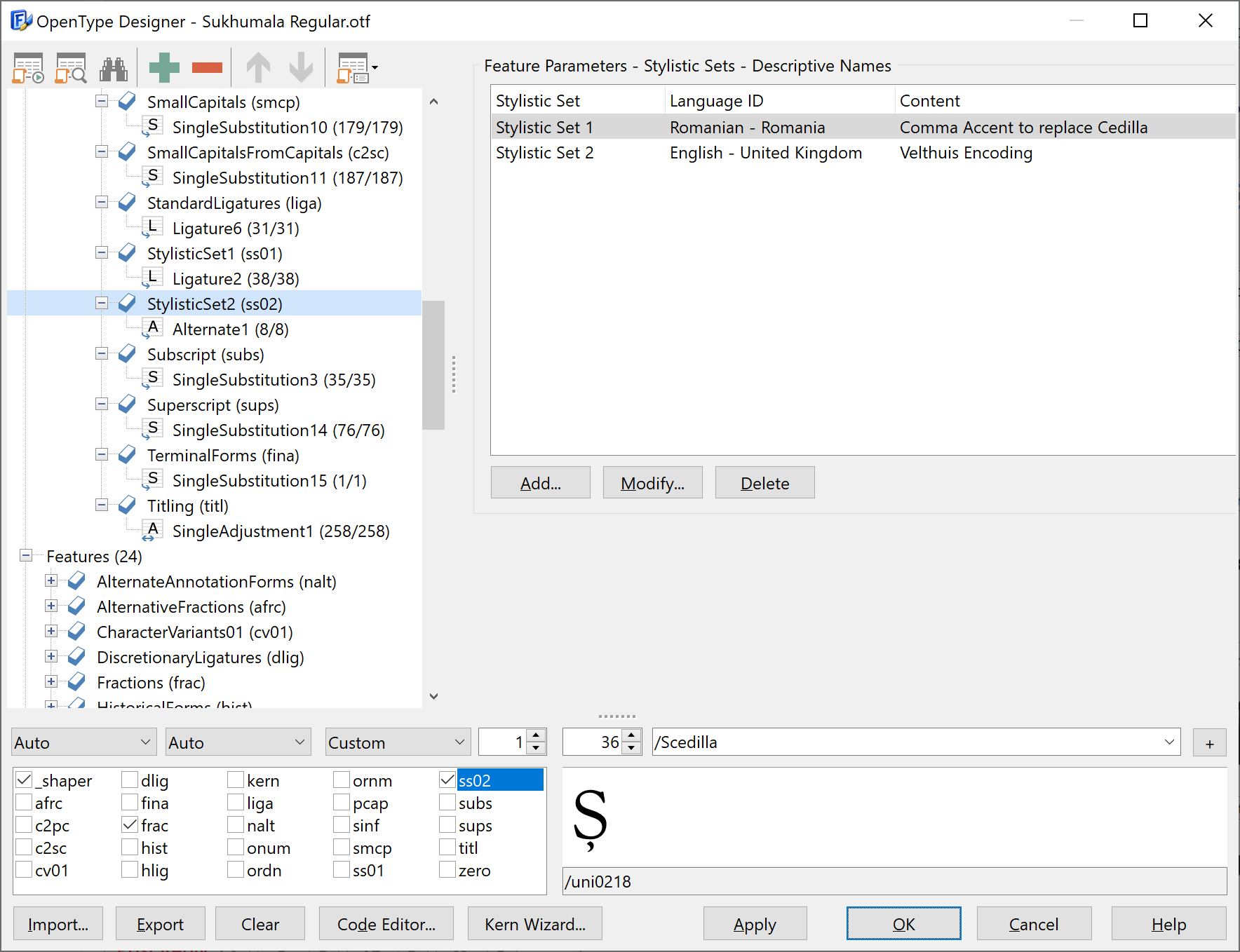
Thanks. Updated archive with the fix.
I have published version 2.42 of Sukhumala, although it is still some way from being finished. If I don’t do any more, at least people will have a usable font now. I am already using it for my latest publications.
Version 2.53 fixes numerous bugs, adds Stylistic Alternates, unifies font metrics, and improves PANOSE classification.
Version 2.54 fixed a few more bugs. MainType 10 has been very useful by identifying inconsistencies in font metrics, Panose classification, etc.
Hi BP–I just watched a YouTube video from Quark for the new dot release of QXP and noticed they were using this font to demonstrate a couple of the new added OT Features (one of which is afrc).
I’ve only recognized a few fonts by people I know in various TV shows, etc. It was pretty neat seeing the use of Sukhumala in the video.
Thanks for the feedback Mike. Did they mention anything about the innovative use of hlig for Roman Numerals?
I have had a lot of pleasure from working on this font. Initially, some Vietnamese Buddhists contacted me as they liked the Goudy OldStyle typeface, but most versions lack the necessary Latin-Extended Additional characters required. They also advised me on the placement of accents for acircumflexacute, acircumflexgrave, acircumflexhook, etc., which is different to other fonts. The accents are usually stacked vertically.
No, but hlig is one of the new features the video shows, but with the AA pair you included in the hlig feature. Petite caps is the 3rd new OT Feature added with this update, again using your font.
I’ve linked to the video at the point where the OT Feature additions start.
NOTE: if you have sound on your computer, you may wish to turn down the volume before clicking the link.