Like my other free fonts, Sukhumala includes an extensive range of Latin Extended characters, Greek, Miscellaneous Symbols, Arrows, Geometric Shapes, and Dingbats. It is designed so that single line spacing is at 130% to accommodate the accents for Vietnamese. You may prefer to reduce the line-spacing to 120% for English text.
Sukhumala version 1.50 adds a Hand Tooled type style, complete with Petite Capitals, Small Capitals, Superscripts for ordinals, and all other glyphs for the OpenType Features. This style should be regarded as a Beta, as it may be changed.
Please let me know if you spot any anomalies or bugs.
I’ve always known that one as the ‘Place of Interest’ sign. I’m not a Mac user, but I think it’s actually the Command key; reading up on the Option key just now, the symbol for it looks like this: ⌥.
Version 1.70 adds a glyph for the Macintosh Option key (Option Key, hex 2325) in the Miscellaneous Technical character set.
Upwards White arrow (U+21E7) Shift Key is already there in the Arrows character set.
Since I include both Petite Capitals (x-height capitals) and Small Capitals in my fonts, I design the Small Capitals to be useful for headings rather than for acroynmns. Sukhumala includes both sizes.
Version 2.10 improved some ogonek contours, added four glyphs with ogonek for Nordic, and added some more kerning pairs.
Following this discussion on Typedrawers I decided to modify the way that glyphs with ogonek were designed, making a smoother transition between the accent and the base glyph.
Very nice and you know far more about typography than me but … I thought that the attachment points on the capital i and capital a might be a little wrong. On the ‘Polish Diacritics : How to?’ website (Polish Diacritics: how to?) it says :-
There are two correct ways of attaching ogonek to the base serif of capital A. The attaching point can be either placed in the centre of the stem or may be merged with the inner part of the base serif. Attaching ogonek to the outer part of the base serif are very incorrect!
Just like the ones in Kelvinch don’t, I was researching the correct way to do this and it will be corrected in the new font.
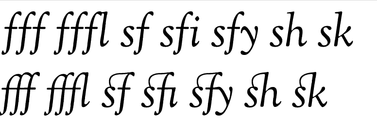
Version 2.30 changed Contextual Ligatures for Velthuis encoding to a Stylistic Set, and changed a Stylistic Set to Character Variants. A Slashed Zero, two more glyphs for Irony Punctuation, super/subscripts for simple equations in fractions, e.g. (4+5)/9÷3), and Pagoda and Stupa Transport and Map Symbols were added. Kerning was made slightly less tight, and more kerning pairs were added.