I have a rather complicated question/request that I’m not sure would be feasible, if not, that’s ok.
I’m somewhat of a novice at variable fonts and smart components, and I would like to be able to make superscript/subscript characters using the weight axis to get them the right amount of thickness to look nice as superscripts/subscripts.
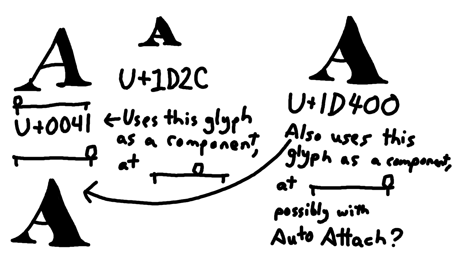
Thing is, since the usual weight axis cannot be used as a smart component axis, I would need to make two identical bold versions of each character–one for the regular weight axis (as I do still want to be able to have a regular weight axis), and one for the smart axis. Since there’s no way to “sync” these two axes (such as having one be used as a component directly into the other with Auto Attach), I need to just manually make them identical, which wastes both effort and filesize, and I’d have to change both of them if I wanted to change the bold glyph.
This is really complicated to explain but what I’d like to be able to do is define, say, ᴬ, as the A glyph with its weight axis set to about 60% of the way from regular to bold, with anchors and bearings intact, but shrunken down to about 62.5% of its size and raised up, and it would live update if I changed either the regular or bold of the A glyph. Ideally, I’d like the anchors to auto-update too, but since it would be shrunken, I don’t think it would be possible to keep an Auto Attach on it. Which should be okay, I may be able to live without the anchors auto updating, the main issue is I don’t want to have to make two duplicate heavy-weight A layers that are completely unattached from each other. I’d also like the character 𝐀 (mathematical bold capital A) to be synced with the bold master of regular A.
Again, I’m not sure if there’s a feasible way to implement something like this, or even if other font softwares have anything like it. If not that should be okay, but I hope I was able to explain what I want without it being too confusing, feel free to ask me questions if you need me to clear anything up.