I bought FontCreator 9 standard edition (and I’m going to upgrade to the professional 11 version now) in order to create a (free and) truly cursive font for primary school teachers.
The problem is I’m beginning from scratch, so I don’t understand everything and I have a few problem to find out out which tool or solution is best. I watched a few tutorials, imported existing fonts to see how they are organized, but it’s still not clear to me.
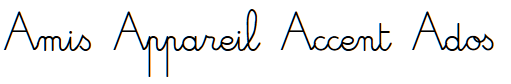
I used Adobe Illustrator to draw the letters, I copied and pasted them in FontCreator and here is an example of what I’ve come up to :
There is still a lot of work to do… and now I wonder if I shouldn’t have asked you first what are the steps and tools I should have taken to create this cursive font.
So, can you tell me how I should proceed ? What are the different steps to create this cursive font ?
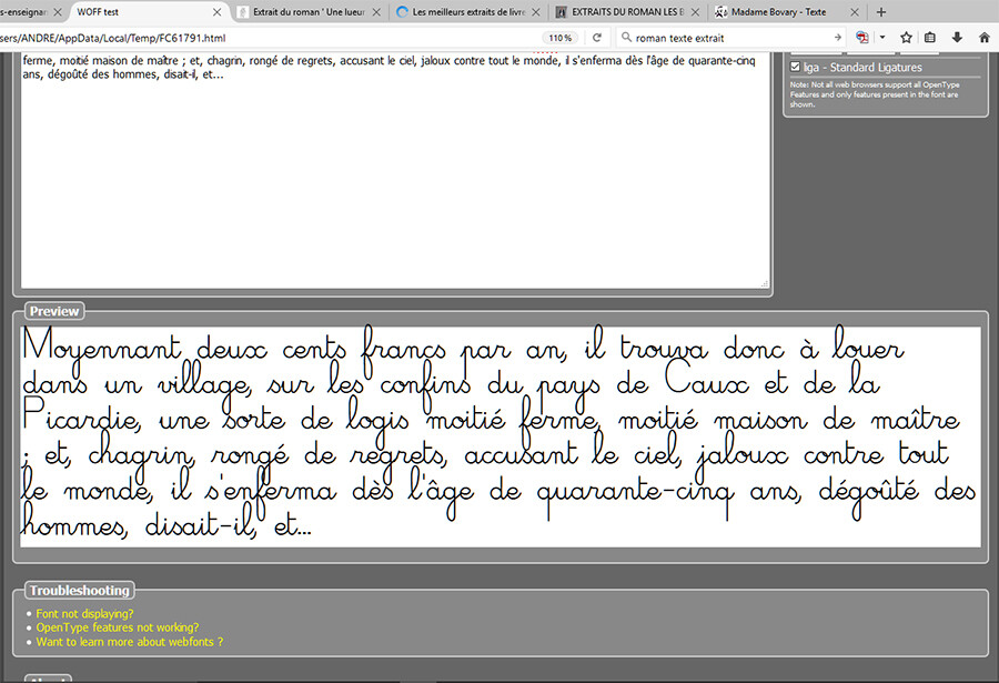
You seem to be doing just fine. The only obvious problem is that the line-spacing is too tight.
Open Font Properties, Metrics, and let FontCreator calculate the metrics for you to optimise the line-spacing to prevent clashes between ascenders and descenders.
As Bhikkhu Pesala said you seem to be doing OK, but you might like to investigate ‘Anchors’.
Anchors are usually used for the positioning of diacritic marks and normal anchors reposition the ‘Mark’ glyph so that its anchor is in the same position as the anchor of the same name in the ‘Base’ glyph.
But there is another type of anchor called ‘Cursive’ and these are classed as ‘entry’ and ‘exit’. I haven’t used these but my guess as to how it might work is that it might just reposition the two glyphs horizontally until the two anchors coincide.
It might be worth a look and a little experiment to see if these are useful to you.
I will have a look at these options and see if I can use them. So far, I’m not doing too bad, but I’m stuck with a few problems I don’t know how to solve.
And by the way, I’ve upgraded to version 11 today and it has cool features and tools.
Contextual Alternates (calt) are enabled by default and it may not be possible to disable them in some applications.
Stylistic Alternates (salt) are not enabled by default and are applied by the user when wanted. I use this feature for decorative drop capitals in my fonts.
In the open type features there are initial forms (to be used at the start of the word), medial forms (the form to be used in the middle of the word) and final forms (at the end of the word).
Font Creator has ‘Open Type Designer’ which is a GUI front end for designing Open Type features and although this is better than any other font editor yet created it is still very complicated so I’m not going to do a full explanation here.
I think you would find it enlightening to read the manual and experiment with Open Type designer until you get the hang of it, it will take a while to understand but what you are wanting to do is quite possible.
inti, medi and fina features can be used–yes, Hudson got the spec changed to how he intended it originally. And he mentioned that a vehicle ought to be included for doing the same in western connected scripts and then as far as I can tell never proposed anything.
Erwin needs to turn this feature back on in FC so those of us that do use this feature in western connected scripts can test in FC.
Thousands of western connected scripts use this facility whether the spec has been recently been edited or not. Not being able to test in FC is onerous. FC is the only font editor that these features cannot be tested inside of.
Every single script font I am hired to code and or code/draw glyphs for use these features. It’s enough to make me want to purchase a used Macbook and purchase Glyphs.
It’s not easy to explain. I suggest taking a look at the OpenType script in my Odana font.
script latn {
  feature StylisticAlternates;
}

class @Chaining_Uppercase [A-Z];
class @Chaining_Uppercase_Salt [A.salt-Z.salt];
class @Chaining_Latin_All [A-Z a-z A.salt-Z.salt];

feature StylisticAlternates salt {
  lookup ChainingContextSalt;
}

lookup ChainingContextSalt {
  ignore context (@Chaining_Latin_All) @Chaining_Latin_All;
  context @Chaining_Uppercase;
  sub 0 UppertoSalt;
}

lookup UppertoSalt {
  sub @Chaining_Uppercase -> @Chaining_Uppercase_Salt;
}
I have not used anchors before, but that might be the best solution for the problems shown in your screen shots to make letters connect better.
Substitution of different glyphs in different contexts is best done as I described for stylistic alternates (salt), e.g. to use a different form of J without the loop if J is followed by an apostrophe.
You still need to fix the metrics. The descenders clash badly with the ascenders.
Yes, I’ve tried what you old me “Font Properties, Metrics, and let FontCreator calculate the metrics for you to optimise the line-spacing to prevent clashes between ascenders and descenders” but it didn’t work… I’m going to try again.
EDIT : I’ve tried again but whatever I choose, it changes nothing…
We are willing to put it back as it used to be, so init, medi, and fina for Latin script only. We will also support init, medi, fina, and isol for Arabic scripts with the next upcoming release.
I think Latin support for this should be optional, as officially it is not allowed. So we are now at a point where we might need OpenType layout feature processing (shaping engine) settings.
Also do let me know if it is worth to implement isol for Latin as well.
Yes to isol as well if not too much work. I have only used it on a handful of western connected script fonts. Makes for easier (less complex) substitution rules as one can concentrate on what/when the subs should happen for the inti/medi/fina.