hi, Iam new to fontcreator, please help to solve my problem..
So, everytime I type 8, 9 and 0 after I type slash, then the that numbers won’t show up, in fact it will delete that slash…but others numbers can work normally…

If I use comma, then that numbers (8,9,0) shows up..but other numbers didn’t need comma to show…I can’t figure out what’s going on here.
Every advice will be apreciated..thanks..
I resize and replaced your camera images and placed them inline for easier reading.
To take a screen shot, focus the text area of the Preview Toolbar and press Alt+Printscreen. Paste that image into Windows Paint, IrfanView, or whatever and save it as a PNG image (best for screenshots; use JPG for photos).
Which version of FontCreator are you using, and what is the font that you are viewing? Are any OpenType fraction features enabled?
It may help if you attach your FontCreator project file for the font.
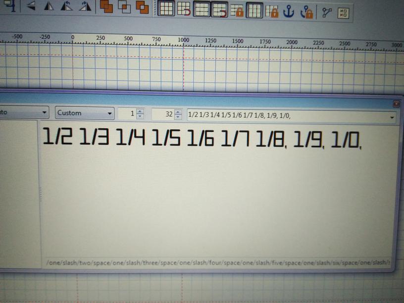
The forward slash is used by the Preview Toolbar as an escape character, which may cause such problems. Note the text string in my screen shots (1//8 and 1//9), and also note the file sizes of my attachments.


thanks for your advice Bhikkhu Pesala,..
currently Iam using Font Creator 12..
Right now Iam trying to make my own font..
I’ve attached my project file so you can so you can tell me what the lacks of my font is…thanks
brooklyn 1.fcp (93.5 KB)
There is not much lacking, apart from a .notdef glyph. There are a number of common errors, some of which I have fixed in the attached project file.
- Lots of redundant points, off-curve extremes, and contours with incorrect direction. I fixed glyphs: 0,1, and ? Use the Validation Toolbar (F7) to spot them and fix them.
- Glyphs that should sit on the baseline do not. I fixed 0 and 1
- Figure Glyphs should match the Capital Height, but do not.
- Widths of figures are often fixed at the same Advance width for use in Tables. Tabular Figures. I fixed those to an arbitrary width of 1020 funits. You might want to adjust that after editing the glyphs.
- No .notdef glyph. I created one from contours in 0 and ?
- Curves are not smooth. I fixed this in glyphs 0,1, and ?
brooklyn 1.fcp (92.2 KB)
thank you for your review..
definitely I’ll try to fix the errors and post here the final result..hope you don’t mind..
thank you so much..
I am curious to know how you are drawing the glyphs to get so many rough corners and contours with incorrect direction?
I made it in affinity designer, expand it and then copy paste into font creator..
I don’t know it will cause some errors with this route…
Take a look at this Video on Using FontCreator 11.0. The various methods of creating contours are described from 3:50 onwards. The glyphs in your font could probably be created quite easily using the Free Draw Tool, holding shift to constrain strokes to horizontal or vertical. Set the line width as you want, and use the same width for all strokes.
Iam affraid I can not open your link, since my goverment has banned this site. Is there any other site that has this tutorial ?..on youtube maybe ?
Yes, you can find My videos on YouTube.
thanks..I’ll check it out ![]()
as I promised, this is my final font..please review it Bhikku Pesala…thanks..
brooklyn.fcp (91.1 KB)
None of the changes that I recommended above have been made. Only one thing to add is that rounded serifs need to overshoot the baseline and caps height by a small amount to make the bottoms and tops of glyphs align visually. So, for example, the bases of the 1 and 2 will sit on the baseline, but the base of the 4 will overshoot it and the top of the 4 will overshoot the caps height.

I beg your pardon Bhikku Pesala, I think I already uploaded the wrong file…here is the correct one..
brooklyn final.fcp (60.7 KB)
..thanks again for all your kind..
That’s better, but still a lot to do.
- Fix baseline/cap height alignment, and overshoots as recommended above
- Fix curve smoothing for all serifs (example below). I have fixed the figure 5 to have smoother serifs and precisely horizontal/vertical strokes.
- Fix glyph metrics (I ran the attached file through Optical Metrics, which is only available in the Professional Edition). You font is too tightly spaced IMO, but that is a design decision/preference, not an error.
- Then start looking at the design of individual glyphs. For example, the capital Y looks like it will fall over.
Curve Smoothing

I still don’t understand with the first point..
“Fix baseline/cap height alignment”..
can you give me an example too ?,
Because I already put all numbers and characters with zero pixel to Baseline, and capital letter to capsHeight line…
and I put the symbols somewhere in the middle..
The Cap Height for the font is currently 1434 funits.
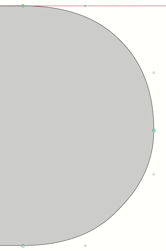
Figure 3
Baseline = +1 funit, height of glyph = 1433 funits (See the size tab of the Transform Toolbar). Note that your horizontal guide is at 1432 funits, not 1434. Double-click the ruler to remove duplicate guides and to move guides to a precise position. Horizontal strokes are not perfectly horizontal. Use the status line at the bottom of the window to check the Y position of each node in points mode (easier if you smooth the serifs first, removing excess nodes). Vertical right side of glyph is not perfectly vertical (check the X position of the nodes).
Period
Y Position = -12 funits (no overshoot needed)
Figure 4
Vertical strokes not exactly vertical, overshoot greater at bottom (24 funits) than at top (8 funits).
Figure 7
Height = 1433 funits, no overshoot at baseline.
Capital A
Height = 1433 funits, no overshoot at baseline, left leg is at Y Position 0, but right leg is at Y Position = 4.
Capital B
Bottom at angle 177.70 deg, not 180.
Capital H
Height = 1434, no overshoot at top or bottom. This glyph is used by FontCreator to calculate Cap Height, so if you fix the overshoots the calculated Cap Height for the font, and the Cap Height guide will move. Set your guidelines manually to zero and 1434 to align glyphs with flat tops/bottoms correctly. Overshoot is required to align tops and bottoms of glyphs visually. Your guess is as good as mine as to how much is needed — 10 funits may be plenty. Whatever you decide looks right at regular sizes like 12 point text (use the Font Test window F5), should be used consistently top and bottom where overshoot is needed.
Missing Glyphs
See the Insert Characters Dialog, Latin-1 Supplement for glyphs that you might want to add to your font. £ sterling is missing, for English users though you have a Euro sign. Adding accented characters is a whole new topic. Think about that later when you’re happy with the glyph outlines and font metrics.
ok, I’ll try to fix the errors..thanks Bhikku Pesala..
hi bhikku, please review my font again..which points I should make it better ?..thanks
brooklyn suggestions.fcp (43.1 KB)
Still some work to do. Look at these glyphs: _ 3 ; : 8 J Q a b h i k © ®